UI Editor Overview
Within Plateau Studio, the UI Editor takes center stage as a pivotal area for component customization and app design. When selecting a model, this dynamic workspace opens in the middle of the screen, adhering to the principle of WYSIWYG (What You See Is What You Get) in the Low Code Editor environment.
On the left side, you have access to both the default component list and a comprehensive display of the components you utilized in your qjson files. This enables seamless navigation and quick selection of components, streamlining your workflow.
To the right, the customization panel provides a rich set of options, allowing you to fine-tune every aspect of your selected components. From modifying visual properties such as size, color, and layout to defining dynamic behaviors, such as button actions and event triggers, the UI Editor equips you with the necessary tools to bring your app's vision to life.
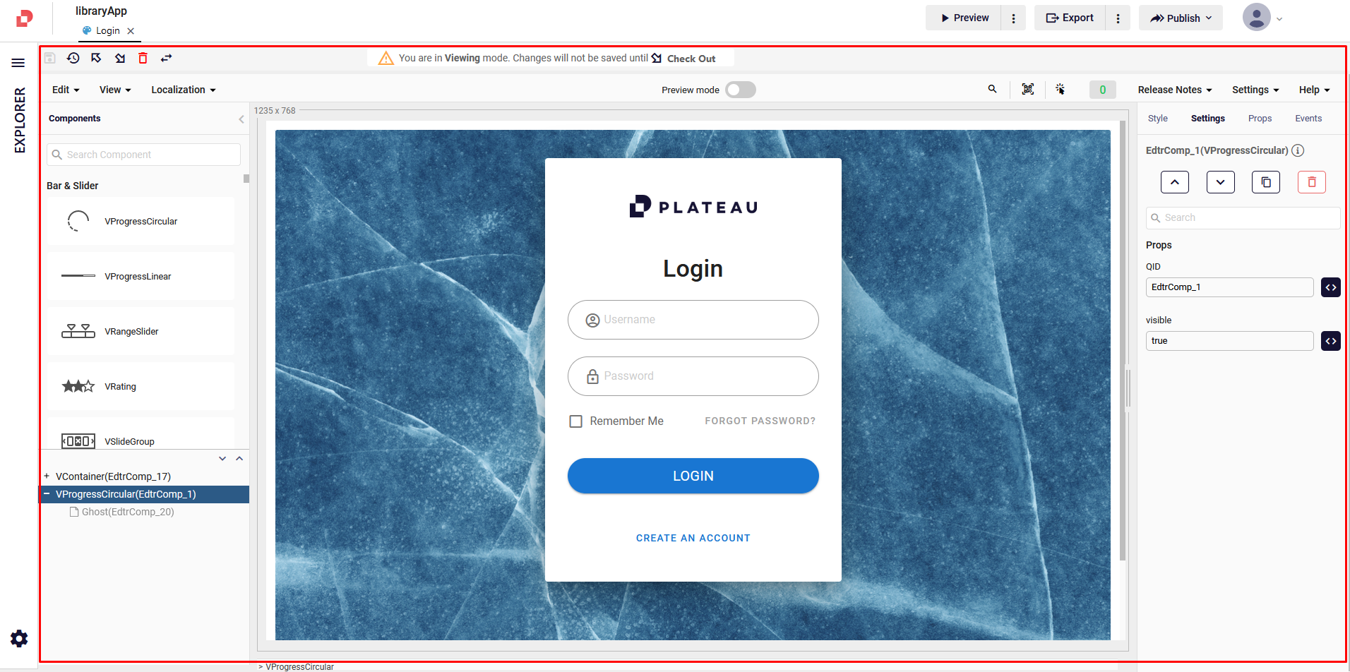
This section of the documentation acts as an informative guide, providing you with a preview of where to find crucial UI Editor details and related actions. By following the provided links, you can delve deeper into specific sections.
Components
Within Plateau Studio, you have access to an array of component sets, including the Vuetify components as well as the ability to create your own customized components.
To find each components' usage and style details, you can click here.
Components in UI Editor
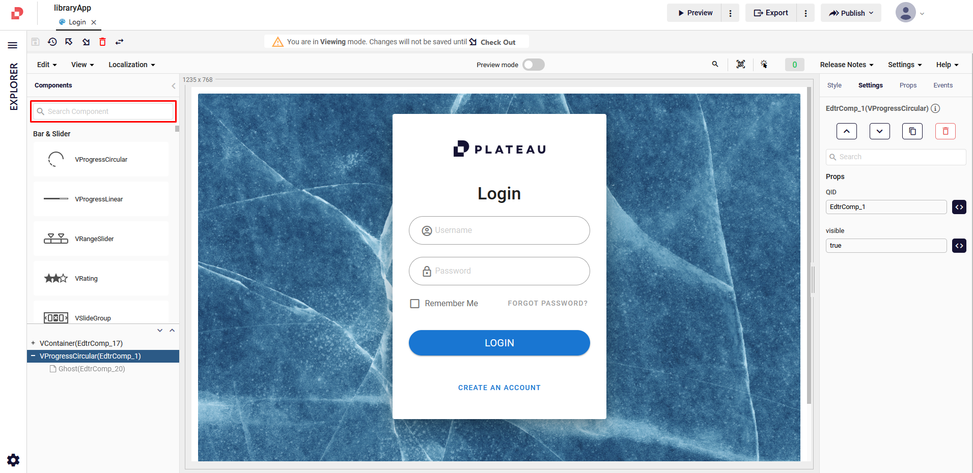
On the left-hand side of the Editor, the component sets are conveniently organized based on their function and/or style, allowing for seamless navigation and exploration.

The UI Editor provides a search feature, enabling you to search for a specific component by name or related keywords.
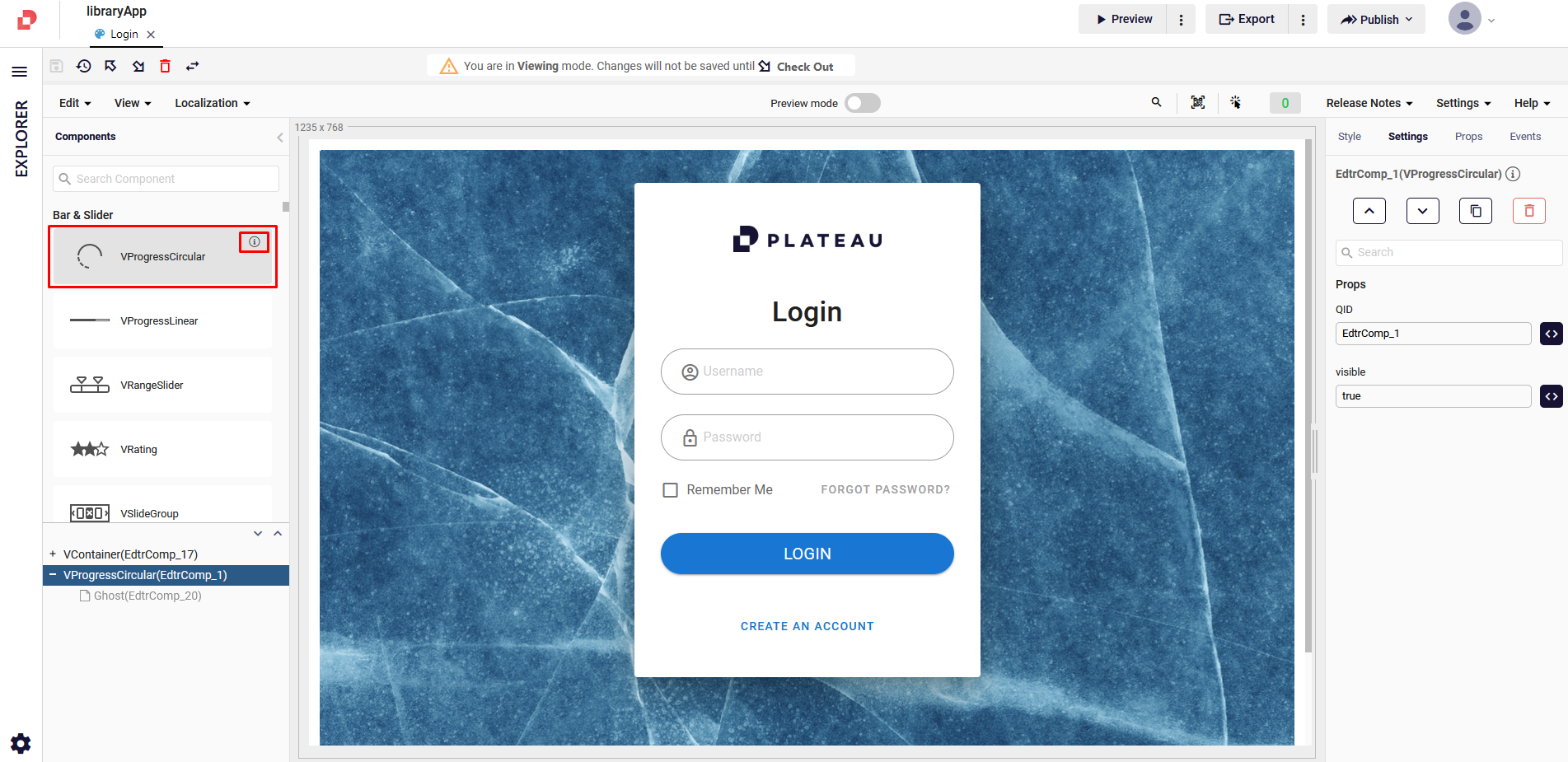
To gain deeper insights into the components available, click the Info button located next to each component. This provides you with specific definitions and details about the component.
To check details on how to use components and style them, click here.
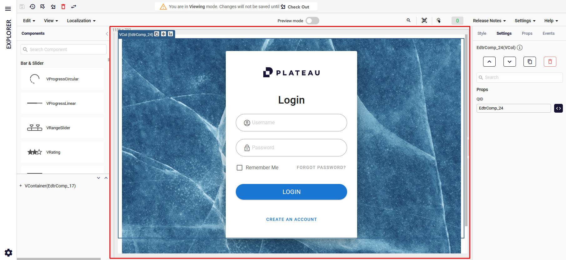
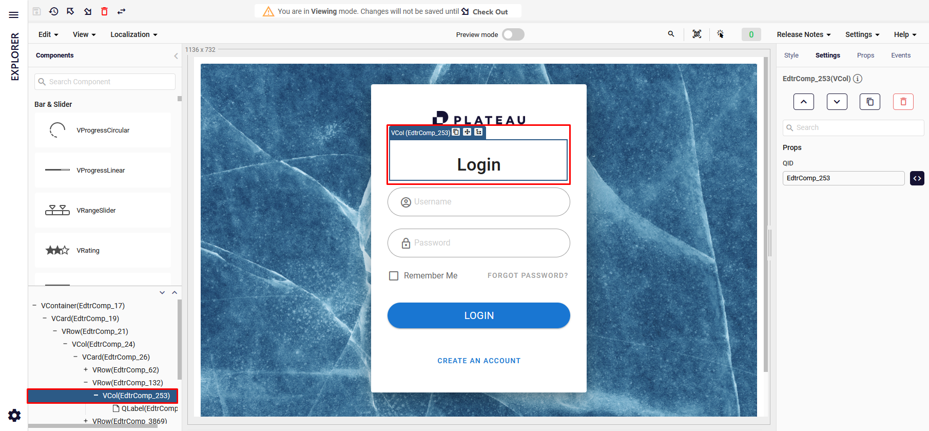
Treeview
The Treeview is positioned below the components and provides a hierarchical representation of your added components.
By clicking the arrows situated on the right-hand side, you can easily collapse or expand the tree structure, allowing for navigation and organization of your components.
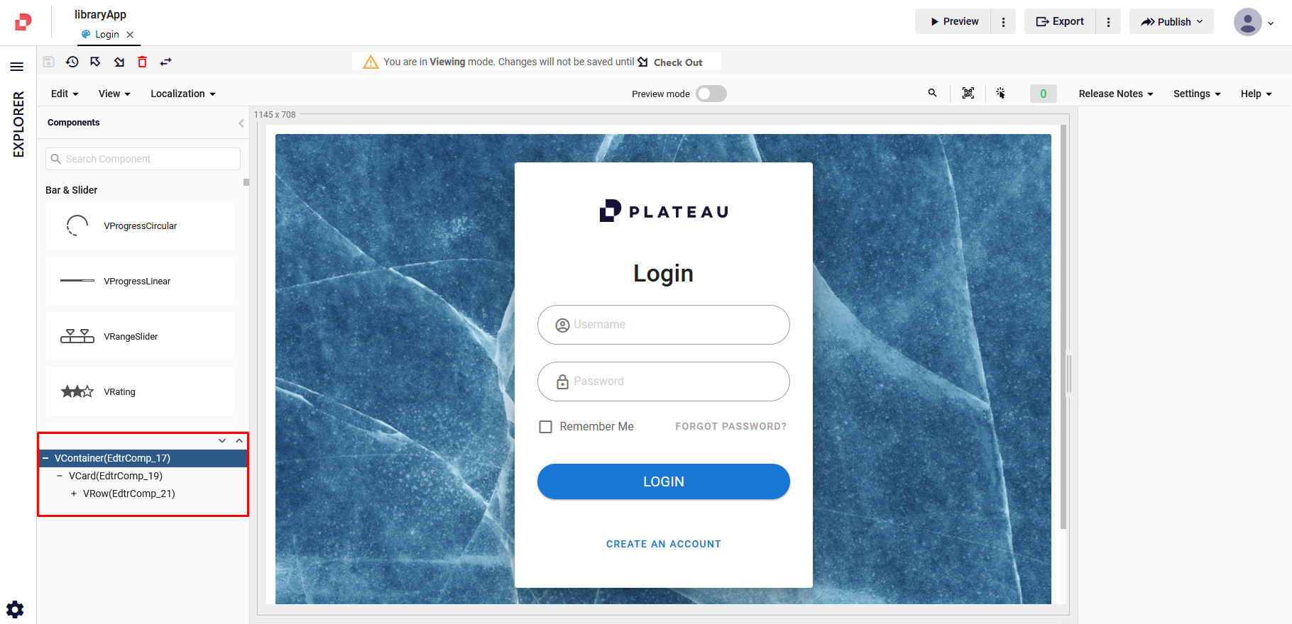
You can also locate and interact with the corresponding component in the UI Editor, enabling the editing and customization. After locating your components, you can take following actions: Dublicate, move and select parent.
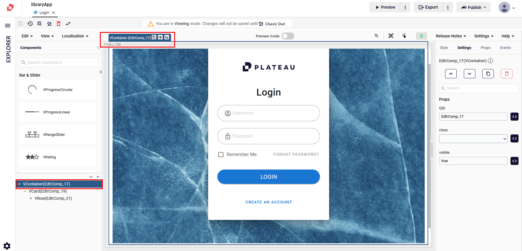
Page Design Area
This is the area where you can manage and place your components and see them in UI pages.
When you click a component in page design area, you can see the related content highlighed in Treeview as well. With this, you can also perform the following actions: Duplicate, Move and Select Parent.
Style
In the Style tab, you can fine-tune various aspects of your component's presentation, including its layout, appearance, and responsiveness across different device breakpoints For more details about Layout, click here.
Settings
Settings gives you the list of the features and props that you make changes to.
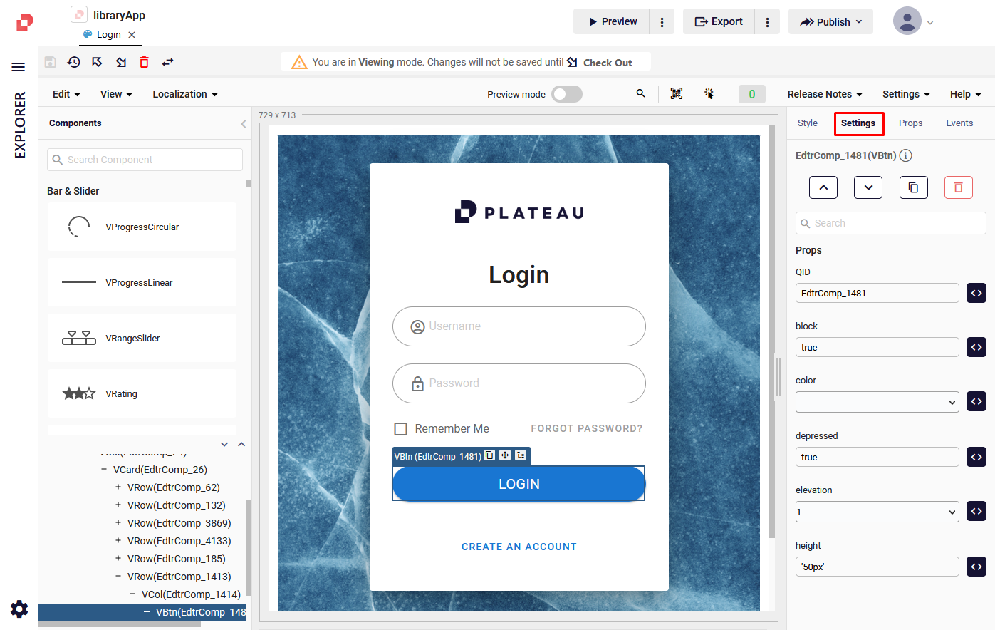
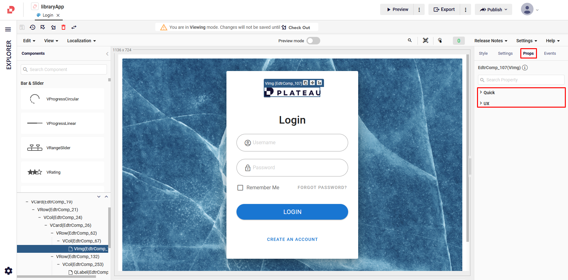
Props
In the Props section, you can manually assign specific property values to your components, allowing for precise control and customization of their behavior and appearance.
These prop values can be set for both the Editor, providing a visual representation of your component during the design phase, and the UX (User Experience), dictating how the component behaves and interacts with users in the final application.
For more details about Layout, click here.
Events
The Events tab provides a toolset for defining the behavior and interactivity of your components.
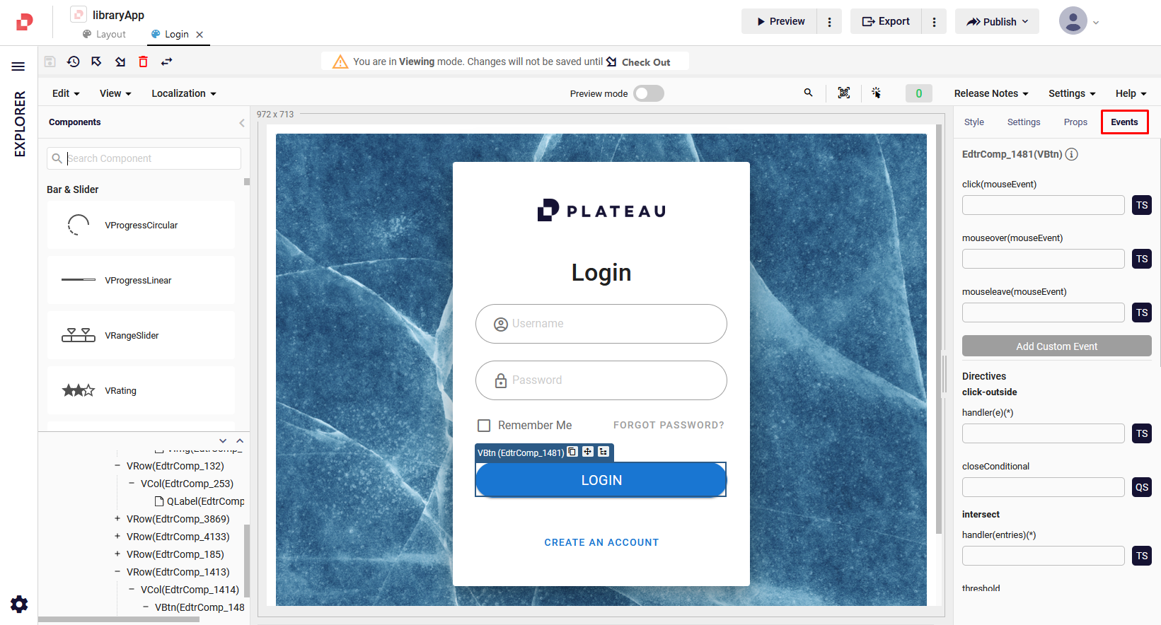
You can assign actions and reactions to various events, enabling you to create dynamic and responsive user experiences. Whether it's a button click, a value change, a scroll event, or any other interaction, you can easily define the desired behavior and trigger the corresponding actions.
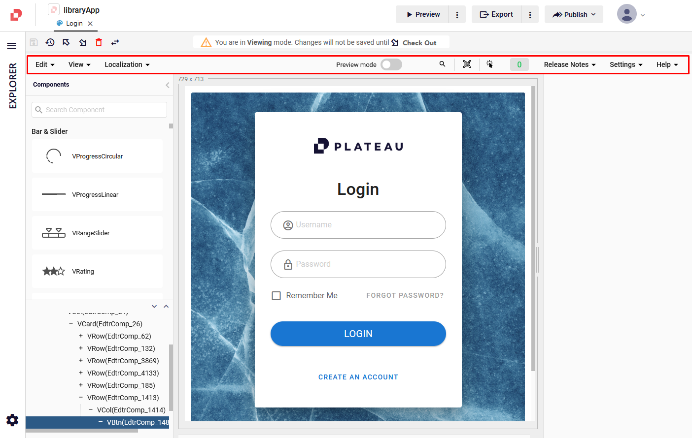
Top Bar Buttons
Situated at the uppermost section of the UI Editor in Plateau Studio, you will find a collection of navigational elements referred to as the Toolbar.
The Toolbar serves as an essential control hub that enables swift and efficient navigation within the UI Editor.
It comprises a set of strategically placed buttons and icons that offer quick access to frequently used functionalities, enhancing your overall editing experience.
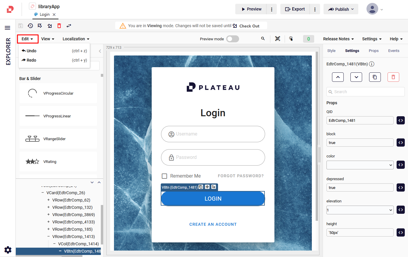
Edit
Undo/Redo: Allows you to recall and re-make your actions.
Localization
Local Resources: Allows you to add new local resources.
Languages: Gives you an option to switch between your added languages.
Add Language: Allows you to add new languages by using the related language code.
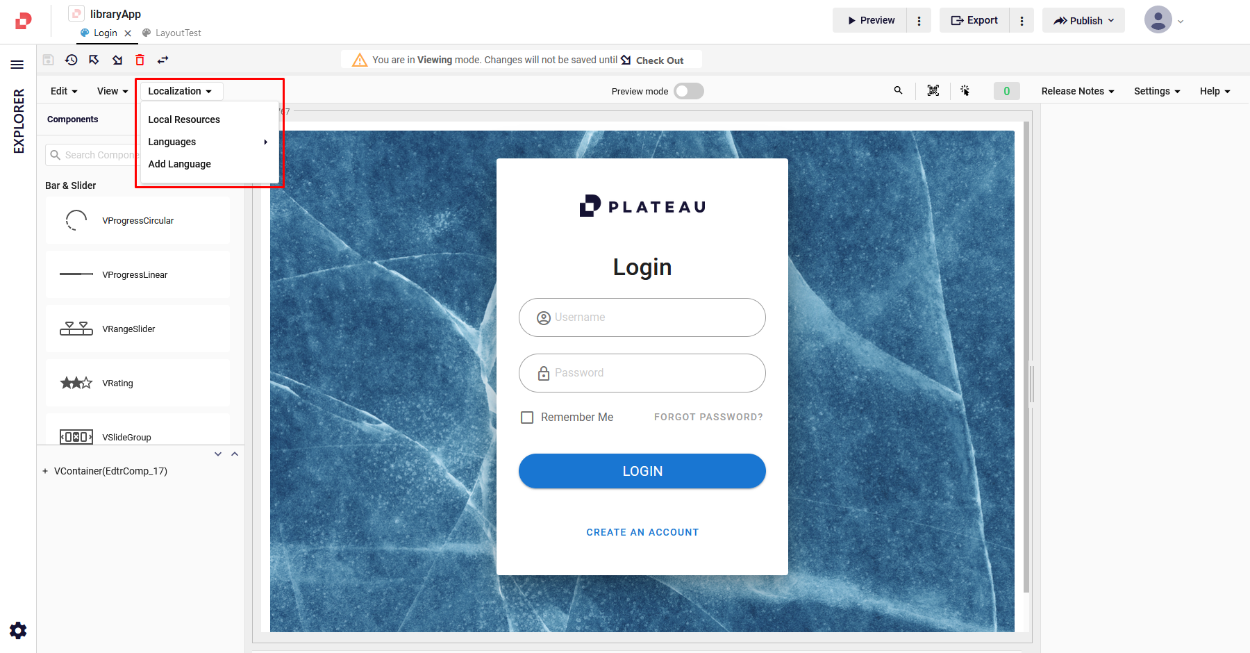
For more details about language settings on Plateau Studio, click here.
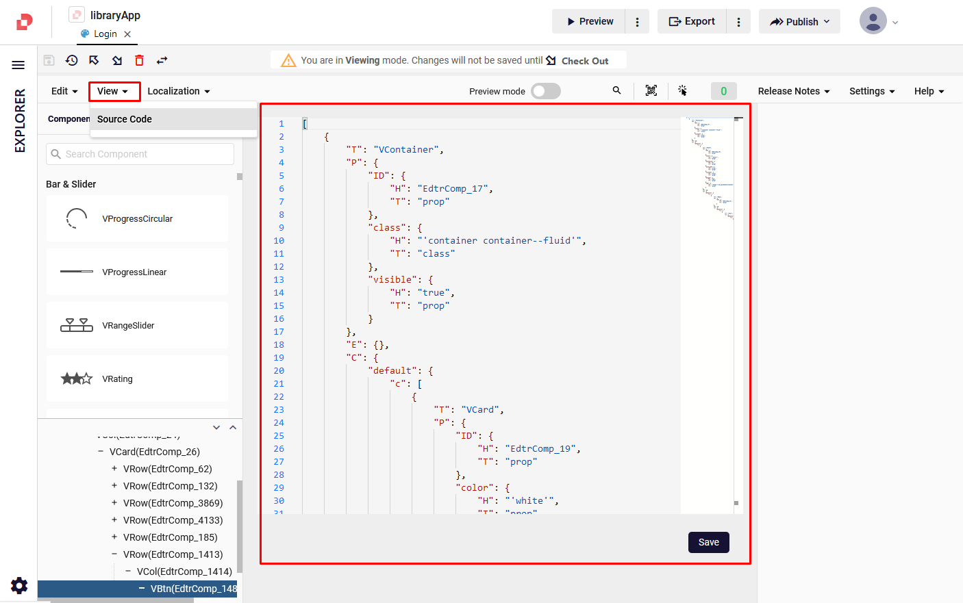
View
Source Code: Allows you to check the source code that is created automatically when you add and/or edit components .
Preview Mode
Allows you to check your UI pages based on your device preference and responsive button behaviors, such as typing, clicking etc.

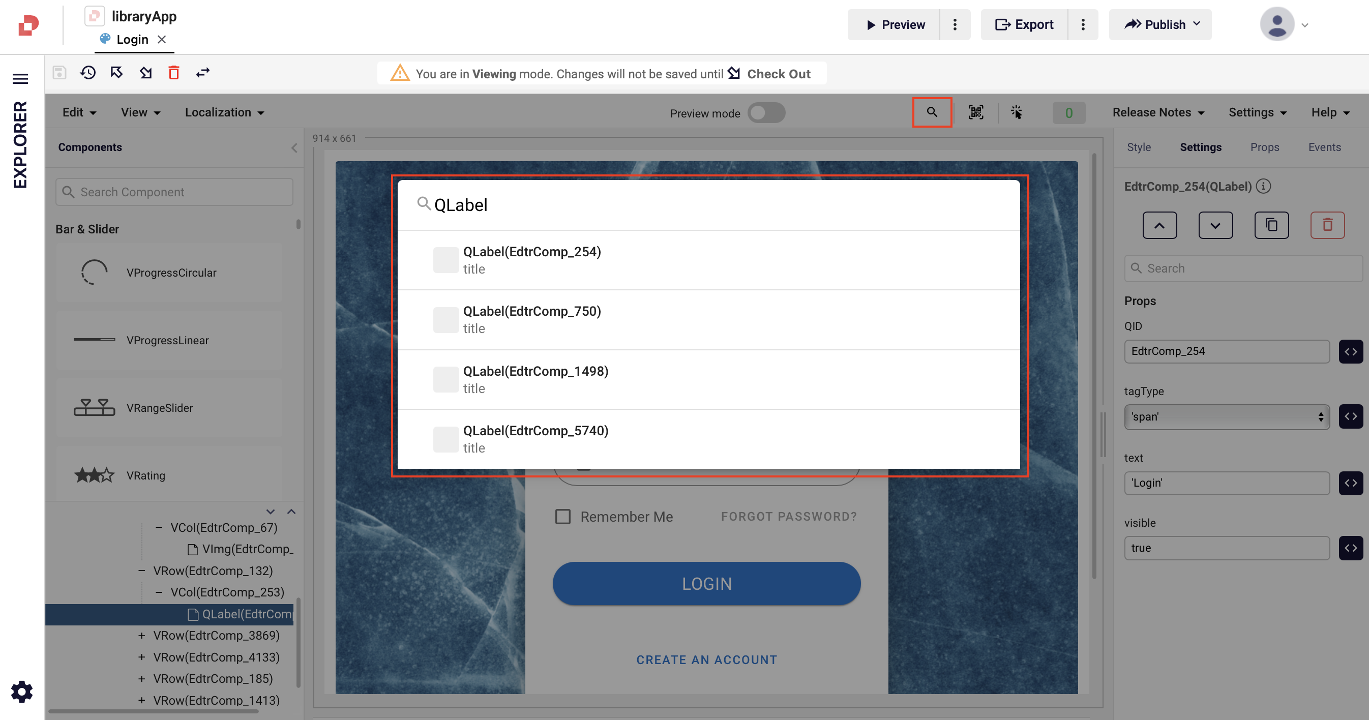
Find In Page
Allows you to search the components that you've used in your page design area.
Simulator
Allows you to preview your UI pages on your iOS & Android mobile devices by scanning the generated QR code.
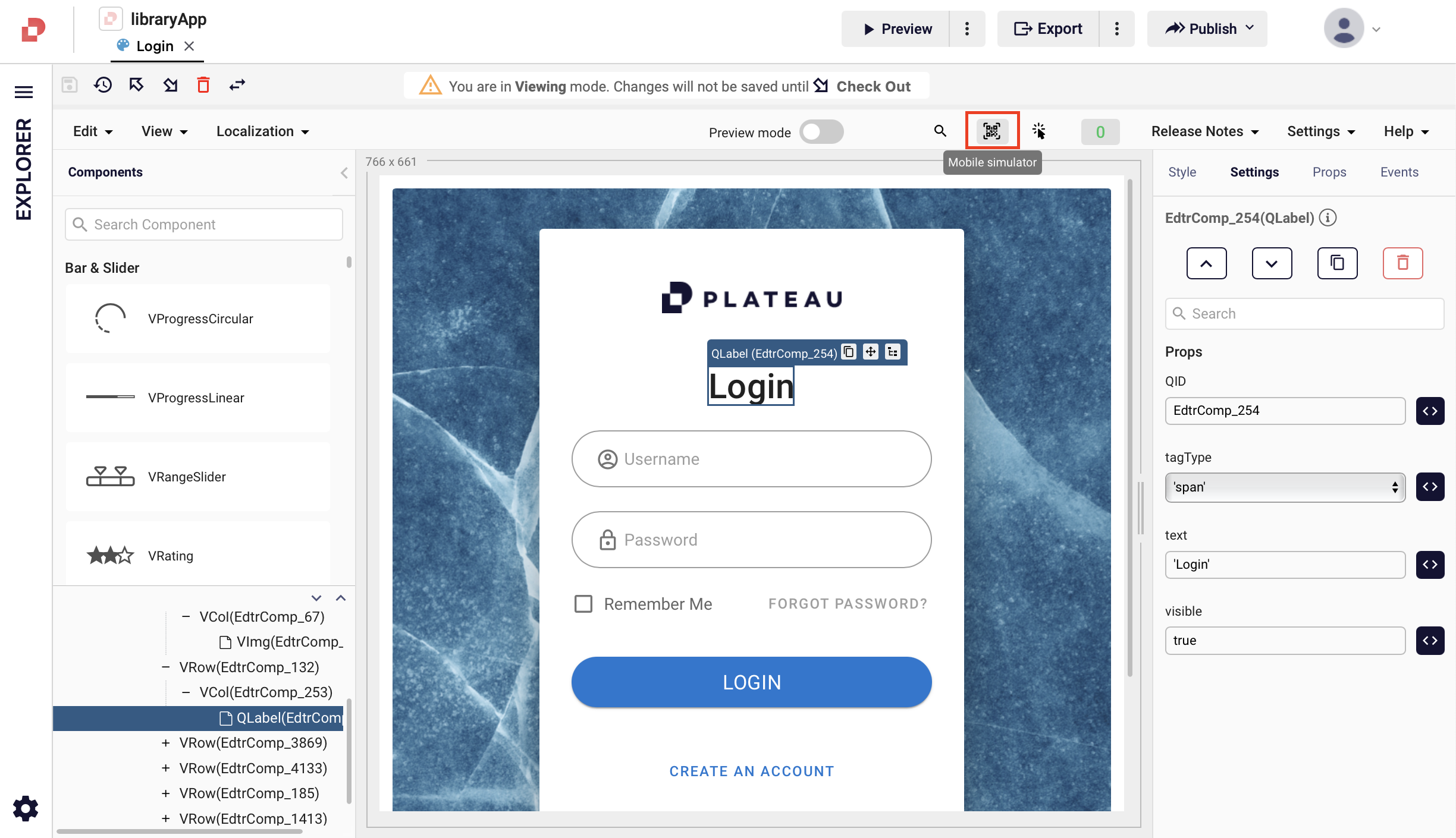
Scanning the QR code through your phone camera launches the phone's browser and redirects to the StudioApps application if the application already exists on your device. After the application launches, you can preview your UI page on your iOS & Android device.
If StudioApps application does not exist on your current device, the browser redirects to the platforms where you can download the app instead.
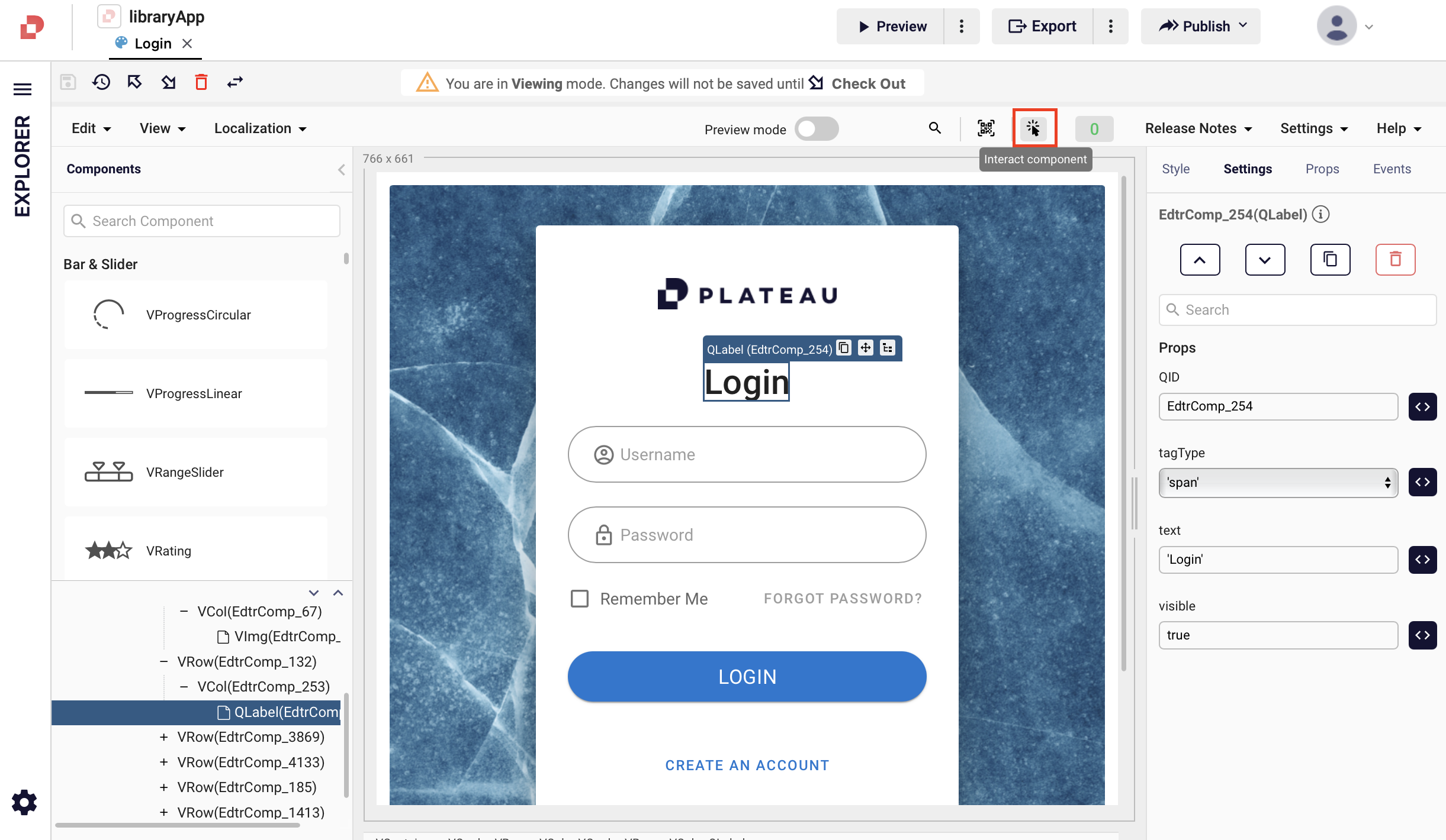
Interact Component
Allows you to check and test your component's responsive behaviors in your page design area, such as typing, clicking etc.
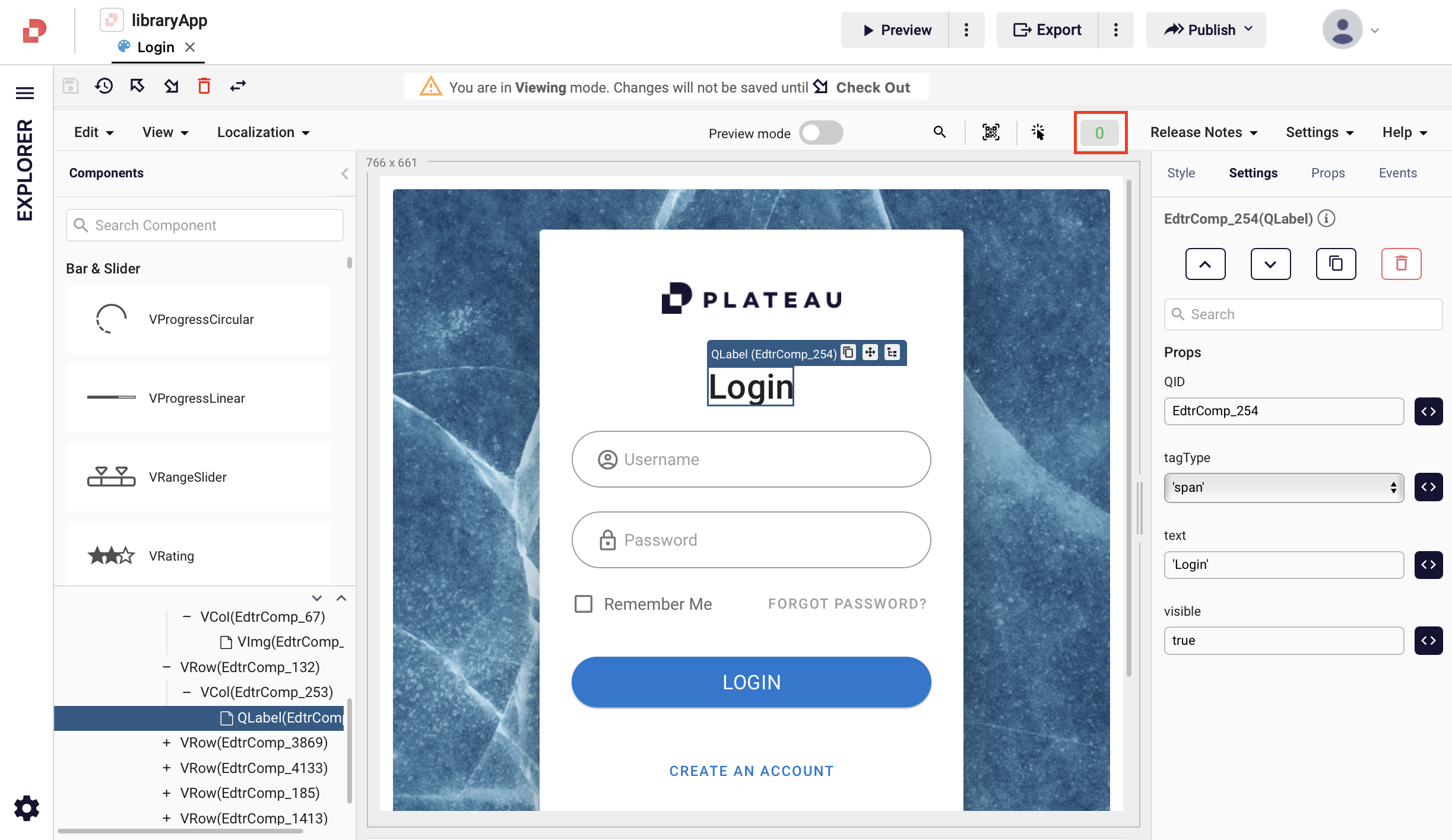
Errors
Shows you any errors that occurs in your UI pages.
Help
You can find detailed documentation, versions, videos and component samples.
