Layout
In Plateau Studio, the concept of Layout refers to the systematic arrangement and configuration of the visual design elements for a web page or mobile application. The layout acts as the foundation that defines the overall structure and organization of the user interface.
By customizing the layout, you have the freedom to determine the positioning, alignment, and sizing of various UI components and content elements.
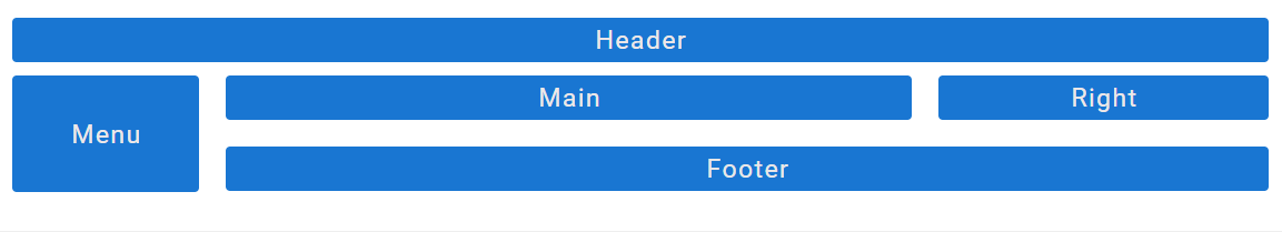
This includes defining the arrangement of navigation menus, headers, footers, sidebars, content sections, and any other relevant elements that compose the user interface.
Plateau Studio Layout Principles
When creating a new page in the studio, a preconfigured structure consisting of containers, rows, and columns is provided as a starting point.
The foundation of this structure is based on a widely-used concept known as grid system containing the row-col structure. This structure utilizes rows and columns to create a flexible grid-like framework for content placement.
By utilizing rows and columns, you can organize your content within designated boxes of varying widths, ensuring a visually pleasing and organized layout.
This structure not only enhances content organization but also enables the adaptation of the page or screen to different screen sizes, making it suitable for responsive design.
Why should you use Container on your page?
Container is a fundamental concept in layout design within Plateau Studio. It serves as an encompassing framework that holds and organizes elements such as lines and grids within a page.
One of the key advantages of the container is its inherent responsiveness. It automatically adjusts itself to the center of the screen, ensuring that your design remains visually balanced across different devices and screen sizes. This responsive behavior helps you create layouts that adapt to varying screen dimensions.
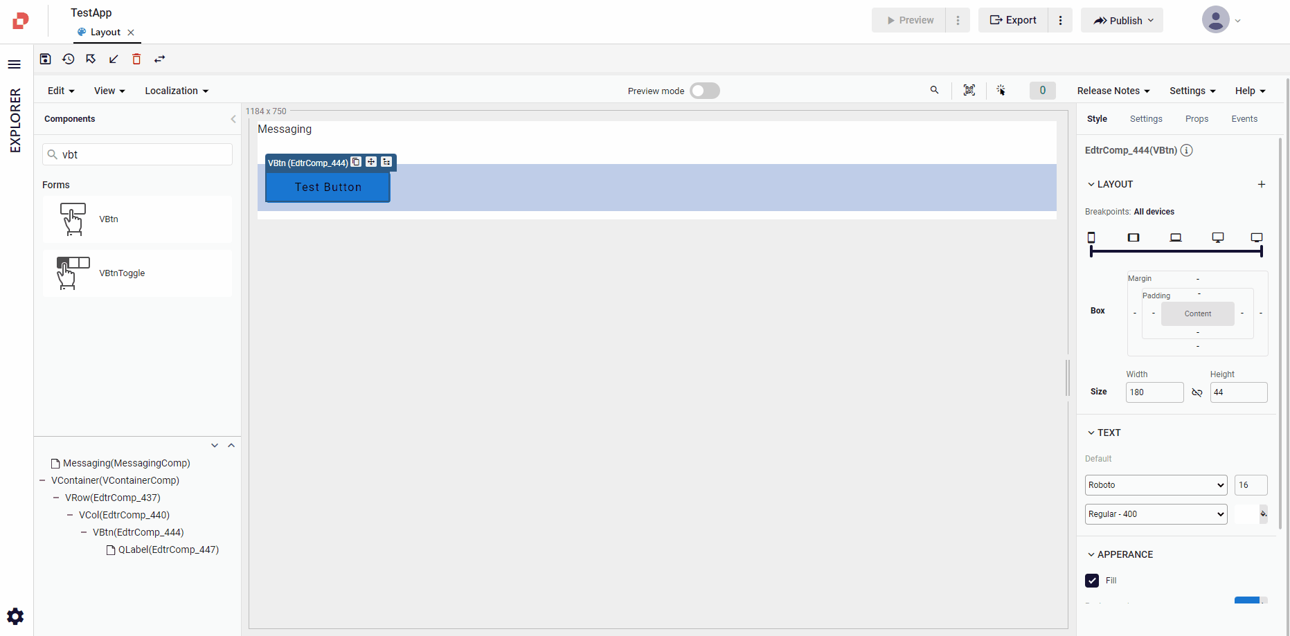
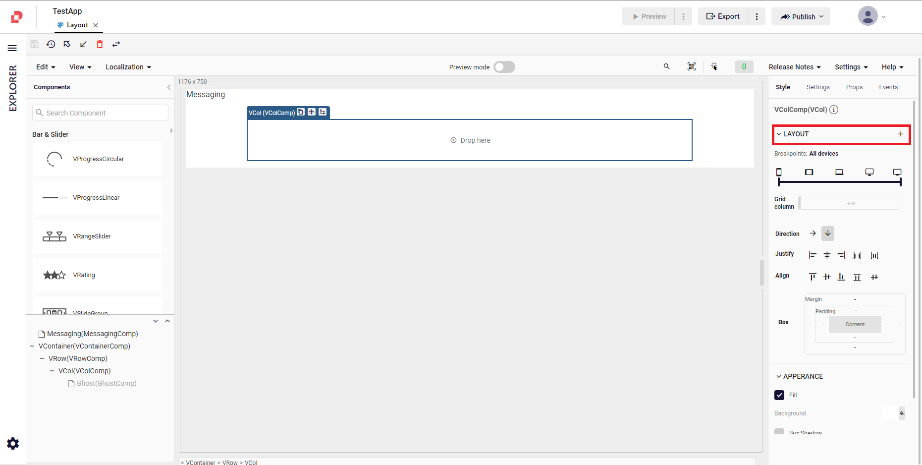
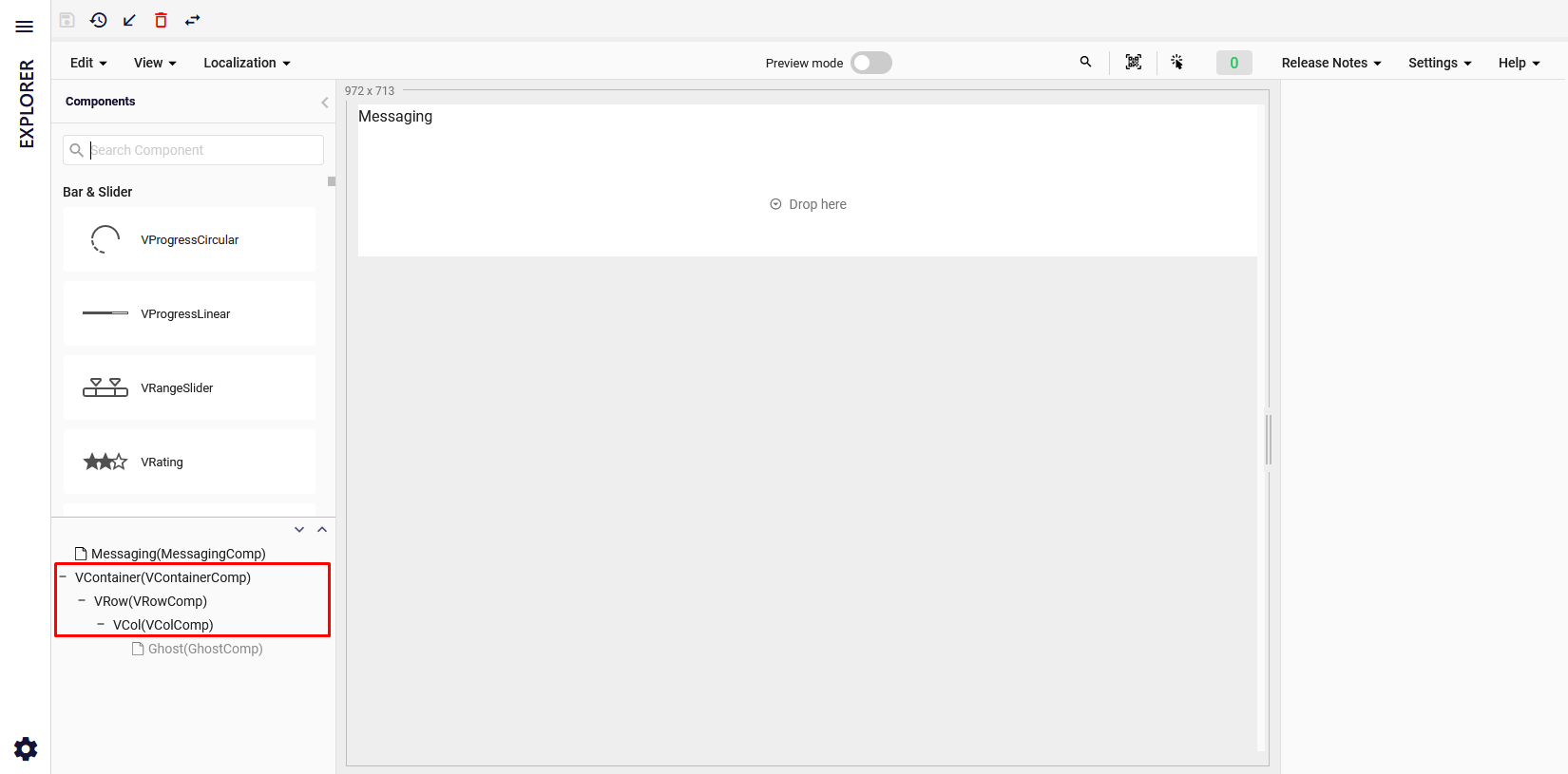
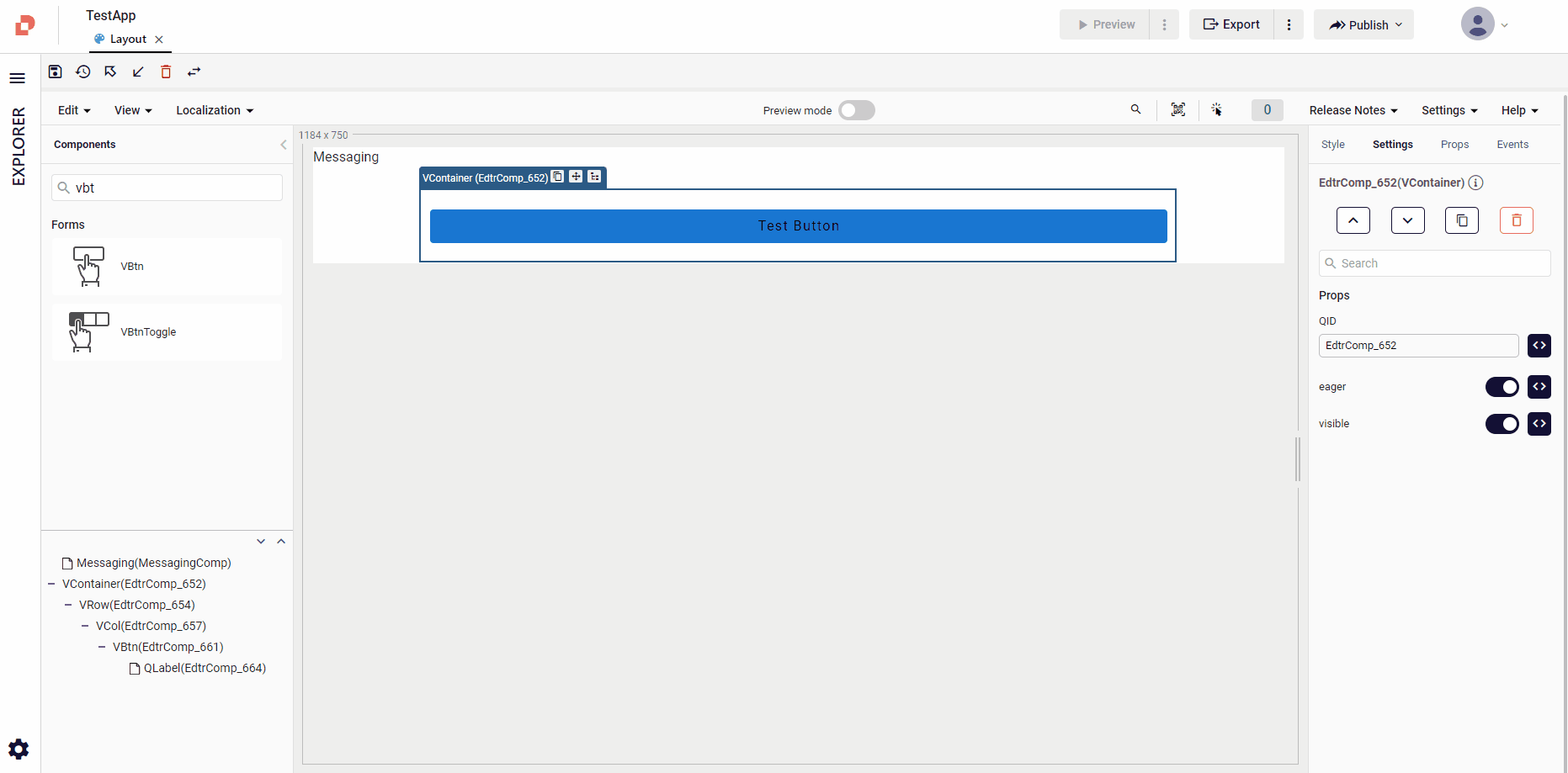
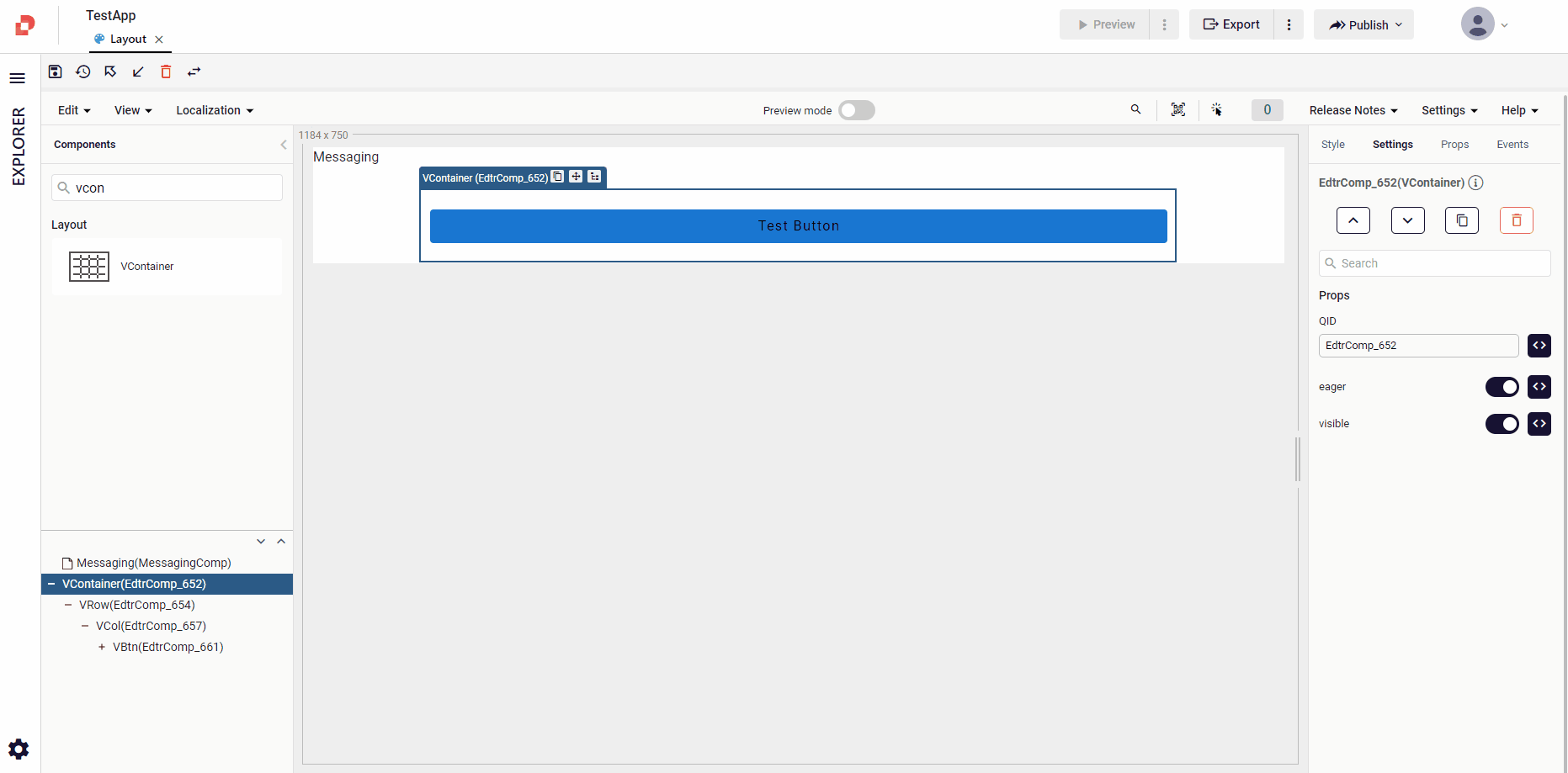
When you create a new UI page, a container is automatically added to the page design area. The default container consists VContainer (VContainerComp), VRow (VRowComp), and VCol (VColComp). These components provide a structured and organized layout system, facilitating the placement and arrangement of content within the container.
For example:
- The .container class sets a fixed width for the container based on the browser's width. It ensures that your page maintains a consistent width regardless of the screen size, providing a responsive design that adapts to different devices.
- By applying the .container-fluid class, you can create a full-screen-width page that spans the entire width of the browser, regardless of its width. This class is useful when you want your content to occupy the entire available horizontal space.
Row & Col
The terms Row and Col in Plateau Studio refer to a grid system used to structure and organize the layout of your web pages or mobile screens.
This grid system divides the available width into 12 equal columns, providing a flexible and responsive framework for arranging your page elements.
This grid system divides the width of the page into a certain number of columns and places the different elements on the page within these columns. In this way, you can make the elements on the page look more organized and legible.
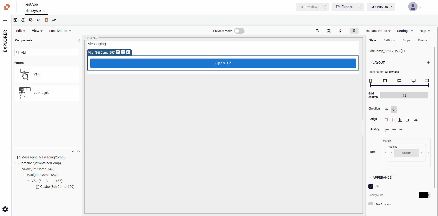
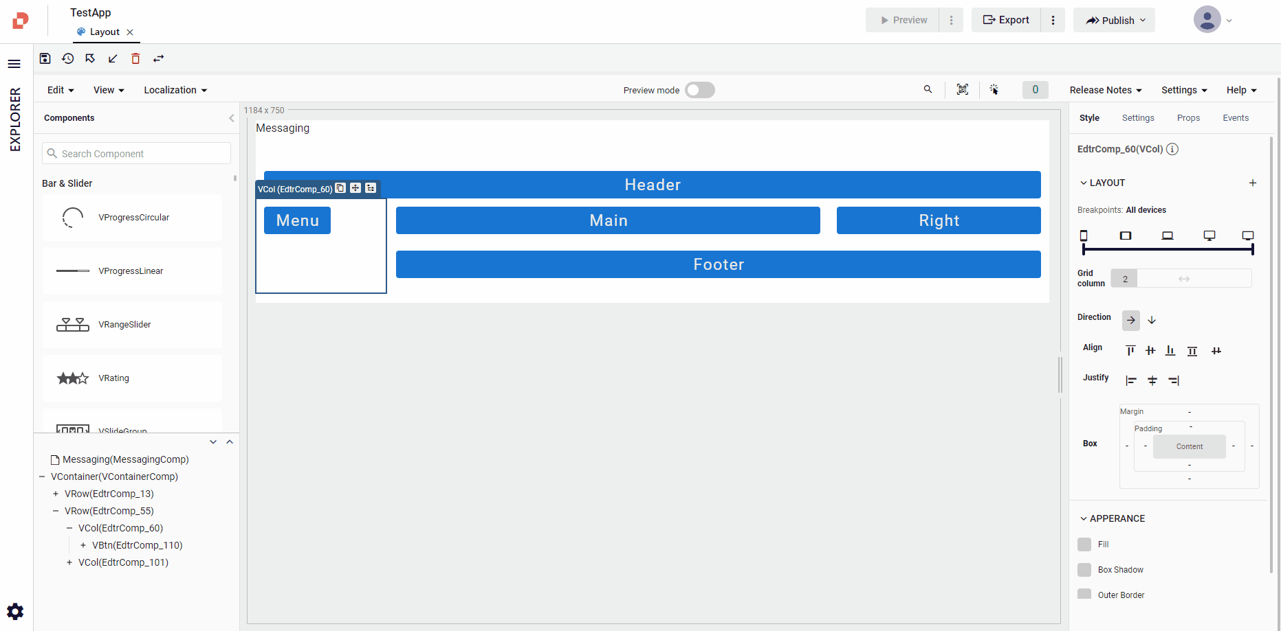
To customize the grid layout, you can adjust the number of columns for a particular Col component using the Grid Column bar. This allows you to control the proportion and placement of elements within the grid.
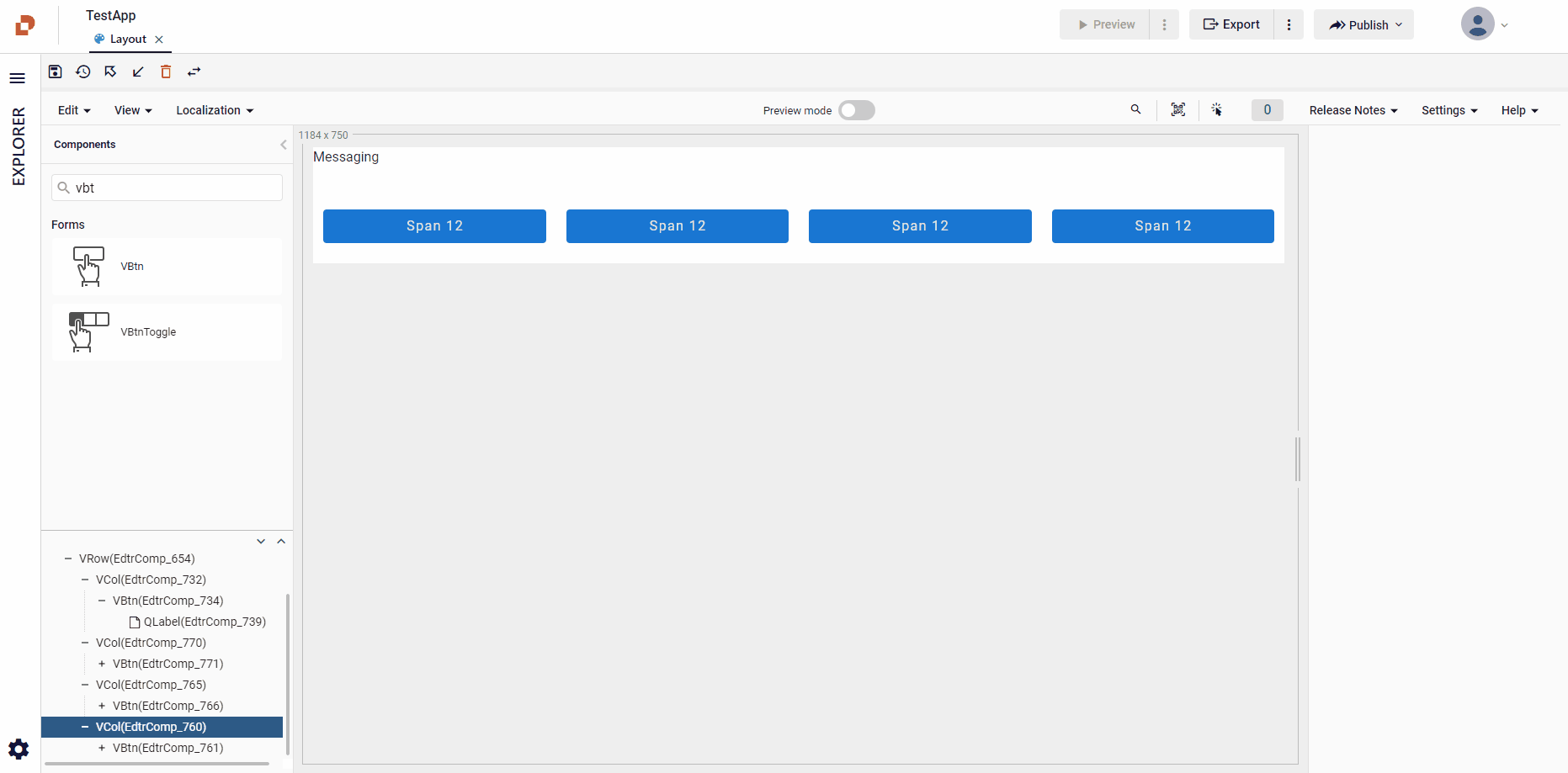
Example: If you want a column to span the entire width of a row, you can assign it a value of 12, indicating that it occupies all available columns in the row.
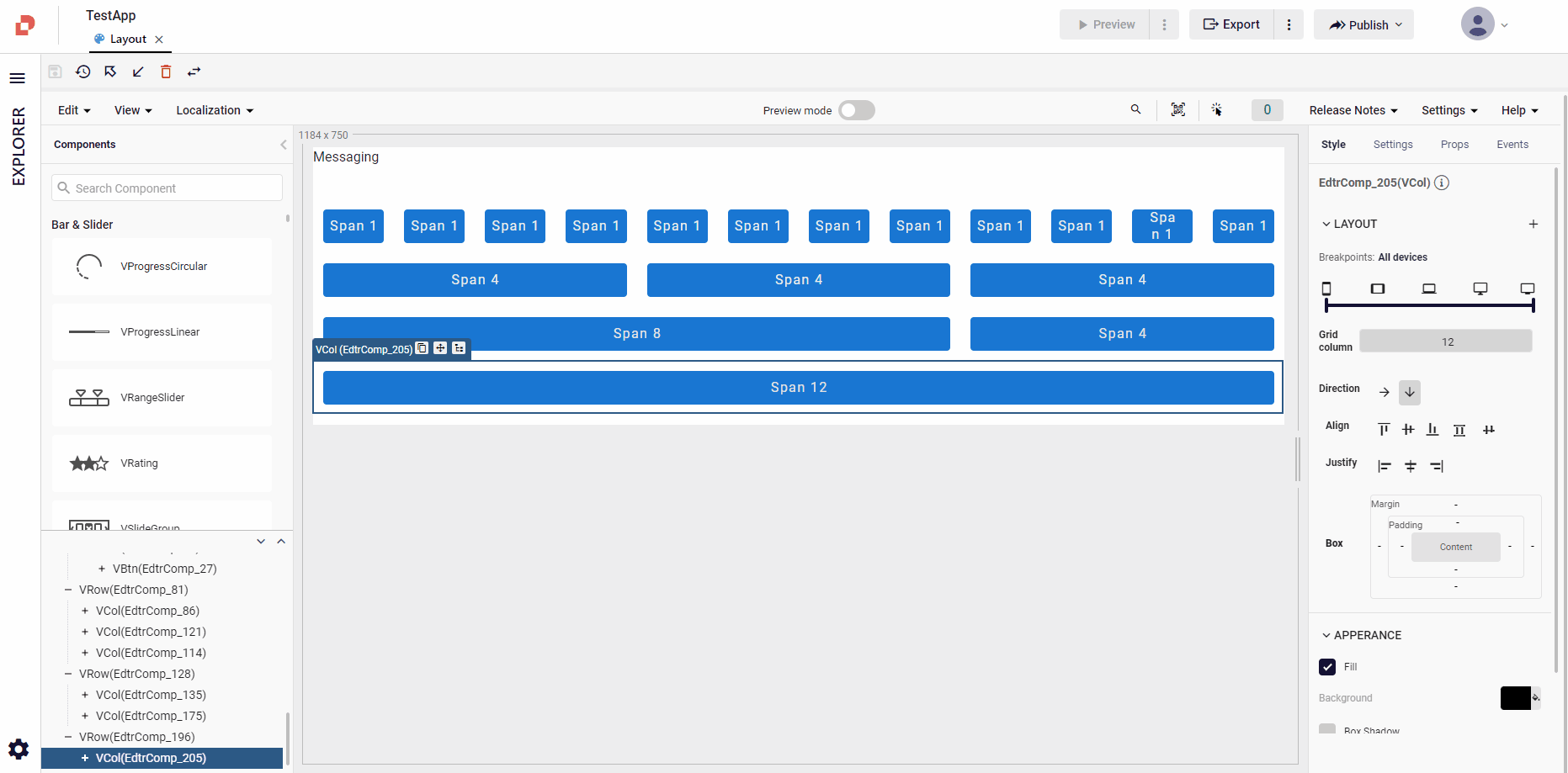
It is also possible to sort the column in the row side by side and from bottom to bottom. If you want the columns to be aligned downwards, give the column the value(12) that a single row can take.
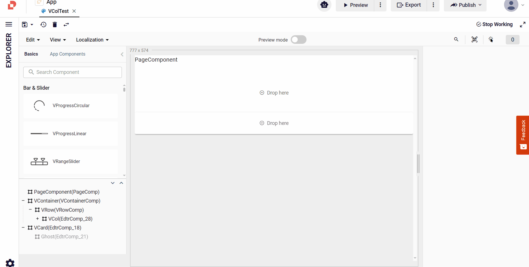
You cannot use the VCol component alone or within any other components. Always use VCol with VRow as its parent component.
Alignments
In Plateau Studio, you have access to various alignment options to control the positioning and arrangement of elements within your layout.
These alignment properties are inspired by CSS and offer convenient ways to achieve desired visual effects. Here are some of the commonly used alignment properties available in Plateau Studio:
Direction
You can specify the direction of content (element or text) within a container using properties like flex-direction. It allows you to arrange elements horizontally (row), vertically (column), or in reverse order (row-reverse or column-reverse).
Justify
The justify-content property enables you to control the alignment of items along the main axis of a container.
You can use values like flex-start, flex-end and center to distribute items evenly or align them to the start or end of the container.
- start: Objects are arranged from the beginning of the container.
- center: Objects are aligned centered.
- end: The last object is aligned to the far right.
To justify features on a horizontally positioned:
- Click the related component in your design area
- Click the horizontal button in Direction
- Click your Justify option
To justify features on a vertically positioned:
- Click the related component in your design area
- Click the vertical button in Direction
- Click your Justify option
Align
The align-items property determines how items are aligned along the cross axis of a container. It offers options such as flex-start, flex-end, center, baseline, and stretch to control the vertical alignment of items.
In the same way, you need to decide how you should do the alignment on the vertical axis.
- start: Objects are arranged starting from the top of the container.
- center: Objects are arranged vertically in the middle.
- end: Objects are stacked upwards, starting from the bottom of the container.
- baseline: Alignment is started by considering the font on the first line.
- stretch: All objects are lined up to be equal to the container height.

Spacing
Plateau Studio provides properties like margin and padding to manage the spacing around elements.
- Padding: Spaces added to the content and borders of an element. Padding determines how far away the content will be from the edges.
- Margin: Determines how far an element will be from other elements. Margin determines the spaces outside of an element.
For example: Give a button a margin and padding value of 10 px from the right, left and 30px from the bottom and top.
To modify margin and padding values, type your preferences into the Margin and Padding boxes.