Responsive Layout
The website, produced by using the responsive layout, is sensitive to the features of the device displayed on and makes itself compatible with that device.
Thus, you can create more user friendly website as if it is designed for that device in terms of usage and appearance, on all devices from phone to desktop computer, from tablet to television.
Plateau Studio offers the following three features for you to perform responsive design: Breakpoint Usage, Grid-Column Usage and Layout Multiplexing.
How to Use Breakpoints?
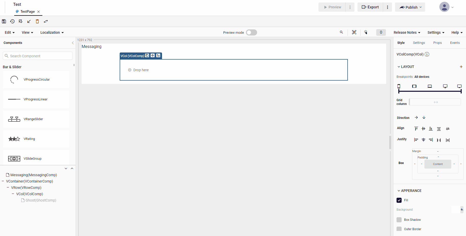
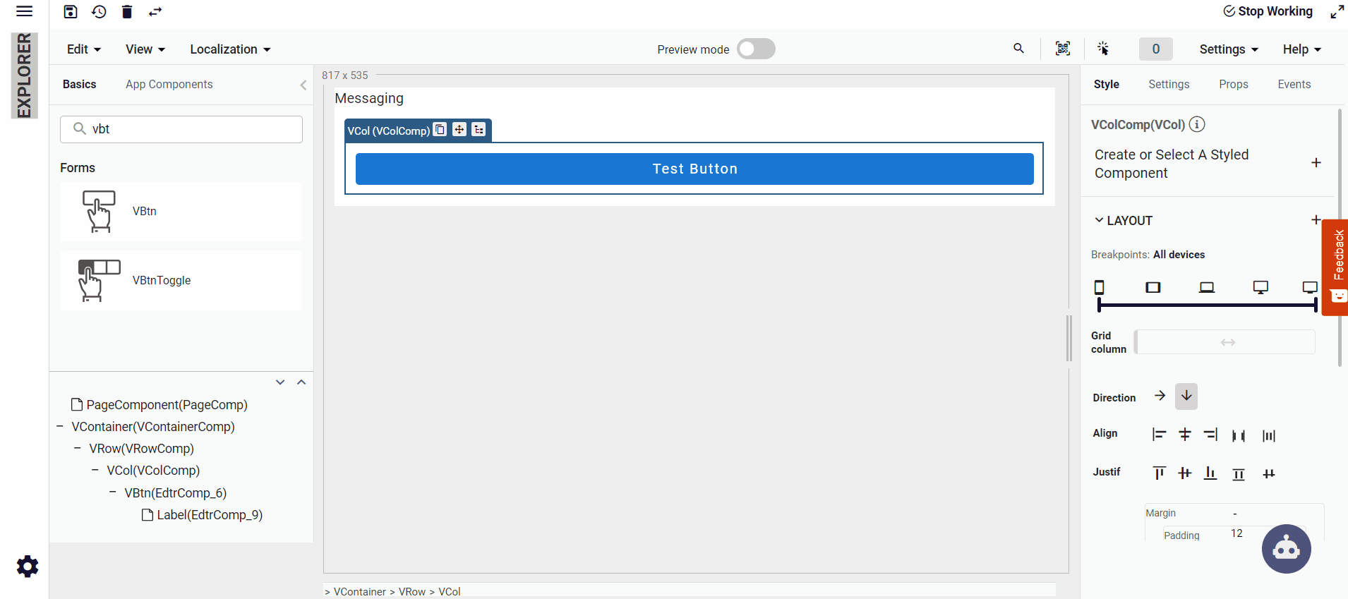
There are 5 breakpoints that you can use in Plateau Studio, located in the layout Style Settings tab on the right of Editor.
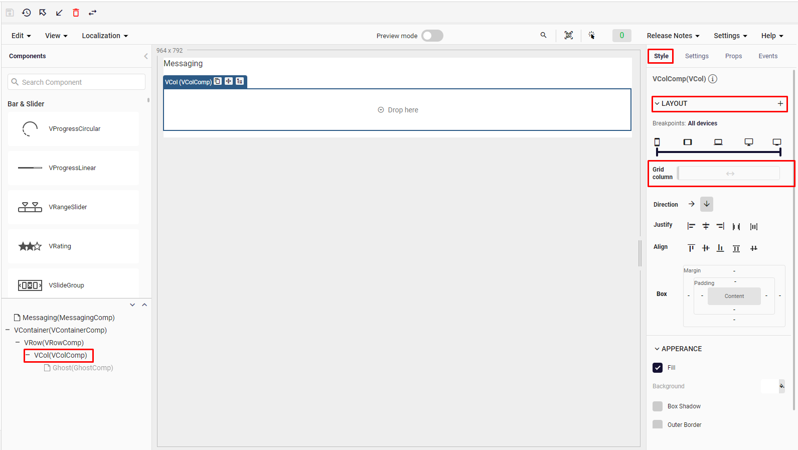
Here, you can see the breakpoints illustrated with 5 different devices: Mobile, Tablet, Laptop, Desktop and TV respectively.
Mobile breakpoint: For designing with screen sizes between 0px - 600px to be used on xs sized devices.
Tablet breakpoint: For designing with screen sizes between 600px - 960px to be used on sm sized devices.
Laptop breakpoint: For designing with screen sizes between 960px - 1264px to be used on md sized devices.
Desktop breakpoint: For designing with screen sizes between 1264px - 1904px to be used on lg sized devices.
Tv breakpoint: For designing with screen sizes 1904px and above to be used on xl sized devices.
How to Use Grid-Columns?
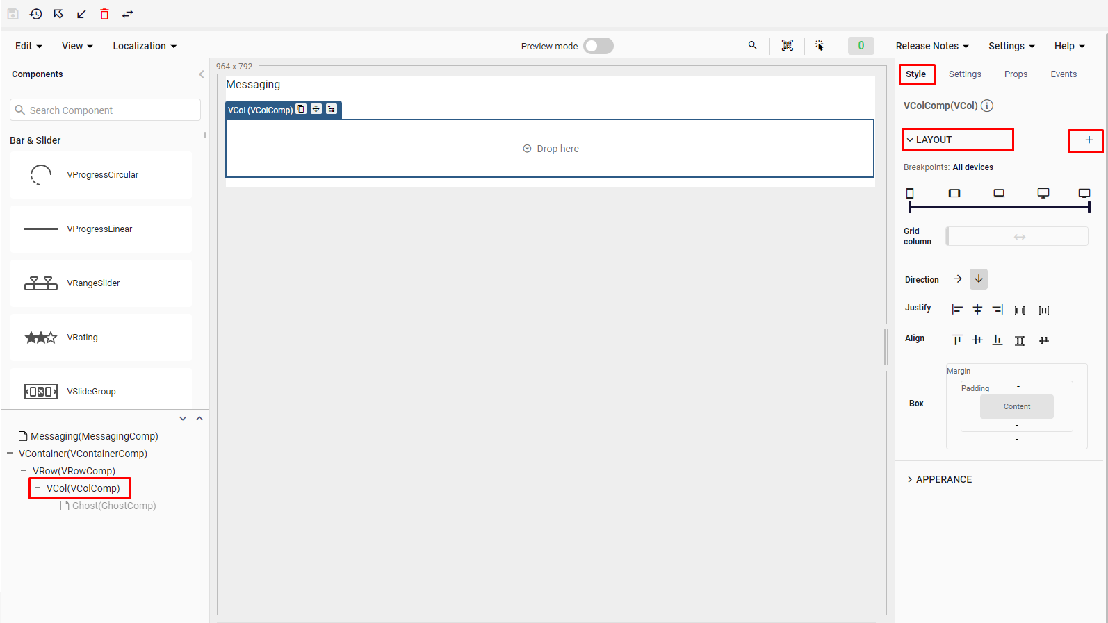
Plateau Studio provides you the convenience of using grid-columns features. Grid-column settings are located under the breakpoints in the Style settings tab of the VCol component.
Here, users can choose between 1 and 12 values for how much of the screen will be filled by the VCol component.
Below that, there are direction options. These options are horizontal and vertical. Horizontal preference applies flex-row, while vertical preference applies flex-column.
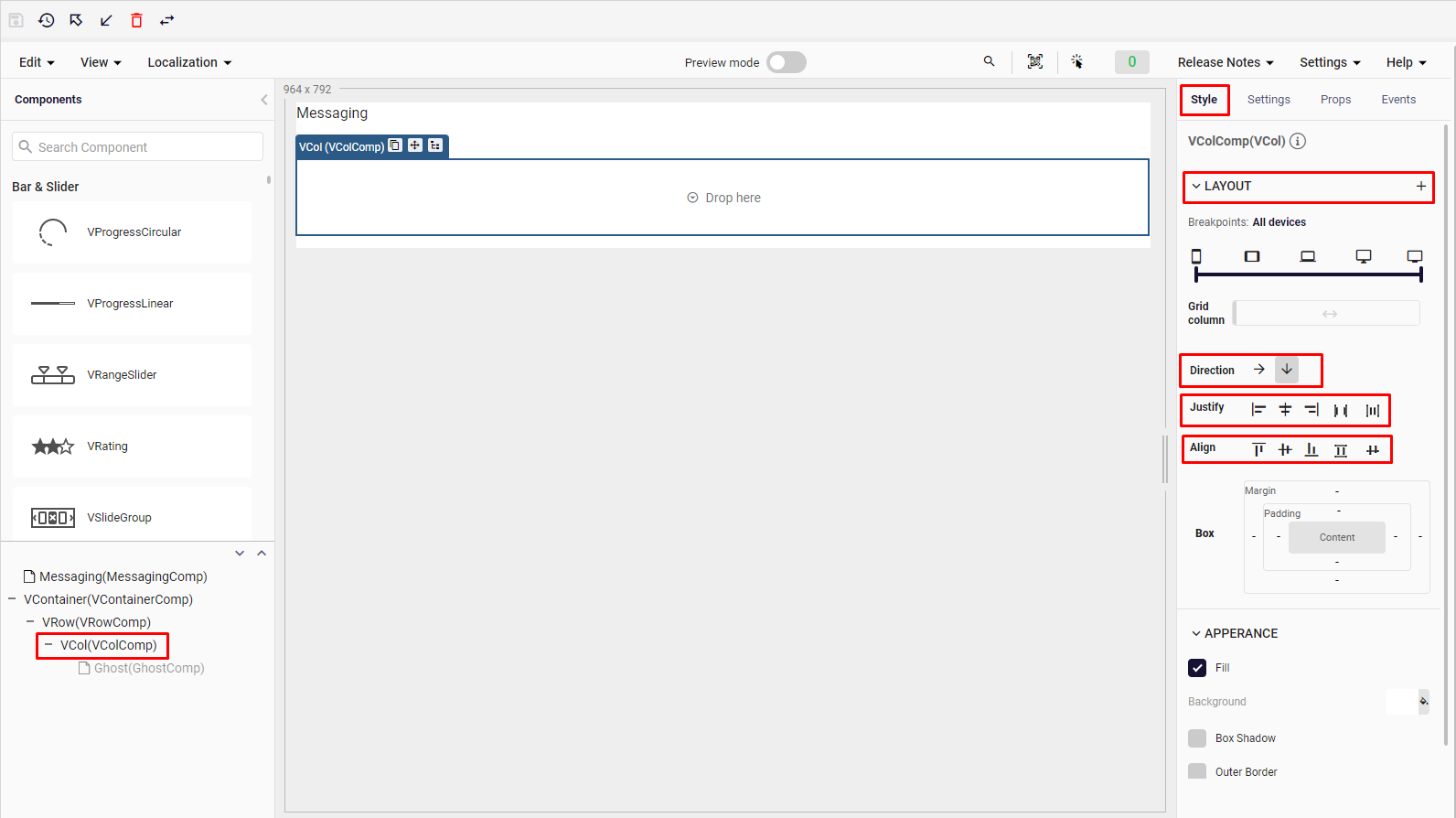
There are justify options under direction options.Sets how items in the column are aligned on the horizontal axis. Plateau Studio offers 5 options here.
- Start (Justify-Start): Justify items against the start of the components main axis.
- Center (Justify-Center): Justify items against the center of the components main axis.
- End (Justify-End): Justify items against the end of the components main axis.
- Space Between (Justify-Space-Between): Justify items along the components main axis such that there is an equal amount of space between each item.
- Space Around (Justify-Space-Around): Justify items along the components main axis such that there is an equal amount of space on each side of each item.
Under Justify options, there are align options which help you set how items in the column are aligned on the vertical axis.
Plateau Studio offers 5 options here.
Start (Align-Start): Items are positioned at the start of the components vertical axis.
Center (Align-Center): Items are positioned at the center of the components vertical axis.
End (Align-End): Items are positioned at the end of the components vertical axis.
Stretch (Align-Stretch): Stretched to fit the component
Baseline (Align-Baseline): Aligned with respect to its parent
Layout Multiplexing
Layout multiplexing feature allows you to increase the effect of the use of breakpoints and grid columns features mentioned above in your design.
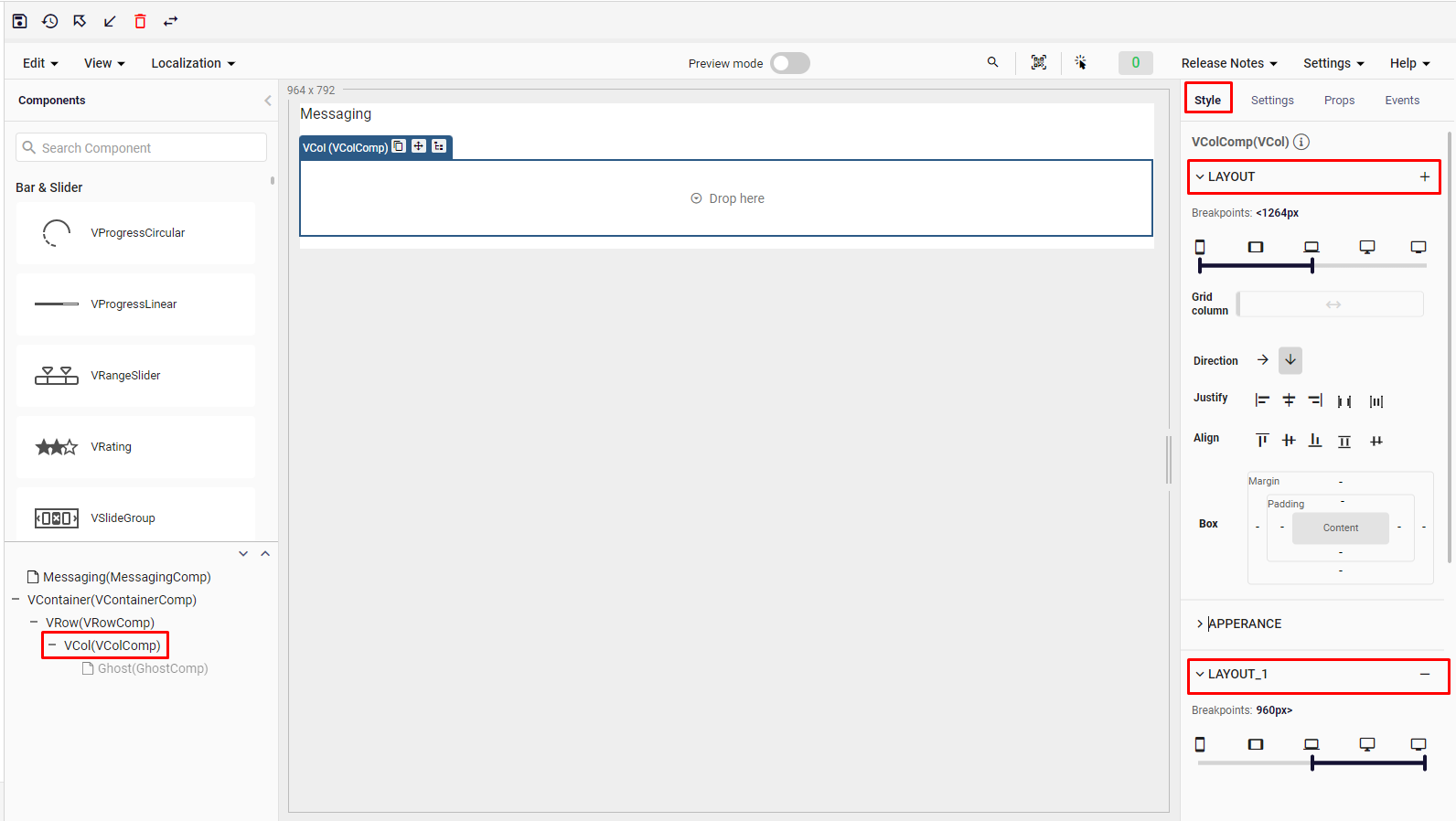
With this feature, you can multiply all your settings for certain screen sizes and make them more useful for different situations. You can now add or delete layout by selecting Add New and Delete sections.

For example, when you want your settings for mobile and tablet to include different preferences for laptop and desktop, you can manage on different devices by multiplexing your layout and arranging all the settings mentioned above.
Also, you can use all style features based on the resolution.