Style Editor
A new Style System has been created to replace the currently used project CSS and Vuetify CSS files, which provide visual effects to the components. You can access this structure from the Style tab in the component feature area that opens on the right when you click the component.
You can check the detailed usage and effects of all the features used in the new system in https://developer.mozilla.org/en-US/. You can use units such as px, em, rem and percentage in all fields that specify size.
With the new system, the CSS equivalents are opened:
Layout
Resolution Range: It is an area where you can select device resolutions as ranges in order to make responsive design and specify the grid, flex-layout and spacing properties in this range. You can define new ranges with '+' next to Layout and define new areas specific to this range. You can also remove the added resolution range with the '-' button. Grid Column: It determines the width and position of a column in the page layout, ensuring that the column adapts to different sizes of the page. You can use the grid column by dragging it to the left or right.
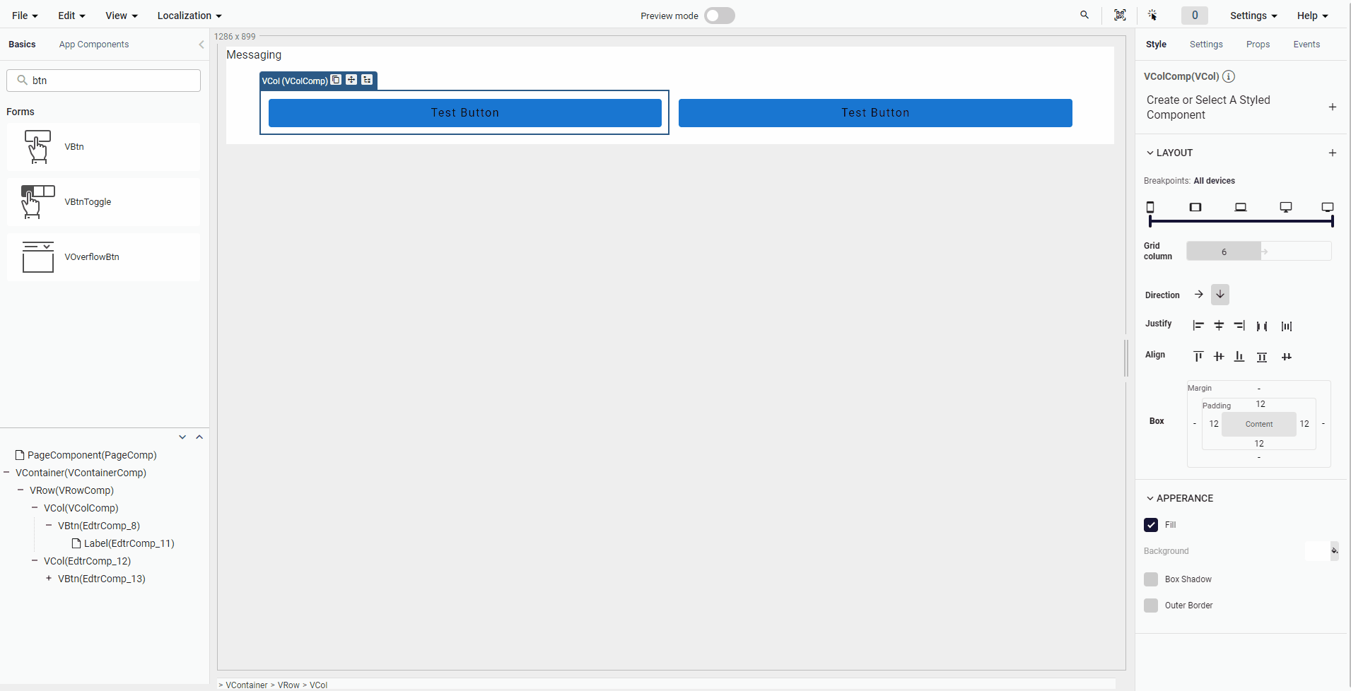
Direction: It is a feature that determines whether a component is displayed in horizontal or vertical direction. In horizontal direction, elements are displayed on the left and right, while in vertical direction, elements are displayed on top and bottom.
Align: It is a feature used to align other elements in a component horizontally or vertically. Horizontal alignment aligns elements to their left or right sides. Vertical alignment aligns elements to their top or bottom sides.
Justify: It is a feature used to distribute other elements in a component evenly in the horizontal direction. Horizontal justification ensures that elements are distributed with equal distances in the horizontal direction.
Box: Margin determines the space outside of a component, while padding determines the space inside of a component.
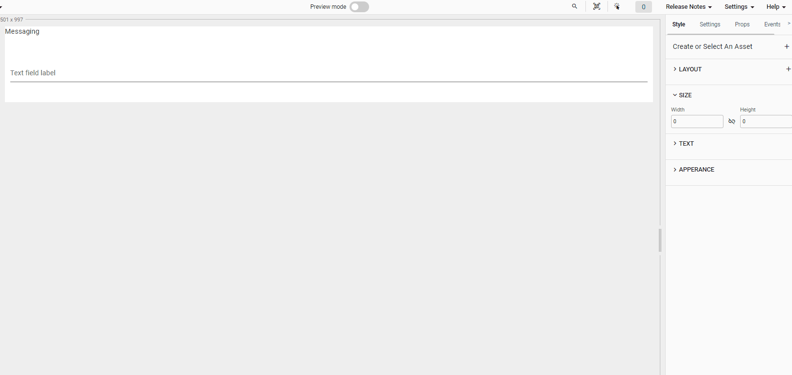
Size
You can use this area to set the size (width, height) of the component based on the px, percentage, em and rem unit size. This feature also contains link-unlink button which specifies if the corresponding height and width of the component are changed separately or simultaneously.
Text
You can use this area to adjust font color, font family, font size, font style and font weight of the specific text of the component. You can also apply this feature to sub text field which includes child components
List of the Web components are available with the new Style System.
- DocumentViewer
- Frame
- Label
- Map
- Menu
- Otp
- PageComponent
- PhoneInput
- Tooltip
- VAlert
- VAppBar
- VAutocomplete
- VAvatar
- VBottomNavigation
- VBottomSheet
- VBtn
- VBtnToggle
- VCalendar
- VCard
- VCarousel
- VCheckbox
- VChip
- VChipGroup
- VCol
- VCombobox
- VContainer
- VDataTable
- VDatePicker
- VDialog
- VDivider
- VExpansionPanel
- VExpansionPanelContent
- VExpansionPanelHeader
- VExpansionPanels
- VFileInput
- VFooter
- VIcon
- VImg
- VInlineDatePicker
- VInlineTimePicker
- VList
- VListGroup
- VListItem
- VMenu
- VNavigationDrawer
- VPagination
- VProgressCircular
- VProgressLinear
- VRadio
- VRadioGroup
- VRow
- VSelect
- VSlideGroup
- VSlider
- VStepper
- VStepperContent
- VStepperHeader
- VStepperItems
- VStepperStep
- VSwitch
- VTab
- VTabItem
- VTabs
- VTextarea
- VTextField
- VTimeline
- VTimelineItem
- VTimePicker
List of Android components are available with the new Style System.
- Label
- VAlert
- VAppbar
- VAutocomplete
- VAvatar
- VCard
- VCarousel
- VCheckBox
- VDivider
- VFooter
- VIcon
- VImg
- VInlineDatePicker
- VRadio
- VSlider
- VSwitch
- VTextArea
- VTimeline
- VTimelineItem
- List of iOS components are available twith the new Style System.
- VAlert
- VAppbar
- VAutocomplete
- VAvatar
- VDivider
- VFileInput
- VFooter
- VIcon
- VImg
- VInlineDatePicker
- VSelect
- VSlider
- VSwitch
- VTab
- VTabItem
- VTabs
- VTextArea