Appearance
The areas where you can change the appearance of the components are divided into boxes. These boxes are areas that affect one or more parts of the appearance of the components, as well as the appearance of the child components.
For example, the background color of a button and the text color of the tabs in the tab component can be determined through these boxes.
If these boxes are checked, it can be understood that the relevant appearance has value in it. If the checked box is removed, the given value will be reset to unset.
The areas that currently provide accessible appearance are as follows:
You can change the color fields such as background-color, icon-color etc. with the color picker area. As seen in the image below, hexadecimal, RGB and HSL values can be selected from color selection field, clicking on an existing color in the browser by pressing the pencil icon or by entering valid values.
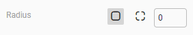
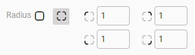
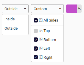
You can apply border CSS to fields such as border-style, border-width, border-color, border-radius and box-sizing properties to the components with the border area.
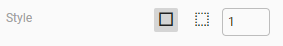
The first line contains the border in rounding option. From here you can value all the corners of the border in one place or all the corners separately.
You can specify the style of the border and width in the second line. You can control solid and dashed options for all corners in one place. In the same way, you can control the width property one by one from the corner options on the bottom line, or you can give a single width value by giving "All Sides". Since the input in this field also determines the size of the border, it is a mandatory field to be able to see the border.
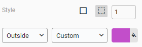
In the last line, you can choose the box sizing and color property of the border.
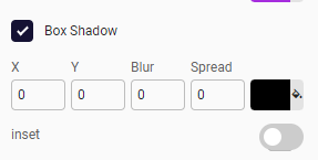
The box shadow The box-shadow CSS property adds shadow effects around an element's frame. CSS feature can be applied with the offset values, blur effect radius, spread radius, and color of the shadow. It is possible to change the outer shadow to the inset shadow with the inset switch button.
- The first input saves the value of X of the shadow which specifies the horizontal distance. Negative values place the shadow to the left of the element.
- The second values specifies the vertical distance. Negative values place the shadow above the element.
- Third input is the blur effect of the shadow. The larger this value, the bigger the blur, so the shadow becomes bigger and lighter. Negative values are not allowed.
- Last input stands for spread value. Positive values will cause the shadow to expand and grow bigger, negative values will cause the shadow to shrink.
- Also, you can set the color of the shadow with the color picker field.
- If inset keyword not specified (default), the shadow is assumed to be a drop shadow. Inset shadows are drawn inside the border (even transparent ones), above the background, but below content.