Styled Components
Styled Components allow you to save the styles applied to a component and reuse them across the current page or other pages within your application. By creating reusable style definitions, you can build components with consistent design more quickly and efficiently. When you update a styled component, all components using that style are automatically updated, ensuring design consistency throughout your application.
Creating a New Styled Component
To create a Styled Component:
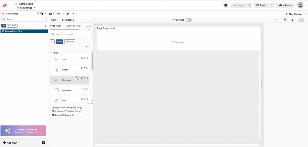
- Select the component you want to style in the designer.
- Open the Style tab in the properties panel.
- Click on Create or Select a Styled Component.
- Enter a name for your styled component and save it.
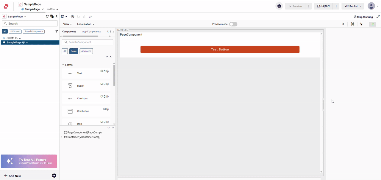
Once created, your styled component will be available for reuse on any page within your application. This ensures consistency and speeds up your design process by eliminating the need to manually apply the same styles repeatedly.
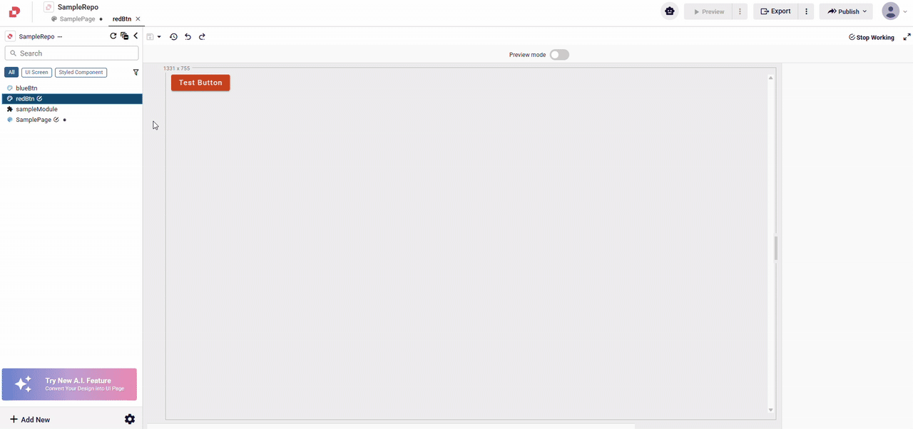
The styled component you created will appear in the project explorer on the left side of the screen.
Updating a Styled Component
There are two ways to update a styled component: editing it through the Edit Styled Component option or using Start Working mode directly on a styled component model.
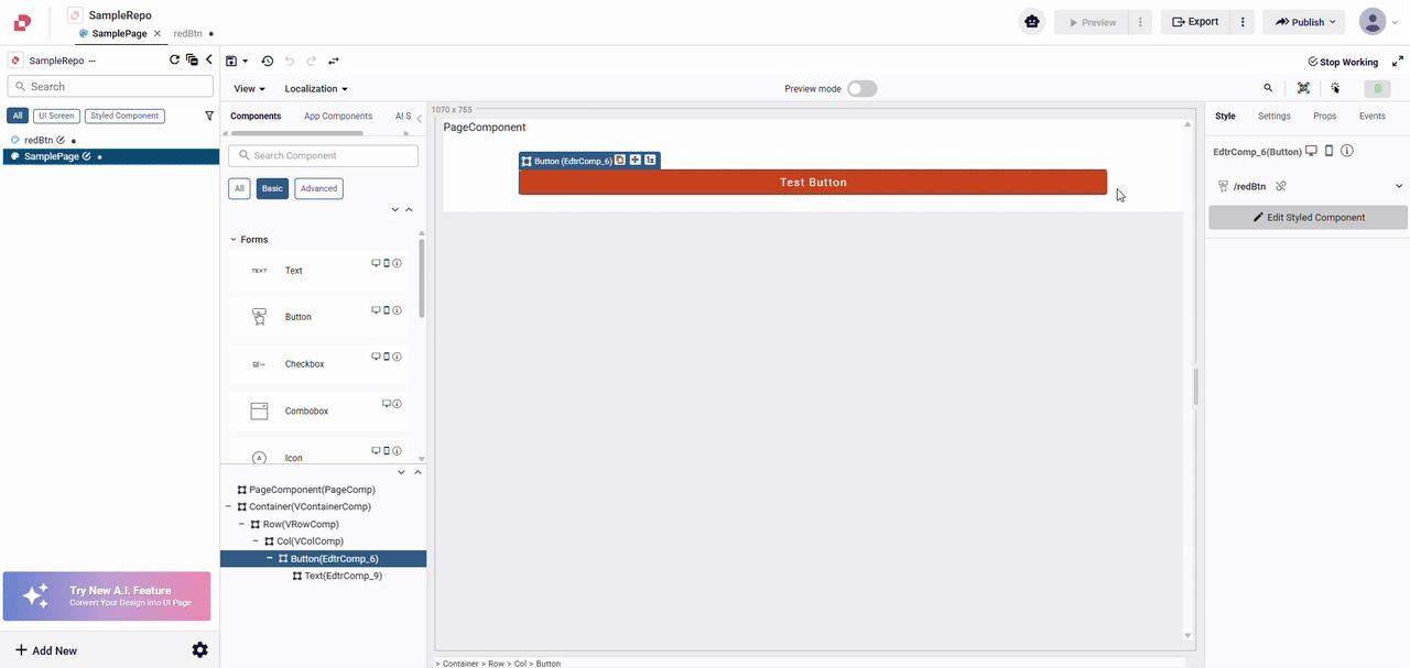
Using Edit Styled Component
- Click the Edit Styled Component button in the Style tab
- Make your changes in the dedicated editing view.
- Save your changes.
Using Start Working Mode
- Select the style component you want to make changes to from the project explorer on the left.
- Open the model, click on the Start Working mode on your styled component.
- Make your style changes as needed.
- Use the options available to Save, Delete, or Reset your changes.
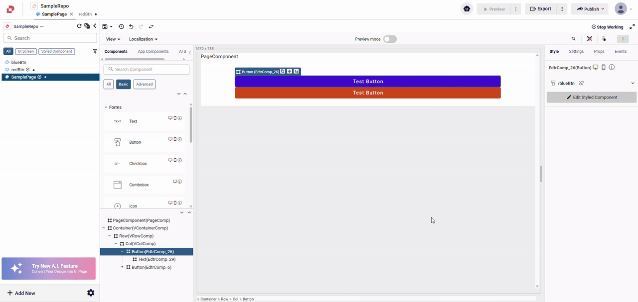
When you save your modifications, all components using that styled component will be automatically updated to reflect the new styles.
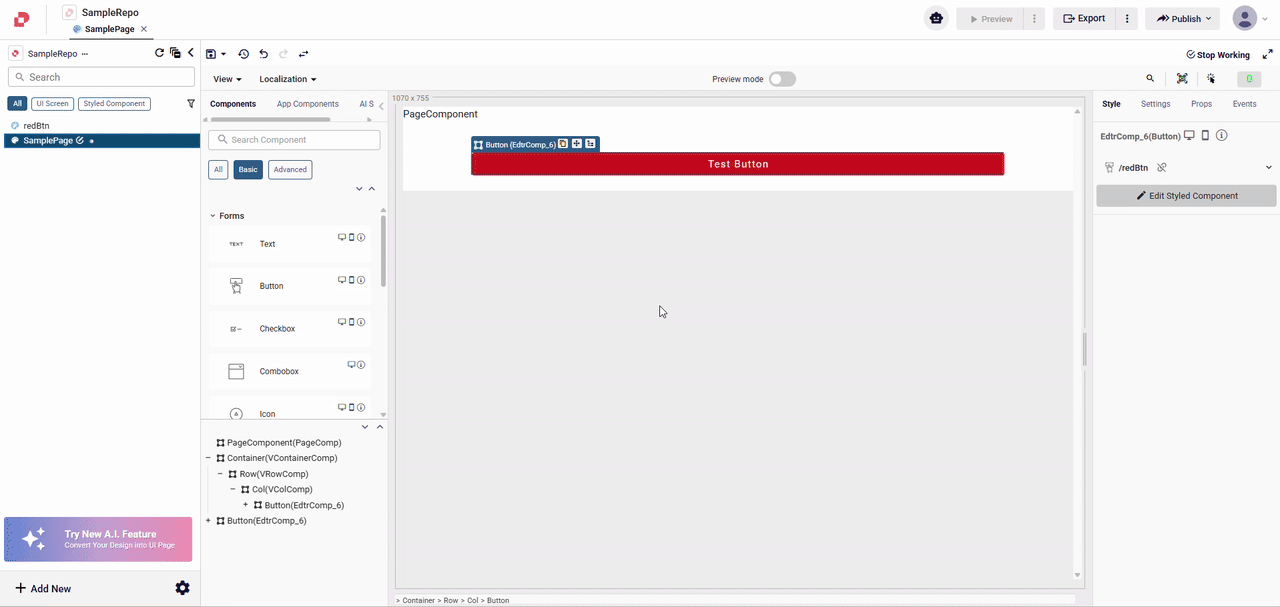
- Additionally, the colors and fonts you select in the Themes Settings in the settings will appear as options in the relevant sections of the Style tab in the styled component.
Detaching a Styled Component
If you want to remove the link between a component and its styled component without deleting the styled component itself:
- Select the component that has a styled component applied.
- In the Style tab, click the attach button.
The component will lose all of its styles and it will no longer be linked to the styled component. The styled component itself remains available for use with other components.
Changing a Component's Styled Component
A component that already has a styled component applied can be switched to use a different styled component.
- Select the component you want to modify.
- In the Style tab, under the styled component section, select a different styled component from the available options.
Sharing Styled Components Across Applications
To reuse styled components across multiple applications, you can move them into a module and share that module.
Moving Styled Components to a Module
- Create or select a module where you want to store your shared styled components.
- Move the styled component to the module.
- Share the module to make it available for other applications.
Once the module is shared, other applications can import it and use the styled components defined within it. This approach is ideal for maintaining a consistent design system across multiple applications in your organization.