Themes
The Themes section allows you to define and manage the visual identity of your application. By configuring global styles, you ensure a consistent look and feel across all platforms and user interfaces.
How to Add Theme Group to Application
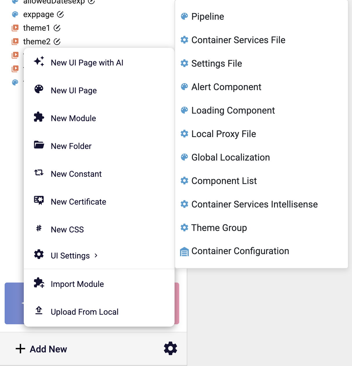
In the navigation menu on the left side of the page, click the Add New button. Then, in the UI Settings dropdown that appears, select Theme Group.
How to Apply A Theme Group
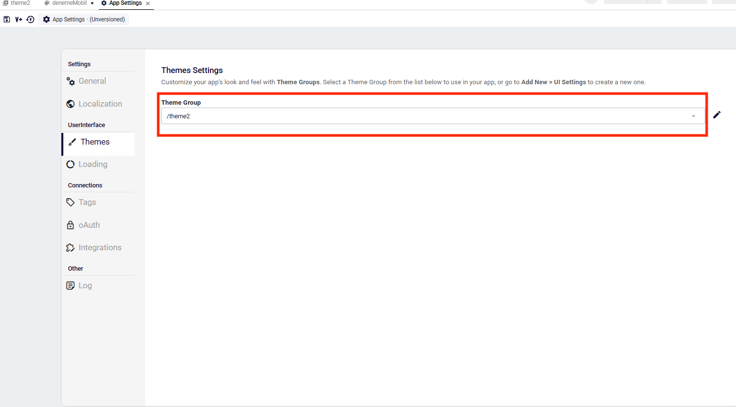
Go to Application Settings > Themes section to select a Theme Group to customize your application appreance.
- Theme Selection: You can select the active Theme Group from the dropdown menu located in the Themes tab within AppSettings.
How to Add a New Theme
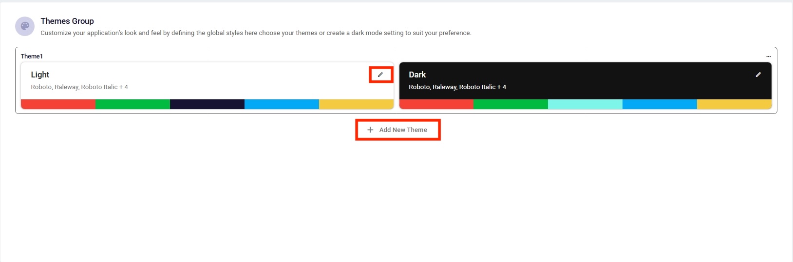
- Navigate to the Themes Group dashboard.
- Click the Add New Theme button located at the bottom of the existing theme cards.
- A new pair containing both Light and Dark variants (e.g., Theme2) is automatically created.You can then use the Edit icon on either card to customize the specific styles for that mode.
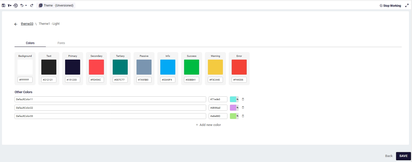
Colors Configuration
The Colors Tab provides a flexible interface for managing both default and personalized color palettes.
Default & Other Colors
- Default Colors: The top section displays essential predefined colors such as Background, Text,Primary, and Success. These are default variables used throughout your application.
- Other Colors: By clicking the Add new color button , users can define additional color variables for more specific styling needs.
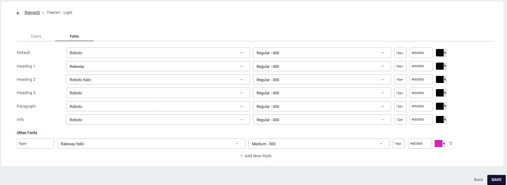
Fonts Configuration
The Fonts Tab allows you to define and manage text styles to maintain a consistent font hierarchy across your application.
Default & Other Font Styles
- Default Text Styles: The top section displays essential predefined styles such as Default, Heading 1, Heading 2, Paragraph, and Info. These serve as the foundation for your application's textual structure.
- Other Fonts Styles: By clicking the Add New Style button, users can define additional text style variables (e.g., "Type1") for more specific design requirements.