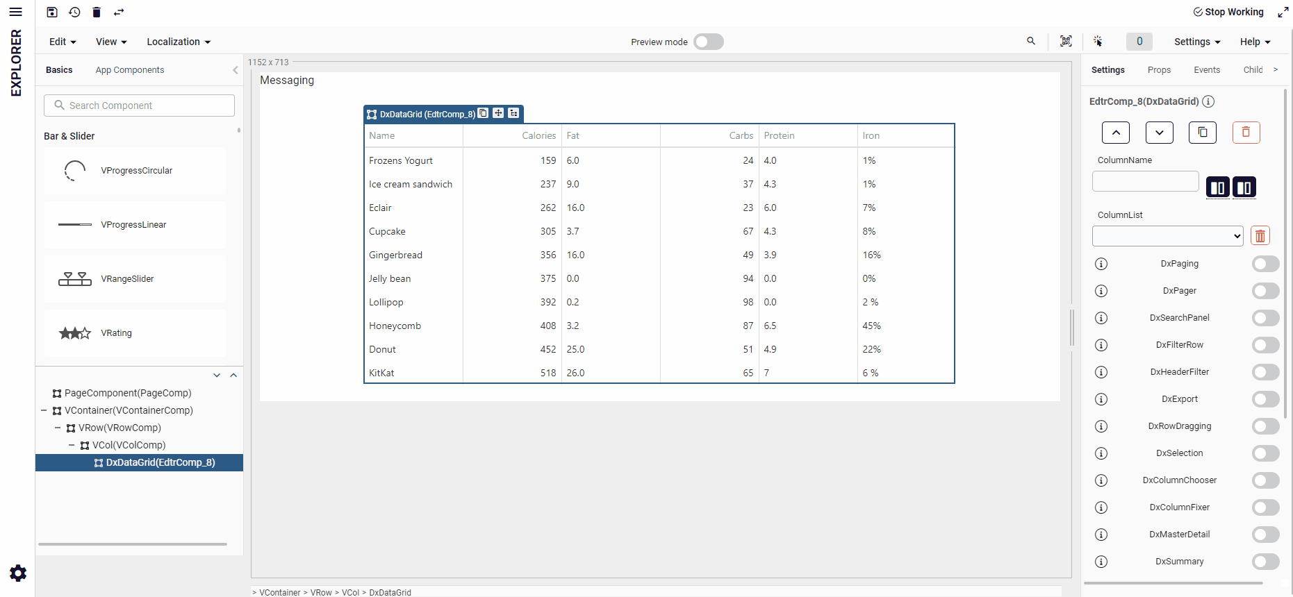
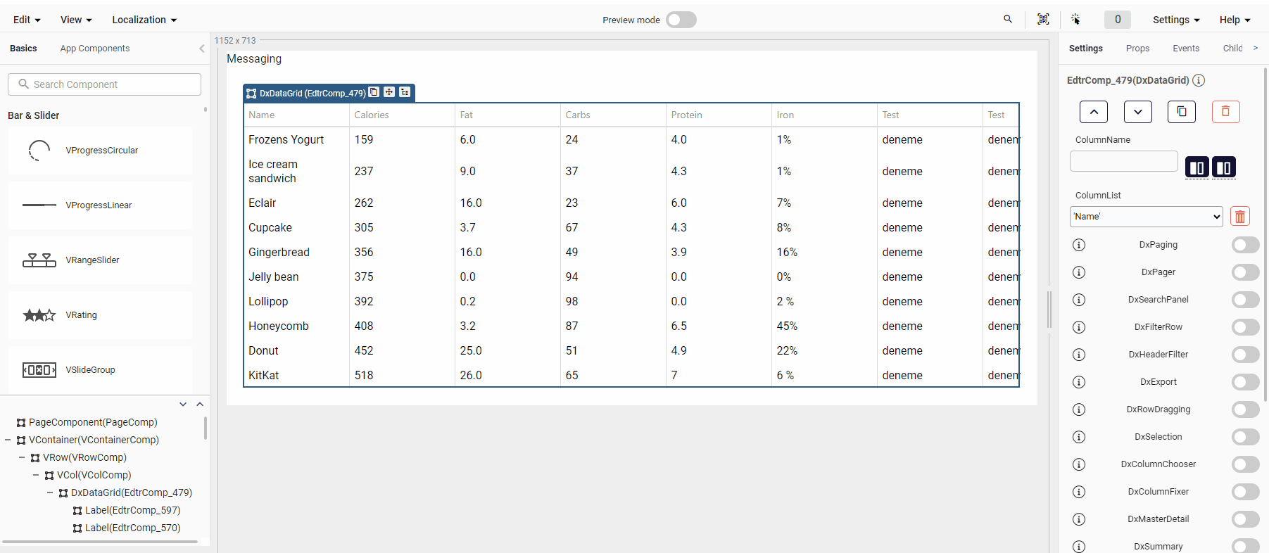
DxDataGrid
The DxDataGridcomponent is typically used to display data. The DataGrid is a widget that represents data from a local or remote source in the form of a grid. This widget offers such basic features as sorting, grouping, filtering, as well as more advanced capabilities, like state storing, client-side exporting, master-detail interface, and many others.
For optimal DxDataGrid performance, avoid integrating Plateau UI or Vuetify components as subcomponents. This can cause significant speed issues.
DxDataGrid doesn't automatically dispose of Plateau UI or Vuetify components, which can lead to memory leaks or duplicated DOM nodes.
For more details, refer to DxDataGrid page .
Props
| Attribute | Description | Type | Default |
|---|---|---|---|
| remoteOperations | Notifies the DataGrid of the server's data processing operations. | boolean | false |
| activeStateEnabled | Specifies whether the UI component changes its visual state as a result of user interaction. | boolean | false |
| allowColumnReordering | Specifies whether a user can reorder columns. | boolean | false |
| allowColumnResizing | Specifies whether a user can resize columns. | boolean | false |
| cacheEnabled | Specifies whether data should be cached. | boolean | true |
| cellHintEnabled | Enables a hint that appears when a user hovers the mouse pointer over a cell with truncated content. | boolean | true |
| cellHintEnabled | Enables a hint that appears when a user hovers the mouse pointer over a cell with truncated content. | boolean | true |
| columnAutoWidth | Specifies whether columns should adjust their widths to the content. | boolean | false |
| columnWidth | Specifies the width for all data columns. Has a lower priority than the column.width property. | number | undefined |
| columnResizingMode | Specifies how the UI component resizes columns. Applies only if allowColumnResizing is true. | string | 'nextColumn' |
| columnHidingEnabled | Specifies whether the UI component should hide columns to adapt to the screen or container size. Ignored if allowColumnResizing is true and columnResizingMode is "widget". | boolean | false |
| dateSerializationFormat | Specifies the format in which date-time values should be sent to the server. | string | - |
| disabled | Specifies whether the UI component responds to user interaction. | boolean | false |
| focusedRowEnabled | Specifies whether the focused row feature is enabled. | boolean | false |
| headerFilter | Configures the header filter feature. | boolean | false |
| highlightChanges | Specifies whether to highlight rows and cells with edited data. repaintChangesOnly should be true. | boolean | false |
| height | Specifies the UI component's height. | number string | undefined |
| keyExpr | Specifies the key property (or properties) that provide(s) key values to access data items. Each key value must be unique. This property applies only if data is a simple array. | string array | undefined |
| noDataText | Specifies a text string shown when the DataGrid does not display any data. | string | 'No Data' |
| repaintChangesOnly | Specifies whether to repaint only those cells whose data changed. | boolean | false |
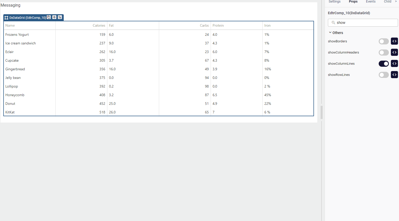
| showBorders | Specifies whether the outer borders of the UI component are visible. | boolean | false |
| showColumnHeaders | Specifies whether column headers are visible. | boolean | true |
| showColumnLines | Specifies whether vertical lines that separate one column from another are visible. | boolean | - |
| showRowLines | Specifies whether horizontal lines that separate one row from another are visible. | boolean | - |
| wordWrapEnabled | Specifies whether text that does not fit into a column should be wrapped. | boolean | false |
| rowAlternationEnabled | Specifies whether rows should be shaded differently. | boolean | false |
| hoverStateEnabled | Specifies whether to highlight rows when a user moves the mouse pointer over them. | boolean | false |
Events
| Attribute | Description | Params |
|---|---|---|
| onEditorPrepared | A function that is executed after an editor is created.Not executed for cells with an editCellTemplate. | object |
| onSelectionChanged | A function that is executed after selecting a row or clearing its selection. | object |
| onEditorPreparing | A function used to customize a cell's editor. Not executed for cells with an editCellTemplate. | object |
| onOptionChanged | A function that is executed after a UI component property is changed. | object |
| onContentReady | A function that is executed when the UI component's content is ready and each time the content is changed. | object |
| onContextMenu | A function that is executed before the context menu is rendered. | object |
| onCellPrepared | A function that is executed after a grid cell is created. | object |
| onRowPrepared | A function that is executed after a row is created. | object |
| onRowClick | A function that is executed when a row is clicked or tapped. Execute internal functions before this function. | object |
| onExporting | A function that is executed before data is exported. | object |
| onCellClick | A function that is executed when a cell is clicked or tapped. Executed before onRowClick. | object |
| onRowDblClick | A function that is executed when a row is double-clicked or double-tapped. Executed after onCellDblClick | object |
| onCellDblClick | A function that is executed when a cell is double-clicked or double-tapped. Executed before onRowDblClick. | object |
DxDataGrid Update Data
You should update DxDataGrid component after you set any property in the runtime.
It is used in the following way:
Quick.updateComponent(ComponentQId)
Example file:dxDatagridUpdate
DxDataGrid Adding Custom Column and Dragging Component
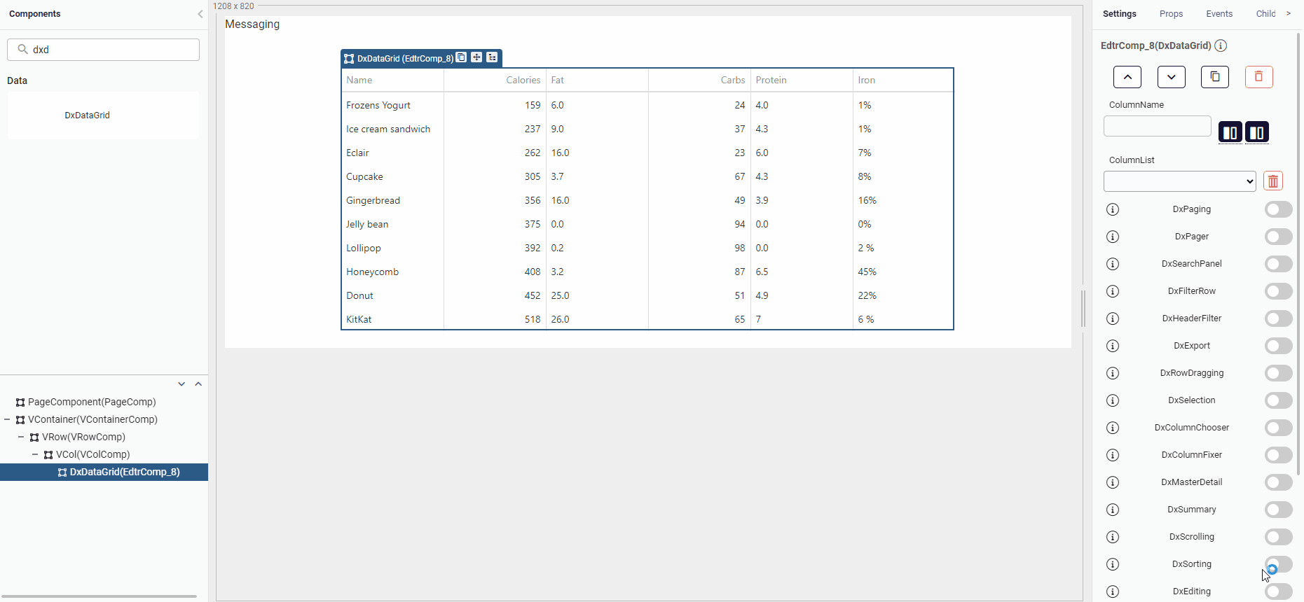
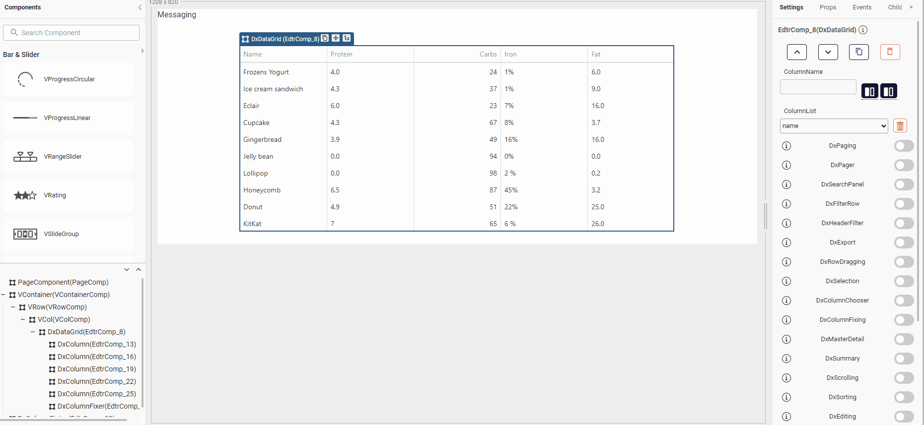
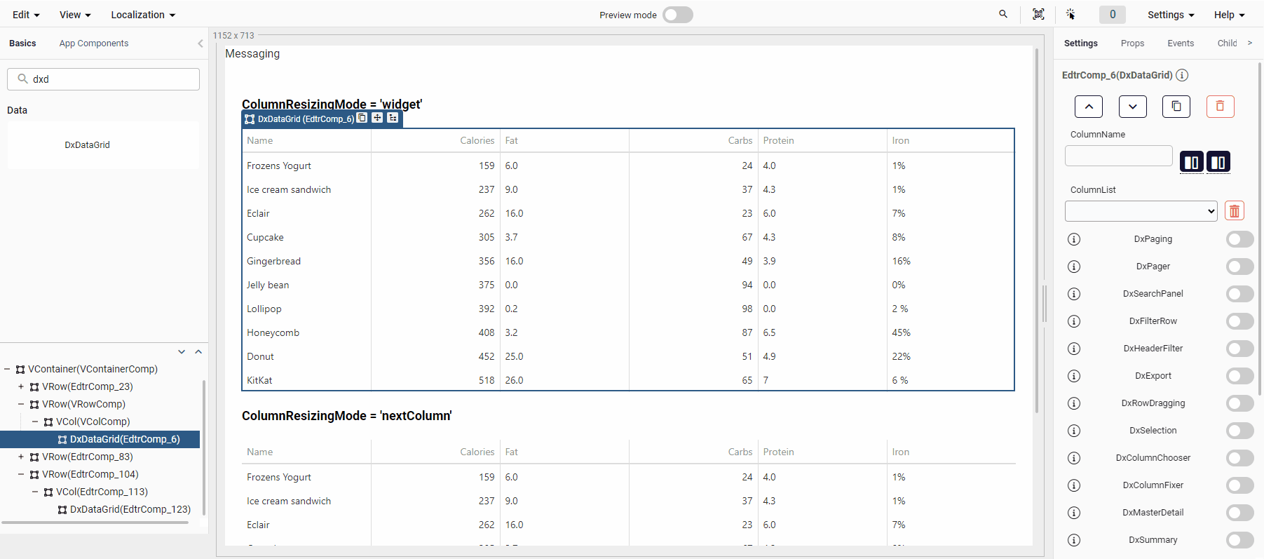
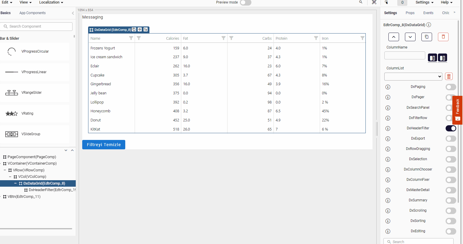
You can add new custom column with add dropable column button. Before adding a new column, make sure you give it a name. When you add a new column, you will see a dxcolumn and ghost on the treeView. Then you can drag a component on the screen through the tree view and drop it on the ghost. Finally you can see the dropped component on the DxDataGrid.
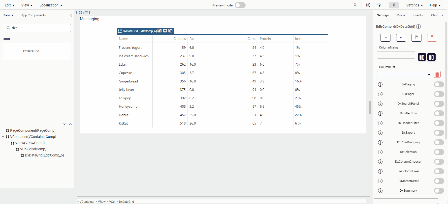
DxDataGrid Bar Usage
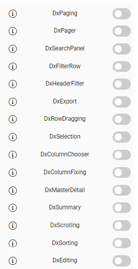
When you drag and drop the DxDataGrid, you can manage certain properties from the bar on the right. You can start using the following features by directly turning them on and off on the switch.
All DataGrid properties can be use. Contact for closed properties.
DxExport
A user can click the Export button to save an Excel file with the exported data. Data types, sort, filter, and group settings are maintained.
Example file: DxExport
DxSearchPanel
The search panel allows searching for values in several columns at once.
Example file: DxSearchPanel
DxFilterRow
The filter row allows a user to filter data by values of individual columns.
Example file: DxFilterRow
DxRowDragging
Configures row reordering using drag and drop gestures.
- The DxDataGrid component's DxRowDragging prop is set to true.
- The allowReordering prop of the DxRowDragging component is set to true. This allows row reordering using drag and drop gestures.
- The following code is written in the onReorder(draggingParam) event of the DxRowDragging component.
- In the onReorder event, determine the row's current index and the index to which it will be moved.
- The DataGridName fields should be replaced with the name of the dxDataGrid component on the page.
const data = components.DataGridName.dataSource;
const visibleRows = (<any>draggingParam).component.getVisibleRows();
const toIndex = data.findIndex((item) => item.name === visibleRows[(<any>draggingParam).toIndex].data.name);
const fromIndex = data.findIndex((item) => item.name === (<any>draggingParam).itemData.name);
const newData = [...data];

newData.splice(fromIndex, 1);
newData.splice(toIndex, 0, (<any>draggingParam).itemData);

components.DataGridName.dataSource = newData;
quick.Quick.updateComponent(components.DataGridName)
Example File: DxRowDragging
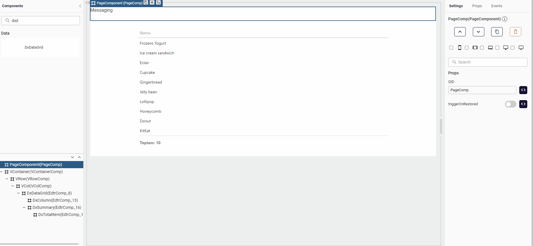
DxDataGrid DxSummary, DxTotalItem Usage
The total summary in the grid footer provides a synopsis of all data in the grid. It contains several summary items, each displaying a value from an aggregate function applied to a specific column's data.
To specify the total summary items, declare an array of objects with at least two fields: column and summaryType. The column field specifies the column identifier for the aggregate function, and the summaryType specifies the aggregate function to apply. The following code snippet shows how to declare two summary items.
- Open up the DxSummary Switch then add total item.
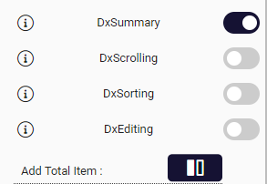
- After that, you should set column (Column Name) and summaryType(count, sum etc..) properties on DxTotalItem component.
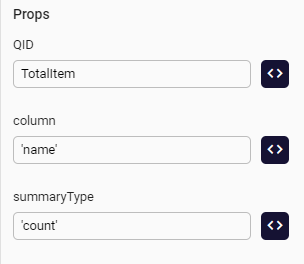
Example file: dxSummary & dxTotalItem
DxSelection
The DxDataGrid UI component supports single and multiple row selection. Use the selection. Mode property to change the current mode.
How to use single selection
To use the single selection feature in the DxDatagrid component:
In the settings tab on the right side of the editor, set DxSelection to true in the DxDataGrid bar.
In the treeList on the left, a DxSelection component will be created under the DxDataGrid. In the created DxSelection component, set the mode prop to single.
For selected row information, the onSelectionChanged event found in the events of the DxDataGrid component can be used. You can get the information of the selected row with the selected parameter on the event.
Example file: SingleSelection
How to use multiple selection
To use the multiple selection feature in the DxDatagrid component:
In the settings tab on the right side of the editor, set DxSelection to true in the DxDataGrid bar.
In the treeList on the left, a DxSelection component will be created under the DxDataGrid. In the created DxSelection component, set the mode prop to multiple, the selectAllMode prop to allMode, and the showCheckBoxesMode prop to always.
For selected row information, the onSelectionChanged event found in the events of the DxDataGrid component can be used. You can get the information of the selected row or rows with the selected parameter on the event.
Example file: MultipleSelection
CalculateFilterExpression Event in the DxColumn Component
The calculationFilterExpression event, when added to the DxColumn component, serves the purpose of enabling dynamic filtering based on calculated expressions within the DxDataGrid control.
This event allows you to experience more flexible and customizable data presentation and interaction.
The DxColumn component, when configured with the calculationFilterExpression event, is acted upon by the event handler.
When you interact with the grid, the event handler is triggered. This event handler, when executed, calculates an expression specified for the column based on the current values within that column for each row.
The calculated expression is then used to determine whether a row should be displayed or hidden, depending on whether it evaluates to true or false.
The calculated expression is automatically applied as a filter to the column.
How to Use calculateFilterExpression Event?
You can follow the steps below to apply the CalculationFilterExpression in DxColumn Component:
Define DxColumn component within the DxDataGrid control.
Attach the calculationFilterExpression event to the DxColumn component. This is typically done during the column configuration stage.
Within the event handler, specify the logic for calculating the filter expression. This logic should take into account the values in the column for each row.
The CalculationFilterExpression event allows you to filter complex logic to be applied and enhance the grid's filtering capabilities.
The calculationFilterExpression event, when added to the DxColumn component, provides a means to dynamically filter rows in the DevExpress Grid control based on calculated expressions. This event enhances the flexibility of data presentation and interaction by allowing developers to define custom filtering logic.
DxDataGrid Custom Store
CustomStore provides a way to implement custom data access logic for any data source and supports server‑side operations such as paging, sorting, and filtering.
For more details, refer to CustomStore page .
Using Custom Store for DxFilterRow
During the PageComponent’s EndRender event, a CustomStore instance is initialized and set as the DxDataGrid’s dataSource.
let dxOptions = {
key: 'id',
load: () => {
    let page = Number(components.myDxPaging.pageIndex) ?? 0;
    let pageRowSize = 10;
    let apiUrl = "https://jsonplaceholder.typicode.com/posts?_page=" + (page + 1) + "&_limit=" + pageRowSize;

    let dxFilters = <{ columnIndex: number, filterValue: string }[]>quick.store.get("$dxFilters");
    if (dxFilters && Array.isArray(dxFilters) && dxFilters.length > 0) {
    let filterString = "";
    dxFilters.forEach(item => {
        filterString += "&" + item.filterValue;
    });
    apiUrl += filterString;
    }
    // sıralama için API yapısına göre kurgulanabilir.
    let dxSortOrder = <{ columnIndex: number, sortOrder: string }[]>quick.store.get("$dxSortOrder");

    return quick.Request.async({
    url: apiUrl,
    data: null,
    http: 'GET',
    onFail: null,
    onSuccess: null,
    responseField: null,
    blockRender: false,
    headers: { "Content-Type": "application/json" }
    })
    ?.then((data) => {

        let listDetail = data.data;
        let totalCount = parseInt(data.headers["x-total-count"]);

        return { data: listDetail, totalCount: totalCount }
    })
    }
};
const dxStore = quick.Quick.dx.getDxCustomStore(dxOptions);
let myDxDataGridInstance = (<any>components.dxDataGrid).instance;
myDxDataGridInstance.option('dataSource', dxStore);
During the onOptionChanged event of the DxDataGrid, the selected column details and filter row input are captured. These values are stored in the quick.store(). Within the CustomStore.load method, the filter parameters are processed before being passed to the API service.
Example file: DxDataGrid_CustomStore
Samples Component
DxDataGrid HeatMap Feature
A heatmap feature which can provide progress view depend on the changes of the data can be used in DxDataGrid. Usage of the feature is like below example.

Example file: HeatMap
DxDatagrid hoverStateEnabled Prop Usage
Specifies whether to highlight rows when a user moves the mouse pointer over them.
Example file: hoverStateEnabled
DxDataGrid Summary Localization
You can use customizeText event for this feature like this.
Example file: dxTotalItem & CustomizeText
DxDataGrid Remove Data Sample
An item can be added to the DxDatagrid component from the outside, and the added item can be removed.
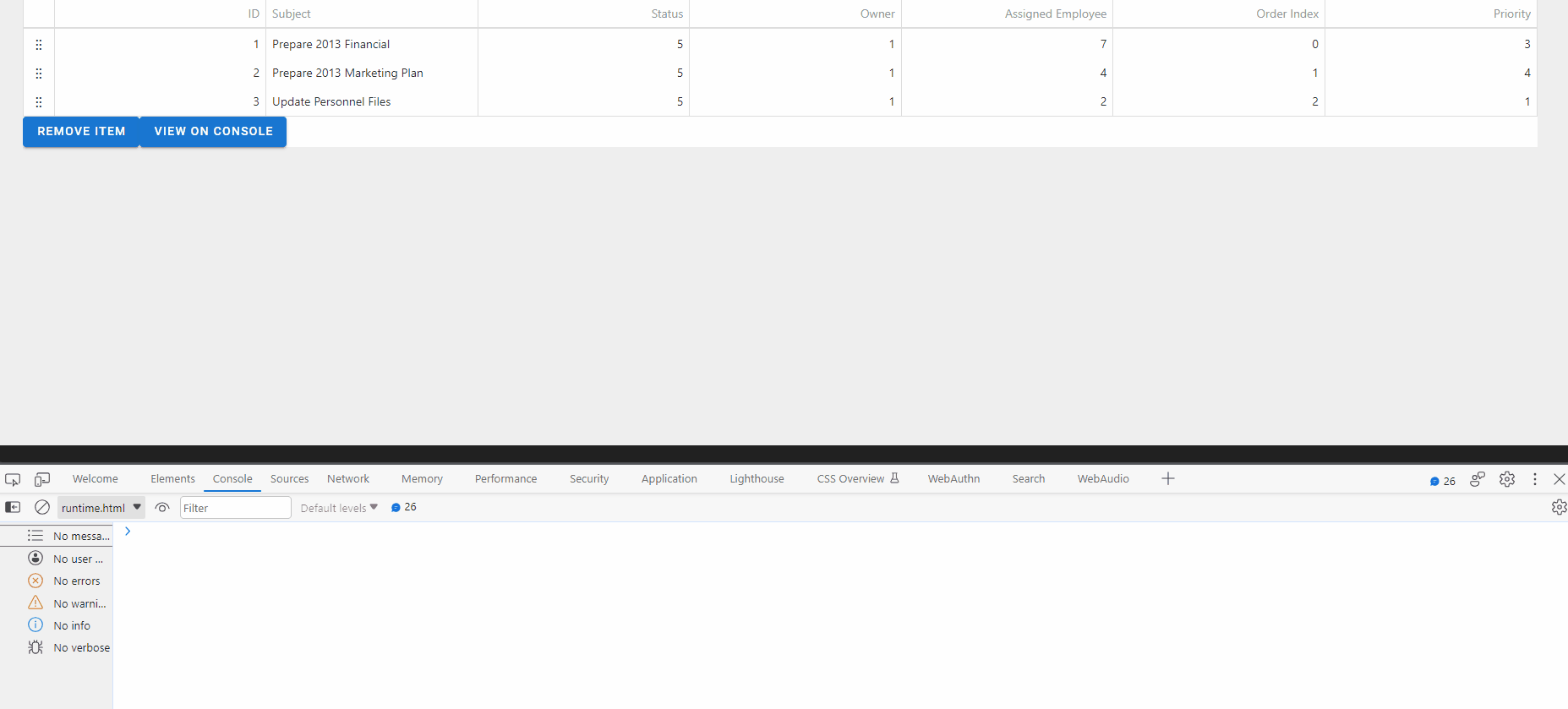
To populate the DxDatagrid in this example, we will create an instance of the ArrayStore class found in the DevExtreme JavaScript Documentation and pass this object to the data source of the datagrid component. The -key parameter is a field name that helps uniquely identify data. We can call the data parameter an array or object containing the data to be stored.
- The variable a, which holds the data source of the datagrid, is assigned to the data parameter.
- The data in variable b is stored in a storage unit along with a test key.
- DxDatagrid's data source is set to storage in variable b. The reshapeOnPush parameter determines whether the component is reshaped when data is changed.
- Finally, the component is update.
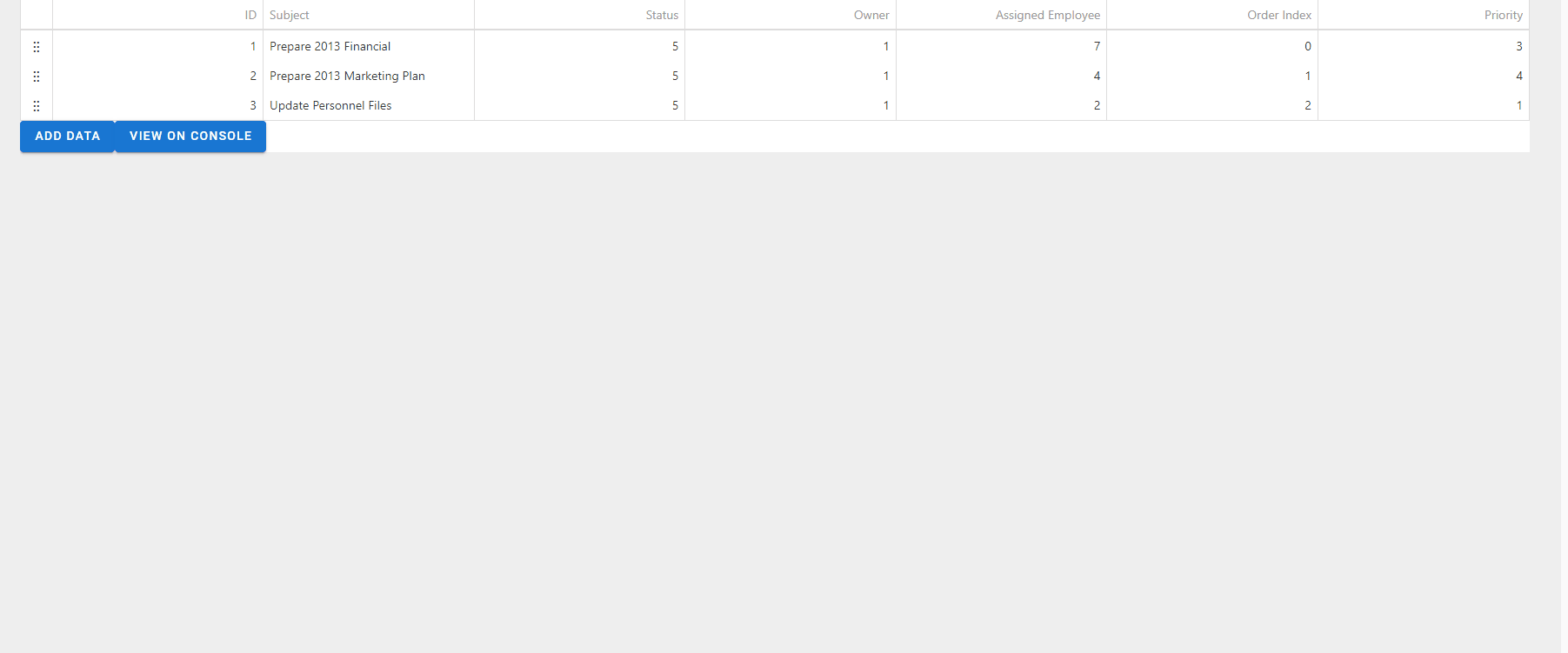
    let a=[{ 'ID':1, 'Subject': 'Prepare 2013 Financial', 'Status': 5,     'Owner': 1, 'AssignedEmployee': 7, 'OrderIndex': 0, 'Priority': 3 }, { 'ID': 2, 'Subject': 'Prepare 2013 Marketing Plan', 'Status': 5, 'Owner': 1, 'AssignedEmployee': 4, 'OrderIndex': 1, 'Priority': 4 }, { 'ID': 3, 'Subject': 'Update Personnel Files', 'Status':5, 'Owner': 1, 'AssignedEmployee': 2, 'OrderIndex': 2, 'Priority': 1 }]
    let b=quick.devex.createArrayStore({key:'ID', data:a})
    quick.store.set('test', b)
    components.EdtrComp_23.dataSource={store:b, reshapeOnPush:true}
    quick.Quick.updateComponent(components.EdtrComp_23)
To remove the items we added to the datasource of the datagrid;
- We assign the stored data with the 'Test' key, which we set when filling the source of the datagrid, to the store variable.
- Using the store.push method, remove the data with id value 1 from the data in the store variable.
- the component is updated.
let store=quick.store.get('test')
store.push([{type:'remove', key:1}])
quick.Quick.updateComponent(components.EdtrComp_23)
Example file: Remove Data
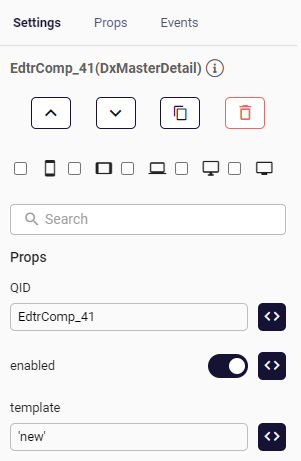
DxDataGrid DxMasterDetail Usage
In DxDataGrid, a master-detail interface provides a usual data row with an expandable section that contains the details for this data row. In that case, the data row is called the "master row", while the section is called the "detail section".
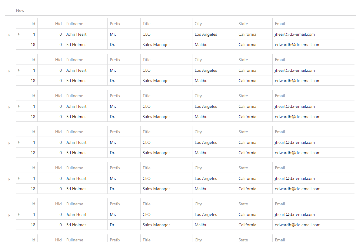
- Open the DxMasterDetail switch and add new dropable column.
- Drag the component you want to the column you just added for the master detail.
- Set DxMasterDetail enabled to true and template to the 'just added column name'.
- Finally, you can see the DxMasterDetail component, but you should set visible:false for the unnecessary column.
- Click on the new DxColumn component in the treeView and set the visible property to false.
Example file: dxMasterDetail
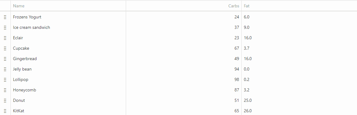
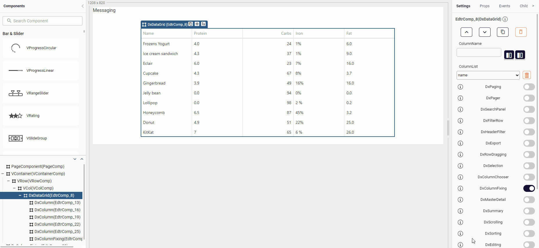
DxColumn fixed & allowFixing Properties
DxDataGrid containing many columns that cause horizontal scrolling provides fixed and allowFixing options.
Enabling the fixed property on a DxColumn stabilizes the column in a fixed place regardless of scrolling. Enabling the allowFixing property on a DxColumn provides options whether the column should be fixed to the right or to the left side of the table when a column on the table is right-clicked.
Sample usage of these properties are shown below:
Fixed Property
You can use the column fixing feature by setting the fixed prop of the Dxcolumn component to true. By setting the fixedPosition prop to 'left' or 'right', you can pin the fixed column to the right or left side of the DxDatagrid component. In order to scroll horizontally in the DxDatagrid component, each column must be given a fixed width.
allowFixing Property
Specifies whether a user can fix the column at runtime. Applies only if DxcolumnFixing.enabled is true.
Example file: allowFixing
DxColumnChooser & DxColumnFixing Sample
DxColumnChooser
The DxColumnChooser allows a user to change the set of columns at runtime. It is configured using the DxColumnChooser object and may operate in two modes: the default drag and drop mode and the select mode designed for touch devices.
You must activate the DxColumnChooser feature in the DxDatagrid bar.
Set the allowColumnReordering property to true to allow a user to reorder columns.
Example File: DxColumnChooser
DxColumnFixing
When the width of all columns exceeds the UI component width, horizontal scrolling appears. If specific columns should remain on screen constantly regardless of how far the UI component is scrolled, allow a user to fix them at runtime using the context menu. For this, set the DxColumnFixing.enabled property to true.
Example File: dxColumnFixing
DxDataGrid OnCellClick
A function that is executed when a cell is clicked or tapped. Executed before onRowClick.
Example file: onCellClick
DxDataGrid Menu Column
A menu column can be added into DxDataGrid component with Toggle Menu component.
Example file: DxDatagrid width Menu
Simple Data Grid Array Store Sample
An array can be stored in the DxDatagrid component and a new array can be transferred to the component.
To populate the datagrid in this example, we will create an instance of the ArrayStore class found in the DevExtreme JavaScript Documentation and pass this object to the data source of the datagrid component. The -key parameter is a field name that helps uniquely identify data. We can call the data parameter an array or object containing the data to be stored.
- The variable a, which holds the data source of the datagrid, is assigned to the data parameter.
- The data in variable b is stored in a storage unit along with a test key.
- Datagrid's data source is set to storage in variable b. The reshapeOnPush parameter determines whether the component is reshaped when data is changed.
- Finally, the component is update.
    let a=[{ 'ID':1, 'Subject': 'Prepare 2013 Financial', 'Status': 5,     'Owner': 1, 'AssignedEmployee': 7, 'OrderIndex': 0, 'Priority': 3 }, { 'ID': 2, 'Subject': 'Prepare 2013 Marketing Plan', 'Status': 5, 'Owner': 1, 'AssignedEmployee': 4, 'OrderIndex': 1, 'Priority': 4 }, { 'ID': 3, 'Subject': 'Update Personnel Files', 'Status':5, 'Owner': 1, 'AssignedEmployee': 2, 'OrderIndex': 2, 'Priority': 1 }]
    let b=quick.devex.createArrayStore({key:'ID', data:a})
    quick.store.set('test', b)
    components.EdtrComp_23.dataSource={store:b, reshapeOnPush:true}
    quick.Quick.updateComponent(components.EdtrComp_23)
To add data source to Datagrid;
- We assign the stored data to the store variable with the 'Test' button that we set while filling the source of the datagrid.
- Using the store.push method, insert the newData array into the storage unit named test, which is kept in the store variable.
let store=quick.store.get('test')
let newData ={ 'ID': 4, 'Subject': 'Review Health Insurance Options Under the Affordable Care Act', 'Status': 1, 'Owner': 1, 'AssignedEmployee': 2, 'OrderIndex': 3, 'Priority': 4 }
store.push([{type:'insert', data:newData}])
Example file: Simplest Grid with Array Store
DxDataGrid State Storing
Filters on DxDataGrid can be saved and load with DxStateStoring component.
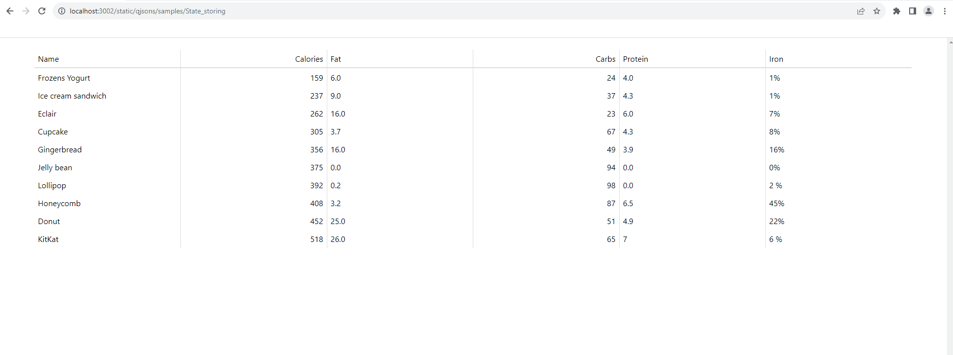
Example File: DxstateStoring
DxDatagrid Adding, Updating and Deleting
The DxDatagrid component can allow a user to add, update and delete data. To control which of these operations are allowed, use the allowAdding, allowUpdating and allowDeleting properties. Mode property is specifies how a user edits data: 'batch' , 'cell' , 'row' ,'form' , 'popup'.
Example File: dxDataGridAddinEditingDeleting
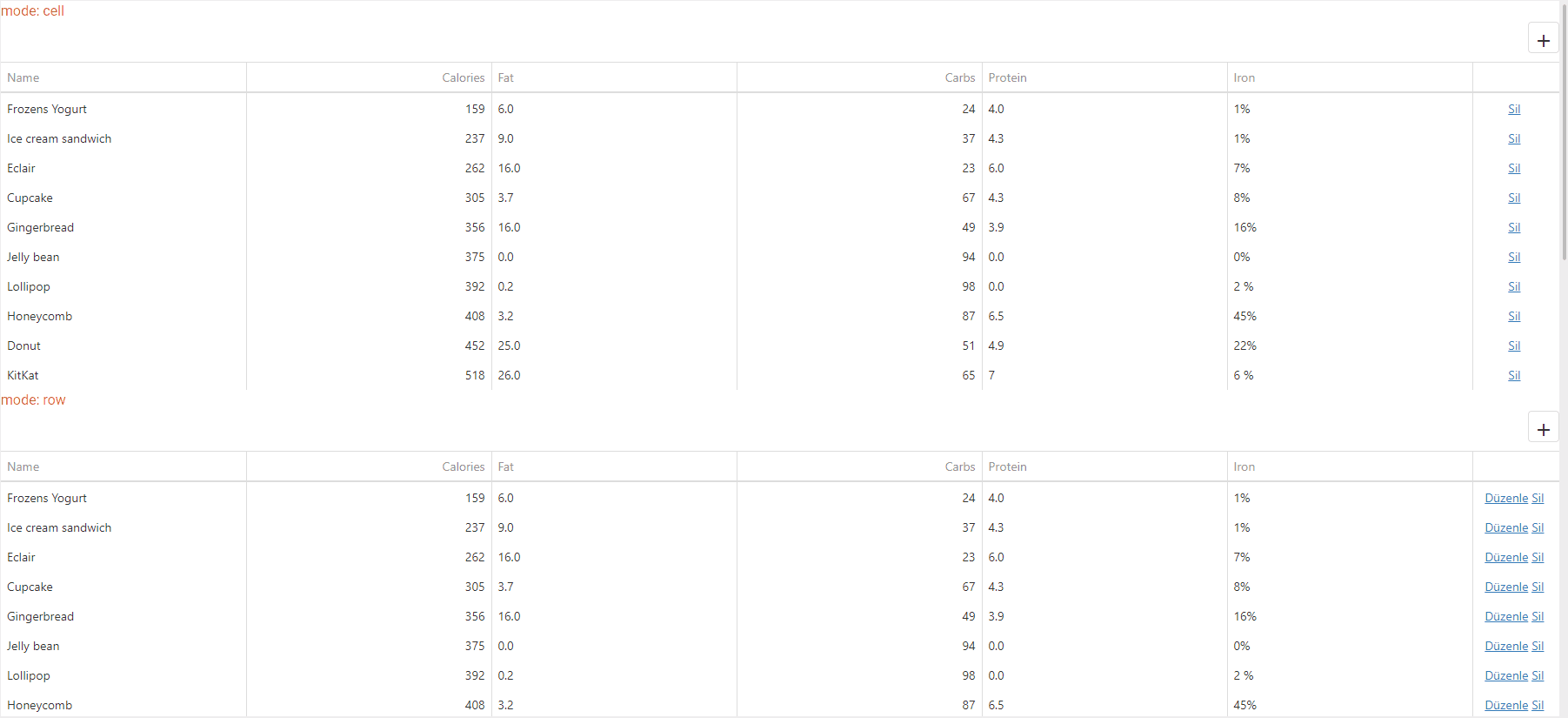
DxDataGrid Column Resizing
The DxDatagrid component allows a user to resize columns in two different modes: by changing the next column's width or the UI component's width. To enable this functionality and set the mode, specify the allowColumnResizing and columnResizingMode properties, respectively. Note that you can prevent a specific column from being resized by assigning false to its allowResizing property.
AllowColumnResizing Specifies how the UI component resizes columns. Applies only if allowColumnResizing is true.
The columnResizingMode property accepts one of the following values:
- nextColumn: When a user resizes a column, the width of the next column changes.
- widget: When a user resizes a column, the width of the UI component changes. This mode is ignored if you specify the width of any column in percent
Example File: columnResizingMode
DxColumn Background Color Change Sample
You can set the cssClass of the column.
Example File: dxColumncssClass
DxDataGrid Service Call Sample
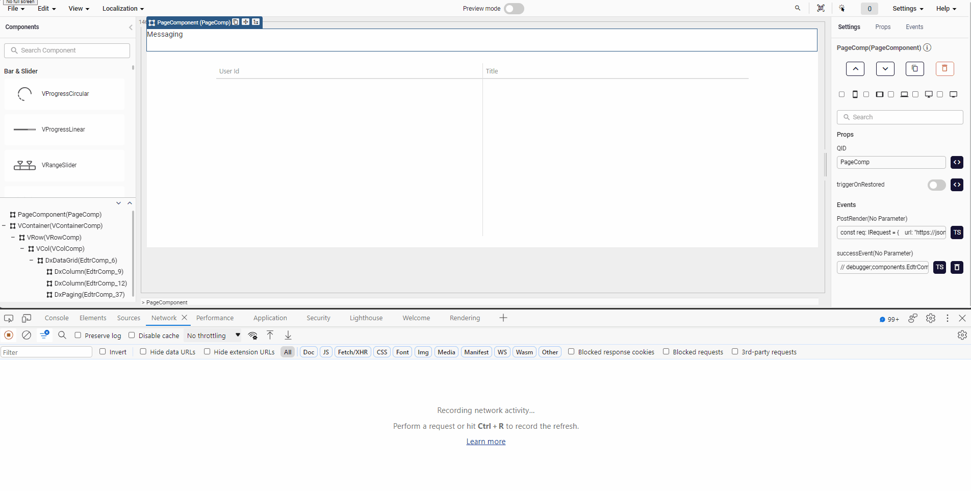
Steps to make a DxDataGrid service call respectively:
- A service request is made on the post render.
    const req: IRequest = {
        url: "https://jsonplaceholder.typicode.com/todos",
        data: null,
        blockRender: false,
        http: "get",
        onFail: null,
        onSuccess: "successEvent",
        responseField: "usersPage"
    };
    quick.Request.async(req);
- A customEvent called succesEvent is opened on Messaging. The response returned from the service is given to the datasource section of the Dxdatagrid component.
    components.EdtrComp_6.dataSource = response.usersPage
    quick.Quick.updateComponent(components.EdtrComp_6)
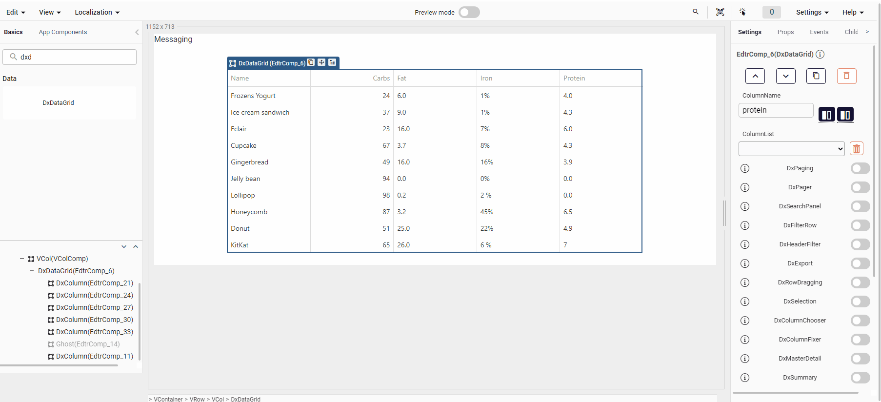
- Now we will display the incoming data in the DxDataGrid in the DxColumn component.
- In the DxDataGrid component, under the Setting tab in the 'ColumnName' section, the data coming from the service is parameterized and displayed.
Example File: Service Call
DxDataGrid Hiding Column Lines

Specifies whether vertical lines that separate one column from another are visible.
- There is a showColumnLines property on the DxDataGrid component. When you set it to false, vertical lines are not visible.
Example File: HidingColumnLines
DxDataGrid External Filtering
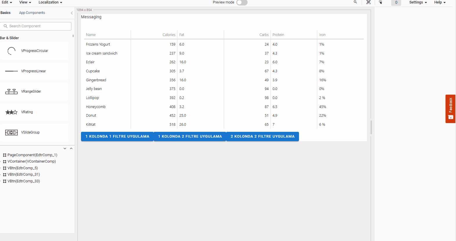
Example usage for external filtering of Dxdatagrid.
- Steps to use ExternalFilter in DxDataGrid respectively:
- DxDataGrid component is added into the editor.
- VBtn component is added into the editor.
- Filtering operations are done in these added buttons.
- Filtering feature is done by accessing the instances of DxDataGrid component.
- According to the desired filtering process, it is used by giving the header name, item name or parameters to be filtered into the filter method.
- Example Uses:
(<any>components.EdtrComp_4).instance.filter(['name','=','Eclair'])(<any>components.EdtrComp_4).instance.filter([['name','=','Eclair'],'or',['name','=','Cupcake']])(<any>components.EdtrComp_4).instance.filter([['name','=','Eclair'],'or',['fat','>=',9.0]])
Example File: ExtarnalFiltering
DxDataGrid External Filter Cleaning
Example usage for dxdatagrid filter cleaning from outside.
- Steps to use ExternalFilter Cleaning in DxDataGrid respectively:
- DxHeaderFilter property is set to true in DxDataGrid component property section.
- In the button component we added, the following codes are written by coming to the click event.
    (<any>components.EdtrComp_7).instance.clearFilter();
(<any>components.EdtrComp_7).instance.clearSorting(); - This code block clears the filter selected on the DxDataGrid via the button.
Example File: FilterCleaning
Custom Header Filter in a DxColumn Using the onOptionChanged Event of DxDataGrid
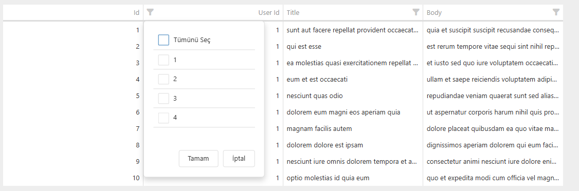
- Add the DxDataGrid component and set its dataSource prop to an empty array. Then call the API service to populate the data source.
[] - Set the DxHeaderFilter prop to true in the Settings section of the DxDataGrid component.
- Add DxColumns from the AddColumn section in the Settings section of the DxDataGrid component.
- In the Children section of DxColumn, add a child named default with type slot, and place the DxHeaderFilter component inside this slot.
- Set the allowFiltering and allowHeaderFiltering props of DxColumn to true, and set headerFilter to true.
- The dataSource of the DxHeaderFilter component in DxColumn is set by executing store.get().
store.get('$userIdList') - For the values to be filtered in the column, a service call is made, and the returned values are set to the store as an array of objects with text and value properties, as shown below.
let userIdList = [
    { "text": 1, "value": 1 },
    { "text": 2, "value": 2 },
    { "text": 3, "value": 3 },
    { "text": 4, "value": 4 },
    { "text": 5, "value": 5 },
    { "text": 6, "value": 6 },
    { "text": 7, "value": 7 },
    { "text": 8, "value": 8 },
    { "text": 9, "value": 9 },
    { "text": 10, "value": 10 }
];
quick.store.set('$userIdList', userIdList);
quick.Quick.updateComponent(components.dxDataGrid); - In the onOptionChanged event of the DxDataGrid, the filter information and the column on which the filter is applied are captured. These values can optionally be stored in the quick.store() and sent to the API service as filter parameters.
Example File: DxDataGrid_customHeaderFilterUsingOnOptionChangedEvent
DxDatagrid Add Dynamic Column

Example usage for Adding columns dynamically with the DxDatagrid Component:
- The gridInstance retrieves the current instance of the grid, and the existing columns are assigned to the columns variable.
const gridInstance = (<any>components.datagrid).instance;
const columns = gridInstance.option("columns") || [];
- columnMap defines which column corresponds to each checkbox (dataField and caption).
const columnMap = {
  1: { dataField: "name", caption: "Name" },
  2: { dataField: "email", caption: "E-Mail" },
  3: { dataField: "age", caption: "Age" },
  4: { dataField: "city", caption: "City" },
  5: { dataField: "phone", caption: "Phone" },
};
- All checkboxes from 1 to 5 are checked:
for (let i = 1; i <= 5; i++) {
  const checkbox = components[`checkBox_${i}`];
  const isChecked = checkbox?.qValue;
  const colDef = columnMap[i];

  const alreadyExists = columns.some(col => col.dataField === colDef.dataField);

  if (isChecked && !alreadyExists) {
    columns.push(colDef);
  }
}
- The updated columns list is set to the grid, so the selected columns become visible.
gridInstance.option("columns", columns);
- The last line closes the dialog.
components.EdtrComp_19.qValue = false;