Bar Chart
A bar chart provides a way of showing data values represented as vertical bars. It is sometimes used to show trend data, and the comparison of multiple data sets side by side.
Bar Chart and Data Labels Usage
For all component features for this component, click Bar Chart page.
For plugin usage of this component, click Chart Data Labels page.
Props
| Attribute | Description | Type | Default |
|---|---|---|---|
| xType | For Time Cartesian Axis use 'time'. | string | |
| xMin | The minimum item to display. | string | |
| xMax | The maximum item to display. | string | |
| xReverse | Reverse the x scale. | boolean | false |
| yReverse | Reverse the y scale. | boolean | false |
| xTimeDisplayFormatsMillisecond | Sets how different time units are displayed. | string | "h:mm:ss.SSS aaaa" |
| xTimeDisplayFormatsSecond | Sets how different time units are displayed. | string | "h:mm:ss aaaa" |
| xTimeDisplayFormatsMinute | Sets how different time units are displayed. | string | "h:mm aaaa" |
| xTimeDisplayFormatsHour | Sets how different time units are displayed. | string | "ha" |
| xTimeDisplayFormatsDay | Sets how different time units are displayed. | string | "MMM d" |
| xTimeDisplayFormatsWeek | Sets how different time units are displayed. | string | "PP" |
| xTimeDisplayFormatsMonth | Sets how different time units are displayed. | string | "MMM yyyy" |
| xTimeDisplayFormatsQuarter | Sets how different time units are displayed. | string | "qqq - yyyy" |
| xTimeDisplayFormatsYear | Sets how different time units are displayed. | string | "yyyy" |
| xTimeIsoWeekday | If boolean and true and the unit is set to 'week', then the first day of the week will be Monday. Otherwise, it will be Sunday. If number, the index of the first day of the week (0 - Sunday, 6 - Saturday). | boolean or number | |
| xTimeParser | Custom parser for dates. | string | |
| xTimeRound | If defined, dates will be rounded to the start of this unit. | string | |
| xTimeTooltipFormat | The format string to use for the tooltip. | string | |
| xTimeUnit | If defined, will force the unit to be a certain type. See Time Units section below for details. | string | |
| xTimeMinUnit | The minimum display format to be used for a time unit. | string | 'millisecond' |
| xTicksColor | Color of X ticks. | string | |
| xTicksFontFamily | Font Family of X ticks. Default font family for all text. | string | |
| xTicksFontSize | Font Size of X ticks. Default font size (in px) for text. Does not apply to radialLinear scale point labels. | string | 12 |
| xTicksFontStyle | Font Style of X ticks. Default font style. Does not apply to tooltip title or footer. Does not apply to chart title. | string | 'normal' |
| xTicksFontWeight | Font Weight of X ticks. Default font weight (boldness). | string | 'normal' |
| xTicksFontLineHeight | Font Line Height of X ticks. Height of an individual line of text. | string | '1.2' |
| yTicksColor | Color of Y ticks. | string | |
| yTicksFontFamily | Font Family of Y ticks. Default font family for all text. | string | |
| yTicksFontSize | Font Size of Y ticks. Default font size (in px) for text. Does not apply to radialLinear scale point labels. | string | 12 |
| yTicksFontStyle | Font Style of Y ticks. Default font style. Does not apply to tooltip title or footer. Does not apply to chart title. | string | 'normal' |
| yTicksFontWeight | Font Weight of Y ticks. Default font weight (boldness). | string | 'normal' |
| yTicksFontLineHeight | Font Line Height of Y ticks. Height of an individual line of text. | string | '1.2' |
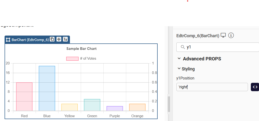
| y1Position | Position of the secondary Y axis. Accepts 'left' or 'right'. | string | |
| ySuggestedMax | Sets the visual maximum value of the Y-axis. | number | |
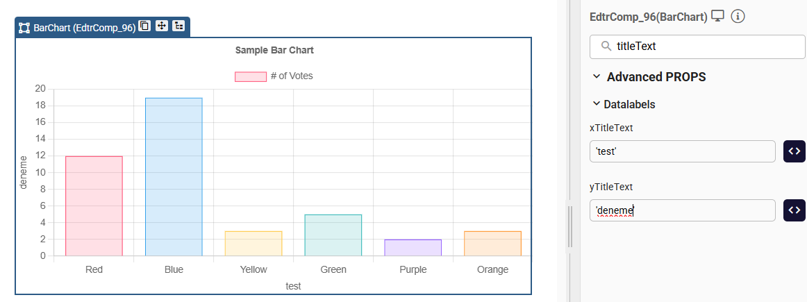
| xTitleText | Text for the X-axis title. | string | |
| xTitleFontSize | Font size for the X-axis title (in px). | string | 12 |
| xTitleColor | Color of the X-axis title. | string | |
| yTitleText | Text for the Y-axis title. | string | |
| yTitleFontSize | Font size for the Y-axis title (in px). | string | 12 |
| yTitleColor | Color of the Y-axis title. | string | |
| legendFontFamily | Font family used for legend labels (e.g., 'Arial', 'Roboto', 'sans-serif'). Inherits the global font if not specified. | string | |
| legendFontStyle | Font style of the legend text (e.g., 'normal', 'italic', 'oblique'). | string | |
| legendFontWeight | Font weight (boldness) of the legend labels (e.g., 'normal', 'bold', 'lighter', 400, 700). | string | |
| legendFontLineHeight | Line height of legend text. Can be a number (1.2) or a string ('20px', '150%'). | string |
Events
| Attribute | Description | Type |
|---|---|---|
| onClick | A callback that is called when a click event is registered on a label item. Arguments: [event, legendItem, legend]. | function |
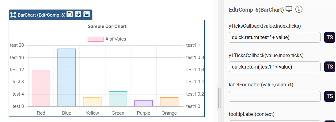
| yTicksCallback | Returns the string representation of the Y tick value as it should be displayed on the chart. Arguments: [value, index, ticks]. | function |
| y1TicksCallback | Custom Y1 ticks formatter. Arguments: [value, index, ticks]. | function |
| xTicksCallback | Returns the string representation of the X tick value as it should be displayed on the chart. Arguments: [value, index, ticks]. | function |
Samples Component
LabelOffset - LabelColor - LabelBorderWidth Props Usage
The position of the bar values can be set using labelOffset prop.
The color of the bar values can be set using labelColor prop.
Borders can be added to the bar values by logging a value to the labelBorderWidth prop.
BackgroundColor - BorderColor - LabelBorderWidth Props Usage

The color of the bars can be changed with 'backgroundColor' prop, and the border colors can be changed with borderColor prop as seen in example below:
['rgba(255, 99, 132, 0.2)', 'rgba(54, 162, 235, 0.2)', 'rgba(255, 206, 86, 0.2)', 'rgba(75, 192, 192, 0.2)', 'rgba(153, 102, 255, 0.2)', 'rgba(255, 159, 64, 0.2)']
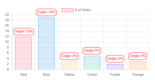
To view the percentage of a bar

-turn on the labelDisplay prop
-log the values, in order, to the data prop
-add the values from data prop with % to the labelFormatter event.
quick.return("Value:"+value+'%');
To remove the display in x and y coordinates

To remove the display in x and y coordinates, turn off the XDisplay and YDisplay prop.
Time Cartesian Axis
Axes that follow a cartesian grid are known as 'Cartesian Axes'. Cartesian axes are used for line and bar charts. Time cartesian axes are included in Chart.js by default.
The time scale is used to display times and dates. Data are spread according to the amount of time between data points. When building its ticks, it will automatically calculate the most comfortable unit base on the size of the scale.
For More Information:
Time Cartesian AxisTime Display Formats

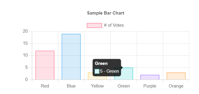
Tooltip Label
tooltipLabel(context) event added to Charts component. Returns text to render for an individual item in the tooltip. The label can change the text that displays for a given data point.
For more detail Charts tooltip-callbacks
quick.return(context.formattedValue + " - " + context.label);
Tooltip Label
Ticks Font
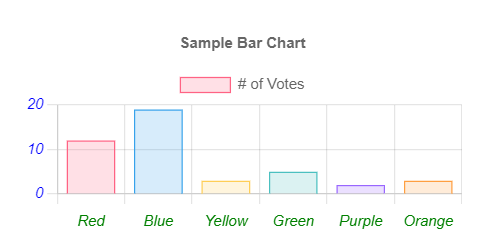
Axis Titles and Styling Options
BarChartTitle.qjson
BarChartYTicks.qjson
Samples Qjson
BarChart.qjsonBarChartEvents.qjson
BarChart_Type_Time_Sample.qjson
Charts_Custom_Legend_Sample.qjson
Charts_tooltipLabel_sample.qjson
BarChart_TicksCallback.qjson