Doughnut Chart
For all component features for this component, click Doughnut Chart page.
For plugin usage of this component, click Chart Data Labels page.
Example DoughnutChart


To set the width in the middle, use the cutoutPercentage prop.


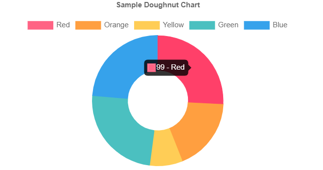
Tooltip Label
tooltipLabel(context) event added to Charts component. Returns text to render for an individual item in the tooltip. The label can change the text that displays for a given data point.
For more detail Charts tooltip-callbacks
quick.return(context.formattedValue + " - " + context.label);
Props
| Attribute | Description | Type | Default |
|---|---|---|---|
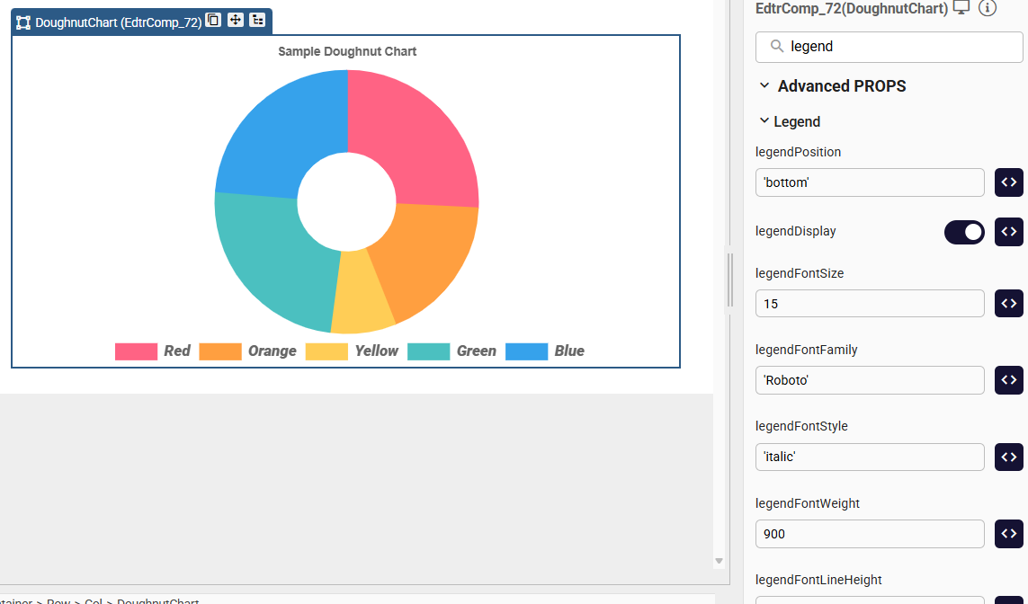
| legendFontFamily | Font family used for legend labels (e.g., 'Arial', 'Roboto', 'sans-serif'). Inherits the global font if not specified. | string | |
| legendFontStyle | Font style of the legend text (e.g., 'normal', 'italic', 'oblique'). | string | |
| legendFontWeight | Font weight (boldness) of the legend labels (e.g., 'normal', 'bold', 'lighter', 400, 700). | string | |
| legendFontLineHeight | Line height of legend text. Can be a number (1.2) or a string ('20px', '150%'). | string |
Events
| Attribute | Description | Type |
|---|---|---|
| onClick | A callback that is called when a click event is registered on a label item. Arguments: [event, legendItem, legend]. | function |
Legend Font Customization
Use the following properties to customize the font appearance of the chart legend.
ChartLegendFont.qjson
Samples Qjson
DoughnutChartDoughnutChartEvents.qjson
Charts_Custom_Legend_Sample
Charts_tooltipLabel_sample
When the cutoutPercentage property is set to 0 in the DoughnutChart component, it appears as PieChart component.
Pie Chart
For all component features for this component, click Pie Chart page.
For plugin usage of this component, click Chart Data Labels page.
All of the component features(except options) can be use in this component.
All of the ChartDataLabels plugin features can be use in this component.
Example: PieChart


Tooltip Label
tooltipLabel(context) event added to Charts component. Returns text to render for an individual item in the tooltip. The label can change the text that displays for a given data point.
For more detail Charts tooltip-callbacks
quick.return(context.formattedValue + " - " + context.label);
Samples Qjson
Charts_Custom_Legend_Sample.qjsonCharts_tooltipLabel_sample.qjson