Shadow DOM Usage Guide
Overview
The Shadow DOM is a web standard that provides encapsulation for DOM and CSS. It allows developers to isolate styles, scripts, and markup within a dedicated scope, preventing conflicts with the global document. This is particularly useful for complex applications where multiple components or frameworks coexist.
Usage
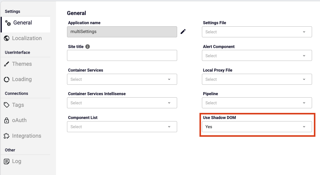
To use shadow DOM in application, set 'Yes' in the settings page then save the settings model.
Key Benefits
- Style Encapsulation: Prevents global CSS rules from affecting component internals, and vice versa.
- DOM Isolation: Elements inside the Shadow DOM cannot be directly accessed or styled from the outside document unless explicitly exposed.
Usage in Applications
When managing complex UI components, Shadow DOM can serve as a secure rendering environment. A container element (or mount point) is associated with a ShadowRoot. All relevant styles and UI logic are scoped within that shadow boundary.
Typical use cases include:
- Embedding third-party libraries or widgets without risking CSS collisions.
- Ensuring that critical UI components retain consistent behavior regardless of the host page’s styling.
Integration Considerations
- CSS Management: Custom CSS order managers or loaders may be required to ensure proper style injection within the shadow boundary.
- Context Awareness: Components may need access to shared application context (e.g., settings, URL helpers) even though they are visually isolated.
Best Practices
- Use Shadow DOM selectively — apply it where isolation provides clear benefits.
- Keep global styles minimal to avoid confusion between shadowed and non-shadowed elements.
- Test across browsers since Shadow DOM implementation details can differ slightly.