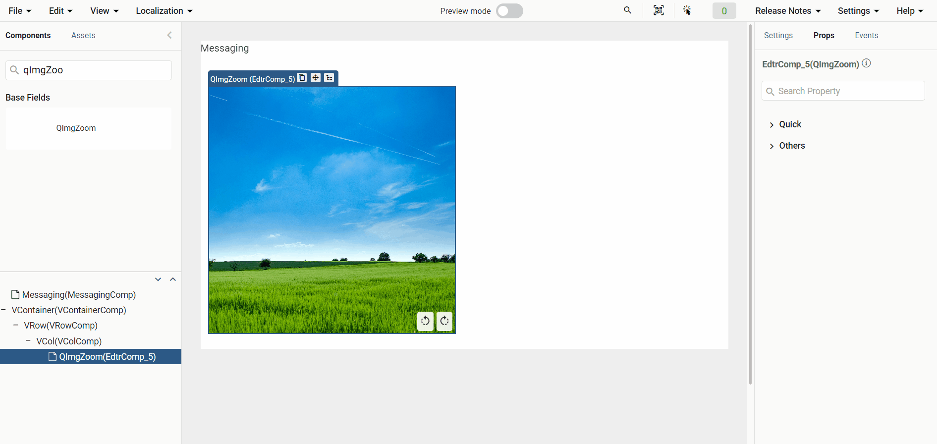
Img Zoom
The ImgZoom component is available in Studio and provides a magnified preview when a user hovers over an image.
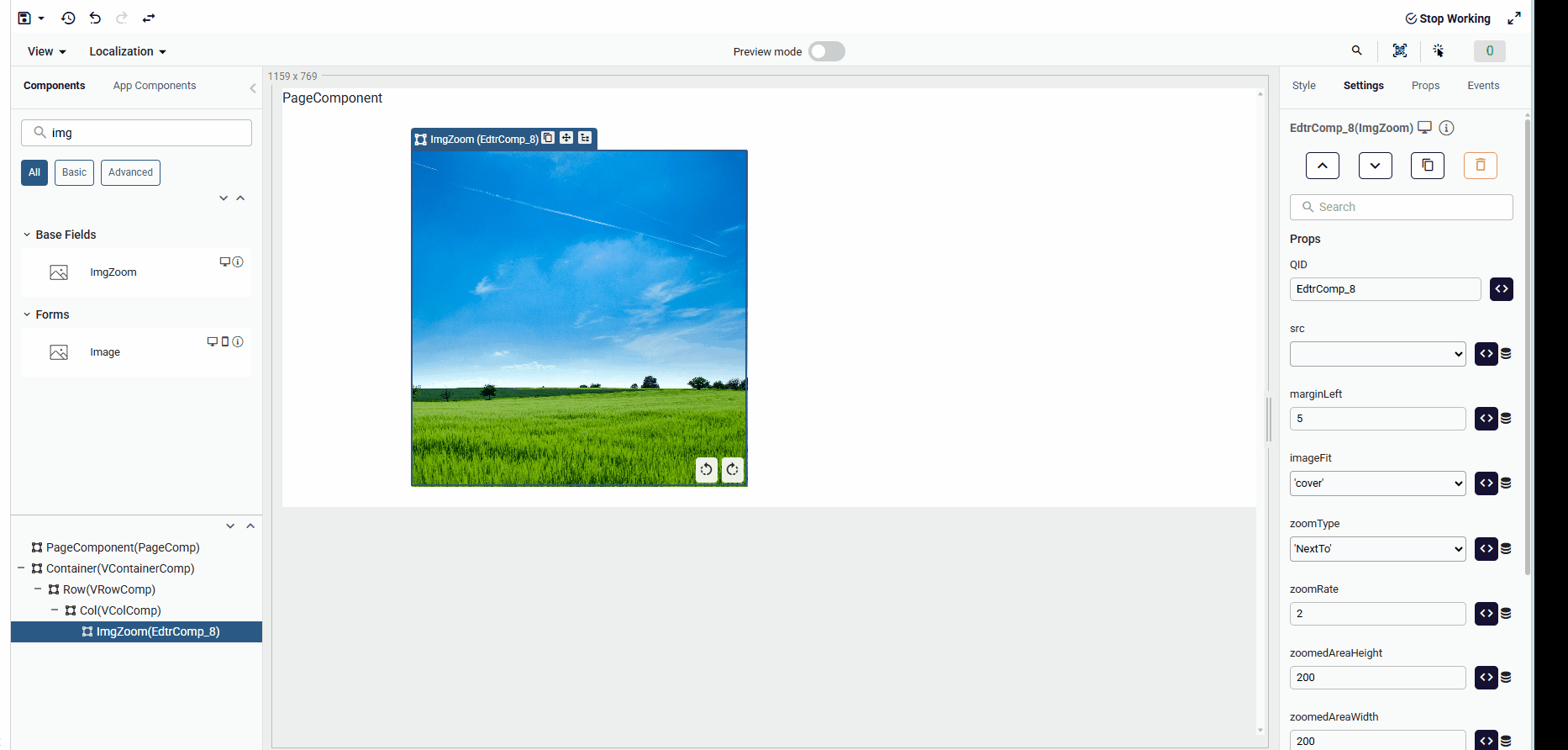
Props
| Props Name | Description | Type |
|---|---|---|
| src | Source URL of the image. This prop is required. | string |
| width | Defines the component width. | string |
| height | Defines the component height. | string |
| zoomedAreaHeight | Height of the zoomed preview area. | number |
| zoomedAreaWidth | Width of the zoomed preview area. | boolean |
| zoomedAreaOpacity | Opacity applied to the zoomed preview area. | string |
| zoomedAreaColor | Background color of the zoomed preview area. | string |
| zoomedImageHeight | Height of the zoomed image. | number |
| zoomedImageWidth | Width of the zoomed image. | number |
| marginLeft | Margin between the zoomed image and the original image. | number |
| zoomType | Determines the zoom interaction type. | string |
| zoomRate | Zoom ratio when zoomType is set to on. | number |
| zoomInUrl | Custom icon for zoom in. | string |
| zoomOutUrl | Custom icon for zoom out. | string |
| imageFit | Sets the image object-fit property. | string |
| disableZoom | Enables or disables zoom. | boolean |
| hideRotation | Shows or hides the rotation controls. | boolean . |
| visible | Controls the visibility of the ImgZoom component. | boolean |
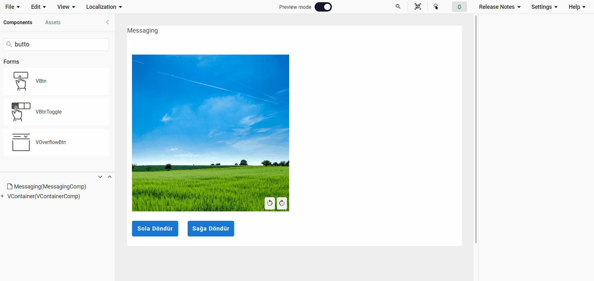
Methods
| Method Name | Description | Example Code |
|---|---|---|
| rotate | Rotates the image. | components.EdtrComp_1.rotate() |
zoomType
Sets the image interaction type. Supported values are NextTo and On.
zoomedAreaHeight - zoomedAreaWidth
Increasing zoomedAreaHeight and zoomedAreaWidth reduces the zoom level.
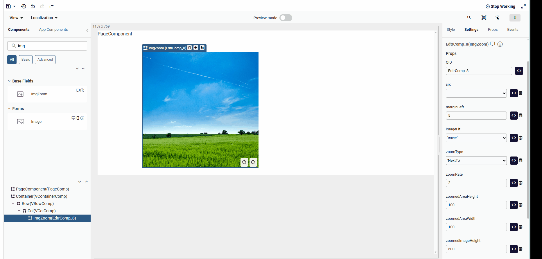
marginLeft
Controls the margin between the zoomed image and the source image.
rotate
Rotates the image in 90-degree increments.
Possible values: 0 | 90 | 180 | 270 | 360 | -90 | -180 | -270 | -360
Samples Qjson
QImgZoomTypeNextToQImgZoomTypeOn
QImgZoomRotate