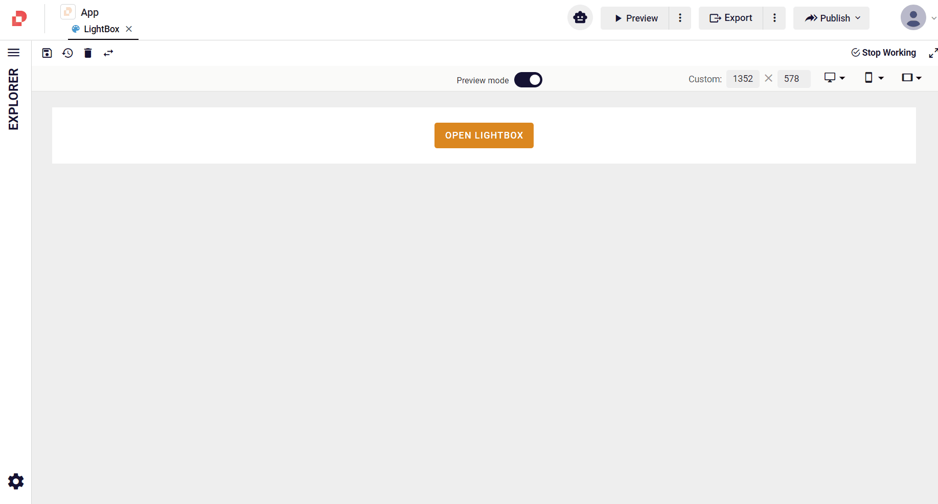
LightBox
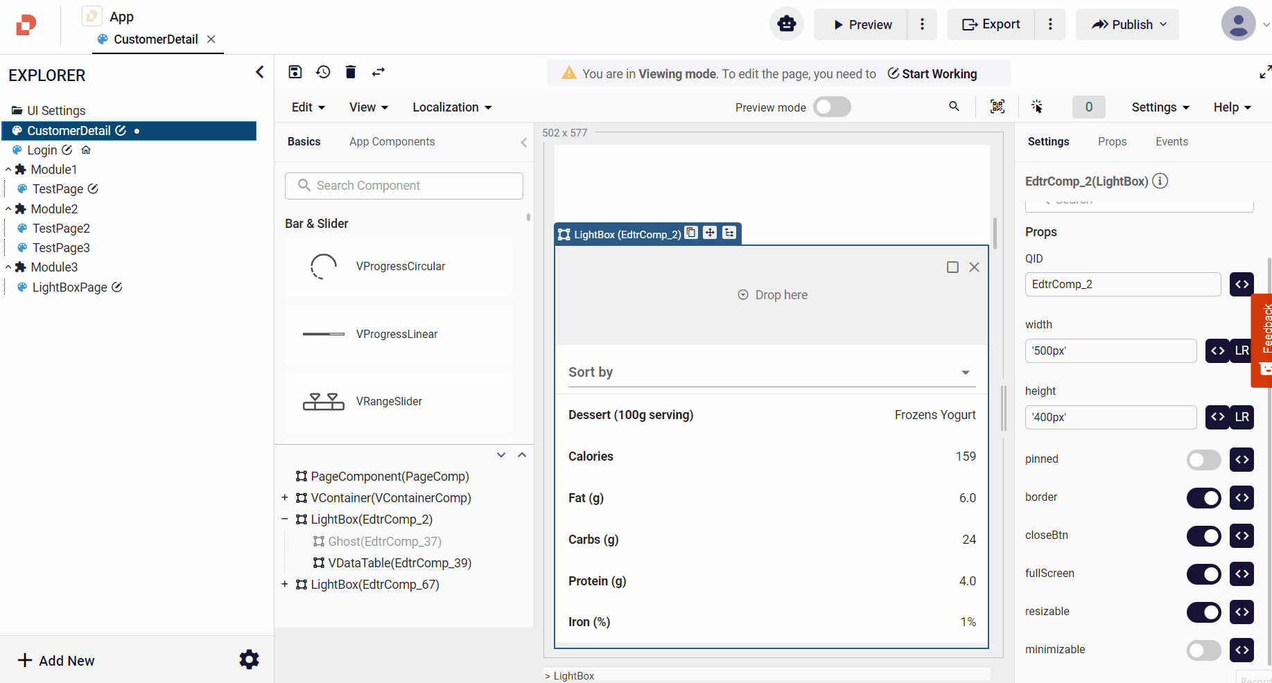
The LightBox component is a window consisting of 2 parts, header and body. This window can be draggable and used as a full screen, and you can also customize its position on the screen. This component includes the form that opens on the screen, the image dialog box, etc.
Props
| Attribute | Description | Type |
|---|---|---|
| width | Sets the width of the lightbox. | string |
| height | Sets the height of the light box. | string |
| headerPadding | sets the header padding. | string |
| zIndex | The z-index used for the component. | string |
| pinned | pin the component. | boolean |
| class | Allows custom properties to take effect. | string |
| border | Specifies the frame thickness. | boolean |
| closeBtn | Add a close button to the component. | boolean |
| headerPadding | Add padding to the header. | string |
| fullScreen | It can maximize and minimize the light box. | boolean |
| resizable | Component allowing you to resize as you prefer. | boolean |
| visible | Visibility of LightBox component. | boolean |
Events
| Attribute | Description |
|---|---|
| closePopup | Event emitted when click close button |
| mounted | Event emitted when mounted |
| clickOutside | Event emitted when click div outside |
| clickInside | Event emitted when click div inside |
Samples Component
How do I use the full screen feature of the LightBox component?
How do I use the minimize feature of the LightBox component?
How do I use the resizable property of the LightBox component?
