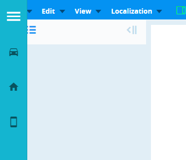
Menu
Props
| Attribute | Description | Type | Default |
|---|---|---|---|
| activeColor | Gives color to the elements selected in the menu. | string | Primary |
| autoCollapse | Collapse previous selection automatically. | boolean | false |
| classmenu | Configure the active CSS class applied when the link is active. | string | - |
| collapseOnItemSelect | Opening and closing the menu so that the items in the menu can be selected. | boolean | false |
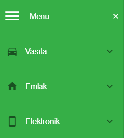
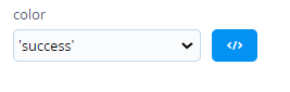
| color | Applies specified color to the control. | string | 'primary' |
| disabled | Disables the menu. Removes the ability to click or target the component. | boolean | false |
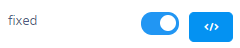
| fixed | Applies position: fixed to the component. | boolean | false |
| hideMenuTitle | Hides the title of the menu. As soon as the menu opens, it only shows the icons of the menu. | boolean | false |
| menuData | Data of component. | array | - |
| miniVariantWidth | Designates the width assigned when the mini prop is turned on. | string | 56 |
| showOnlyIcon | Hides the title of the menu. | boolean | false |
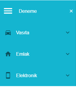
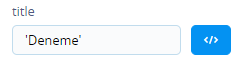
| title | Title of component. | string | 'Menu' |
| width | Sets the width for the component. | string | 256 |
Events
| Attribute | Description |
|---|---|
| click:row | Triggers when clicked on the row item. |
| update:mini-variant | Changes the appearance of the menu to mini or expanded. |
Component Samples
menuData
[{ menuItem = true, code = 'Vasıta', imagePath = 'mdi-car',tooltip= true, children = [{menuItem = true, imagePath = 'mdi-star', code = 'Otomobil',tooltip = false, children = [{ menuItem = true, imagePath = 'mdi-star',code = 'BMW',tooltip = true, children = [{ menuItem = true, imagePath = 'mdi-star', code = '5.20', tooltip = false}]}]}] }]
| Attribute | Description | Type |
|---|---|---|
| menuItem | Visibility information in the menu | Boolean |
| code | What to write in the menu | String |
| imagePath | Icon of data (using 'materialdesignicons' to icon set) or Images | String |
| tooltip | Displaying tooltip on menu name | Boolean |
| options | Icons or images are given a size and color | iconOptinons or imageOptions |
| children | Sub-items of data | Array |
Using imagepath for image
imagePath= Url.resolve({url='/static/images/cekmatiknew.png'})
Using imagepath for icon
imagePath='mdi-menu'
options Usage
options = {
    iconOptions?: { size?: string | number; xSmall?: boolean; small?: boolean; large?: boolean; xLarge?: boolean; color?: string },
    imageOptions?: { width?: string | number; height?: string | number }};
Color
Fixed
Title