Otp
The OTP component is used to generate and manage a One-Time Password (OTP).
Usage Component
Once you select the type for the OTP component, you can begin the data entry. This component allows you to navigate back and forth between inputs, make changes and fill in the missing data by using the Tab, Delete, and Arrow keys.
To use this functionality, click an input box and start typing.
Tab key: Takes you to the next input box. Delete key and Arrow key: Allow you to move back and forth between inputs.
Keep in mind that when you select 'number' for the type prop, make sure to continue only with numbers.
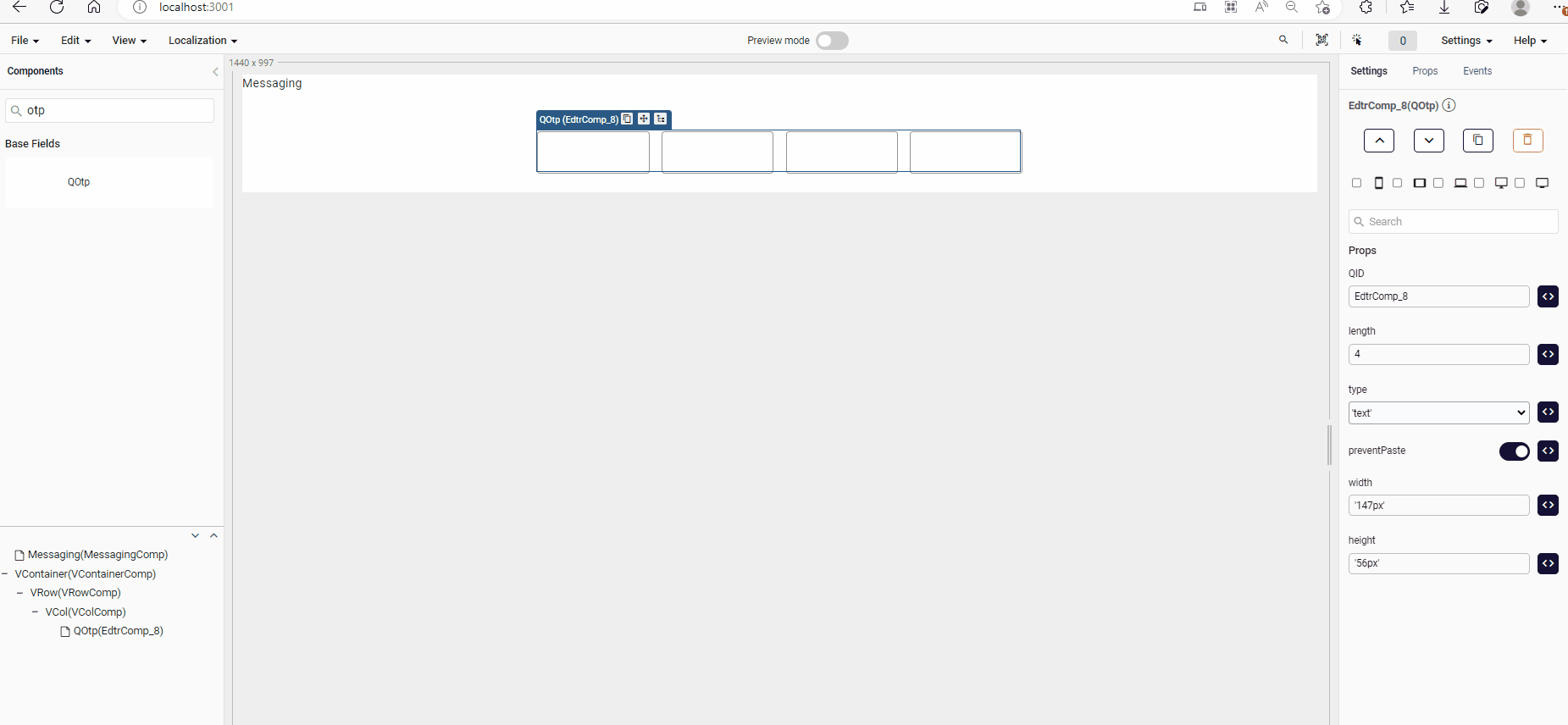
Props
| Attribute | Description | Type |
|---|---|---|
| length | Sets the desired length of the OTP. Default value is 4. | number |
| disabled | Disables the OTP inputs. Default value is false. | boolean |
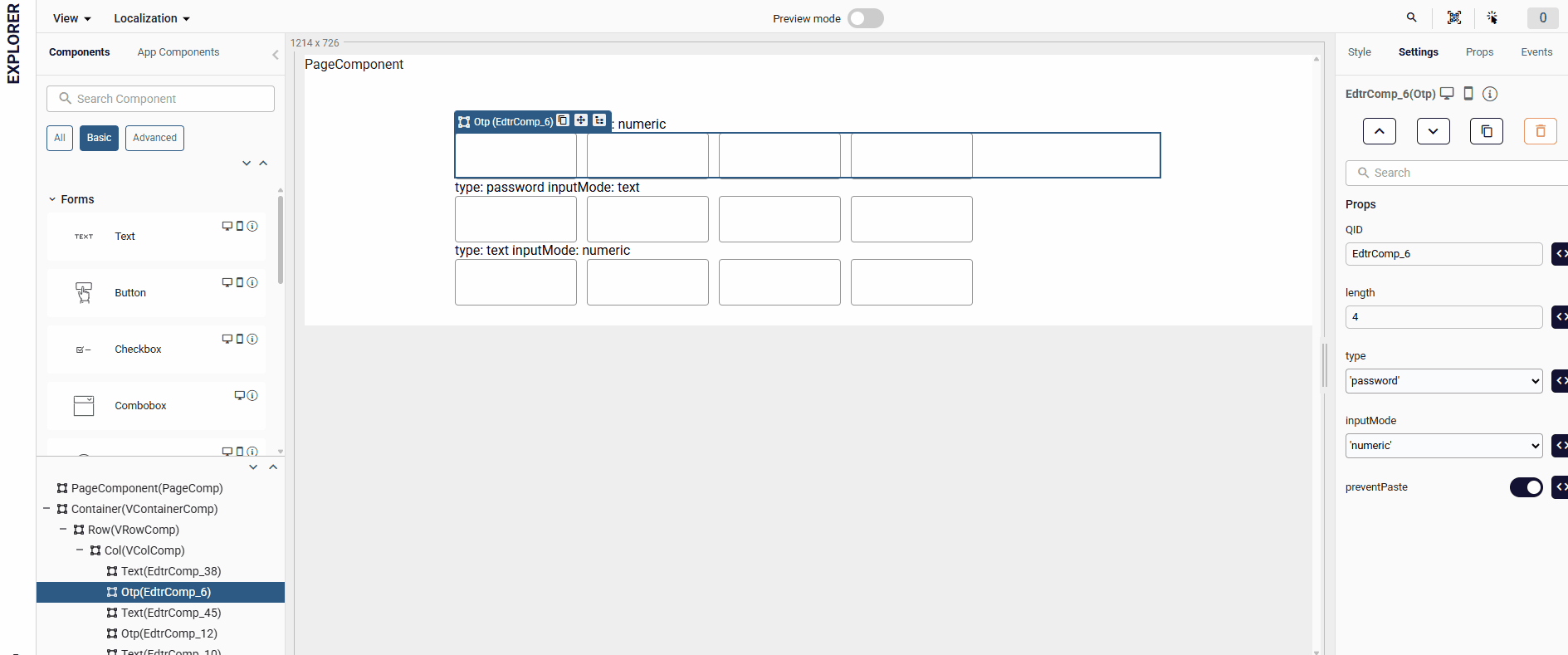
| type | Specifies the expected input type for the OTP fields, helping browsers choose the appropriate keyboard ['number', 'text', 'password']. | string |
| inputMode | Specifies the type of on-screen keyboard that appears when accessing the page from a mobile web browser ['text', 'numeric'] | string |
| value | Sets the value of the OTP. | array |
| preventPaste | Determines whether to allow pasting into the OTP inputs. Default value is true (allows paste). | boolean |
| readonly | Determines whether the OTP inputs should be read-only. | boolean |
| error | Enables or disables error of the OTP. Default value is false (error disabled). | boolean |
| customClass | Sets the name of the custom CSS class to be applied to the OTP inputs. | string |
| visible | Visibility of Otp component. | boolean |
Events
| Attribute | Description |
|---|---|
| input | Triggered for each character input in the OTP. Returns the concatenated string value of the inputs as a parameter. |
| finish | Triggered when all OTP inputs are completed. Returns the completed OTP string value as a parameter. |
| blur | Triggered when a click occurs outside the OTP component and after the first input has been made. Returns the concatenated string value of the inputs as a parameter. |
Samples Component
length
You can increase or decrease the number of input fields based on the numerical value provided by the 'length' prop.
preventPaste
Determines whether to allow pasting into the OTP inputs. Default value is true (allows paste).
error & errorMessage
You can apply validation to the input fields by setting the "Error" property to "true" and entering the value you designate to the "errorMessage" property.
inputMode
This usage applies to the application keyboard in web applications opened on mobile devices.
The inputMode feature is not yet supported in the mobile application.
- By using the
inputModeprop, you can control the mobile keyboard type. For example:inputMode="numeric"opens a numeric keyboard.inputMode="text"shows a full alphanumeric keyboard.