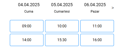
The AppointmentCalendar component is a flexible UI component designed for displaying and managing date- and time-based appointments. It offers intuitive day-to-day navigation, time slot selection, and event-driven updates to support dynamic scheduling workflows.
Props
| Attribute | Description | Type |
|---|
| dailyTimeSlots | Defines the available dates and time slots for appointments. Each item includes a date, times, and optionally disabledTimes. Example: [ { date: '04-04-2025', times: ['09:00', '10:00'], disabledTimes: ['10:00'] } ] | Array |
| locale | Sets the locale used for date and day name formatting (e.g. 'tr' for Turkish). | string |
| dateFormat | Customizes how dates are displayed. Default is "DD.MM.YYYY". | string |
| timeFormat | Defines the display format of time labels (e.g. "HH:mm"). | string |
| loading | Displays a loading spinner when true. Useful for async data fetching. | boolean |
| hideHeader | Hides the top date navigation bar when true. | boolean |
Events
| Event Name | Description | Parameters |
|---|
| dateChange | Triggered when either the date or time selection changes. Returns current date and times. | { date, selectedTime, availableTimeSlots, disabledTimeSlots } |
| selectDate | Fired when a new date is selected from the header. | { date } |
| selectTime | Fired when a time slot is selected. | { time } |
| dateNavigate | Fired when navigating between dates using the previous (<) or next (>) buttons. | { date } |