Bottom Sheet
The BottomSheet component, derived from the VDialog, serves as a versatile element that slides up from the bottom of the screen, providing additional functionality and options within an application. This component's usage is valid for both mobile and web platforms, ensuring consistent functionality across different devices.
While bottom navigation components typically house buttons and specific application-level actions, the bottom sheet offers a broader range of content and functionalities.
For more details about Vuetify’s usage of BottomSheet component, click BottomSheet page.
For more prop explanations, click Vuetify BottomSheet API page.
Props
| Attribute | Description | Type | Default |
|---|---|---|---|
| attach | Specifies which DOM element that this component should detach to. | any | false |
| class | Allows custom properties to take effect. | string | undefined |
| dark | Applies dark theme. | boolean | false |
| eager | Ensures that the content of the component is rendered immediately upon mounting. | boolean | false |
| scrollable | It expects a vCard and a vCardText component with a designated height. | boolean | false |
| visible | Visibility of bottomSheet component. | boolean | true |
| hideOverlay | Prevents the overlay from being displayed along with the bottom sheet. | boolean | false |
| persistent | Helps no being closed by clicking outside them. | boolean | false |
| value | Sets the active button. | number | undefined |
| visible | Visibility of BottomSheet component. | boolean | true |
Events
| Attribute | Description |
|---|---|
| click:outside | Allows you to provide a handler to be invoked when the user clicks outside of the target element. |
Usage Scenarios
- If you want to dynamically display components within the component, you should first set the value of the component to true at the desired location, and then call the code to create the dynamic content inside a setTimeout function.
- If you want to access the static or dynamic components within the component's content, you should first set the value of the component to true, and then access the components inside using a setTimeout function to perform the desired operation.
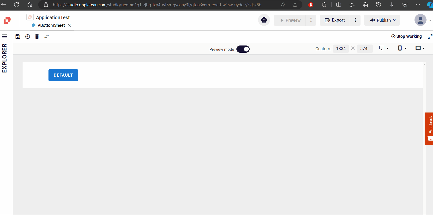
Default
How to scrollable?
If you want to enable scrolling in the bottomSheet, you can review the two usage examples below and choose the one that fits your needs.
Using scroll

Set the scrollable prop of the BottomSheet to true.
Add a Card component to the ghost inside the BottomSheet.
Assign the class overflow-auto to the Class prop of the added Card component.
Set the height of the added Card component using the height prop in the style section.
bottomSheetScrollable