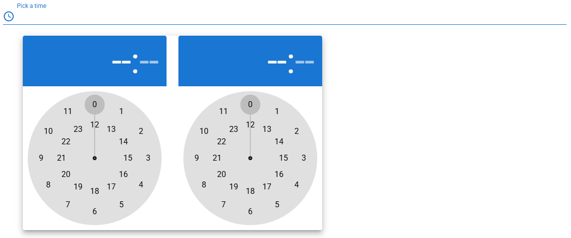
Inline Time Picker
info
For more details about Vuetify’s usage of InlineTimePicker component, click InlineTimePicker page.
For more prop explanations, click Vuetify InlineTimePicker API page.
Props
| Attribute | Description | Type | Default |
|---|---|---|---|
| compareValue | QLegend is used for comparison values. You can look at the QLegend document. | string | undefined |
| compareText | QLegend is used for comparison values. You can look at the QLegend document. | string | undefined |
| compareTableValue | QLegend is used for comparison values. You can look at the QLegend document. | string | undefined |
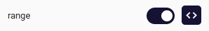
| range | Allows the selection of time range. | boolean | false |
| dense | Reduces the input height. Use it with the style prop. | boolean | false |
| disabled | Disables picker. | boolean | false |
| hideDetails | Hides hint and validation errors. When set to auto messages will be rendered only if there’s a message (hint, error message, counter value etc) to display. | boolean | string | undefined |
| readonly | Puts picker in readonly state. | boolean | false |
| readonlyTextField | Prevents changing of input field. | boolean | false |
| allowedHours | Restricts which hours can be selected. | array | - |
| allowedMinutes | Restricts which minutes can be selected. | array | - |
| label | Sets input label. | string | undefined |
| max | Maximum allowed time. | string | undefined |
| min | Minimum allowed time. | string | undefined |
| allowedSeconds | Restricts which seconds can be selected. | array | - |
| outlined | Applies the outlined style to the input. Use it with the style prop. | boolean | false |
| willAttach | Specifies which DOM element that this component should detach. | boolean | true |
| rounded | Adds a border radius to the input. | boolean | false |
| rules | You can find more detailed information here. | array | [] |
| value | Time picker model (ISO 8601 format, 24hr hh:mm). | any | undefined |
| visible | Visibility of InlineTimepicker component. | boolean | true |
Events
| Attribute | Description |
|---|---|
| change | Emitted when the time selection is done (when user changes the minute for HH:MM picker and the second for HH:MM:SS picker |
| click:hour | Emitted when user selects the hour |
| allowedHours | Restricts which hours can be selected |
Component Samples
Range
Disabled

allowedHours

allowedMinutes

InlineTimePicker Value Getter and Setter
How to Set InlineTimepicker value?


How to Get InlineTimePicker value?

