Treeview
Props
| Attribute | Description | Type | Default |
|---|---|---|---|
| value | Allows one to control which nodes are selected. The array consists of the item-key of each selected item. | array | [] |
| items | An array of items used to build the treeview | array | [] |
| activatable | Allows user to mark a node as active by clicking on it | boolean | false |
| class | Prop that determines the class to add to the Treeview | string | undefined |
| color | Applies specified color | string | undefined |
| dense | Hide opposite slot content, and position all items to one side of timeline. | boolean | false |
| hovertable | Applies a hover class when mousing over nodes | boolean | false |
| itemDisabled | Set property of items’s disabled value | string - array - function | disabled |
| loadingIcon | Icon used when node is in a loading state | string | '$loading' |
| onIcon | Icon used when leaf node is selected or when a branch node is fully selected. Only visible when selectable is true. | string | '$checkboxOn' |
| openAll | When true will cause all branch nodes to be opened when component is mounted | boolean | false |
| openOnClick | When true will cause nodes to be opened by clicking anywhere on it, instead of only opening by clicking on expand icon. When using this prop with activatable you will be unable to mark nodes with children as active. | boolean | false |
| selectable | Will render a checkbox next to each node allowing them to be selected | boolean | false |
| selectedColor | The color of the selection checkbox | string | 'accent' |
| selectionType | Controls how the treeview selects nodes. There are two modes available: ‘leaf’ and ‘independent’ | string | 'leaf' |
| active | Syncable prop that allows one to control which nodes are active. The array consists of the item-key of each active item | array | [] |
| dense | Decreases the height of the items | boolean | false |
| expandIcon | Icon used to indicate that a node can be expanded | string | '$subgroup' |
| itemChildren | Property on supplied items that contains its children | string | 'children' |
| itemKey | Property on supplied items used to keep track of node state. The value of this property has to be unique among all items | string | 'id' |
| itemText | Property on supplied items that contains its label text | string | 'name' |
| multipleActive | When true, allows user to have multiple active nodes at the same time | boolean | false |
| offIcon | Icon used when node is not selected. Only visible when selectable is true | string | '$checkboxOff' |
| open | Syncable prop that allows one to control which nodes are open. The array consists of the item-key of each open item | array | [] |
| openOnClick | When true will cause nodes to be opened by clicking anywhere on it, instead of only opening by clicking on expand icon | boolean | false |
| search | The search model for filtering results | string | undefined |
| shaped | Provides an alternative active style for Treeview node. Only visible when activatable is true | boolean | false |
| tabindex | Allows component to give and receive focus. | number | undefined |
| transition | Applies a transition when nodes are opened and closed | boolean | false |
| visible | Visibility of Treeview component | boolean | true |
Events
| Attribute | Description |
|---|---|
| input(array) | Emits the array of selected items when this value changes |
| update:active(array) | Emits the array of active items when this value changes |
| update:open(array) | Emits the array of open items when this value changes |
Slots
| Attribute | Description | |
|---|---|---|
| append | Appends content after label. | { item: any, leaf: boolean, selected: boolean, indeterminate: boolean, active: boolean, open: boolean } |
| label | Label content. | { item: any, leaf: boolean, selected: boolean, indeterminate: boolean, active: boolean, open: boolean } |
| prepend | Prepends content before label. | { item: any, leaf: boolean, selected: boolean, indeterminate: boolean, active: boolean, open: boolean } |


Component Samples
Treeview Performance with Server-Side Search and Expandable Nodes
In the Treeview component, only a small initial dataset is rendered and the full data is stored in the store, with search and filter operations performed on it. This approach must be used for large datasets, otherwise performance can degrade significantly.
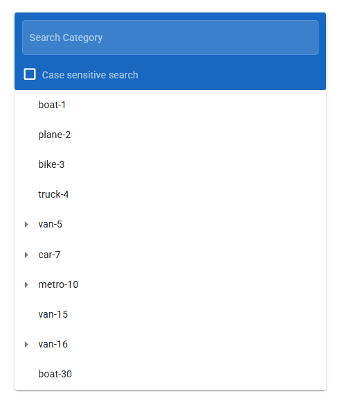
When performing searches on a Treeview component with a large dataset, loading all data directly into the Treeview can cause performance issues. Therefore, only a small initial dataset is displayed, while the full dataset is stored. When the user searches, filtering is performed with a debounce, and matching nodes are set to the Treeview. Parent nodes are expanded only if their children match. These practices keep searches fast and efficient. It can be applied to the component by following the steps below;
- When the page first loads, the Treeview is provided with only a small dataset (initialData) for fast rendering. The full dataset (fullData) is set in the store*, and searching and filtering are performed using this data.
EndRender
// The full tree data and the initial subset are set in the store
quick.store.set("treeFullData", fullData);
quick.store.set("treeInitialData", initialData);
// The Treeview component's items are set to the initial subset
components.myTreeview.items = initialData;
When the user types into the TextField, the filtering process runs with a 300ms debounce.
If the input value has 3 or more characters, the entire dataset (treeFullData) is filtered.
Matching nodes are set to the Treeview, and if there are matching children, parent nodes are automatically expanded (openIds).
If no matches are found, or the input is less than 3 characters, the Treeview displays the initial data (initialData).
Input(value)
function onInput(value, caseSensitive) {
  const comp = components.myTreeview as any;
  const searchValueRaw = (value || "").trim();
  clearTimeout(comp._debounceTimeout);
  comp._debounceTimeout = setTimeout(() => {
    const allData = quick.store.get("treeFullData") || [];
    const initial = quick.store.get("treeInitialData") || [];
    if (searchValueRaw.length >= 5) {
      const openIds = [];
      const filtered = filterTreeWithOpenIds(allData, searchValueRaw, caseSensitive, openIds);
      if (filtered.length > 0) {
        comp.items = filtered;
        comp.open = openIds;
      } else {
        comp.items = caseSensitive ? initial : [];
        comp.open = [];
        comp.search = "";
      }
    } else {
      comp.items = initial;
      comp.open = [];
      comp.search = "";
    }
  }, 300);
}
Samples Qjson
treeviewtreeview2
TreeViewExample