Textarea
Textarea components are used for collecting large amounts of textual data.
Props
| Name | Description | Type | Default |
|---|---|---|---|
| appendIcon | Appends an icon to the component, uses the same syntax as Icon. | string | undefined |
| autoGrow | Automatically grow the textarea depending on amount of text. | boolean | false |
| autoFocus | Enables autofocus. | string | '$Clear' |
| class | Prop that determines the class to add to the Textarea. | string | undefined |
| clearIcon | Applied when using clearable and the input is dirty. | boolean | false |
| clearable | Add input clear functionality, default icon is Material Design Icons mdi-clear. | boolean | false |
| counter | Creates counter for input length; if no number is specified, it defaults to 25. Does not apply any validation. | boolean|Number|string | undefined . |
| compareValue | QLegend is used for comparison values. You can look at the QLegend document. | string | undefined |
| compareText | QLegend is used for comparison values. You can look at the QLegend document. | string | undefined |
| compareTableValue | QLegend is used for comparison values. You can look at the QLegend document. | string | undefined |
| counterValue | function | null | - |
| dark | Applies the dark theme variant to the component. This will default the components color to white unless you’ve configured your application theme to dark or if you are using the color prop on the component. You can find more information on the Material Design documentation for dark themes. | boolean | false |
| disabled | Disable the input. | boolean | false |
| error | Puts the input in a manual error state. | boolean | false |
| errorCount | The total number of errors that should display at once. | number|string | 1 |
| errorMessages | Puts the input in an error state and passes through custom error messages. Will be combined with any validations that occur from the rules prop. This field will not trigger validation. | string|array | [] |
| hideDetails | Hides hint and validation errors. When set to auto messages will be rendered only if there’s a message (hint, error message, counter value etc) to display. | boolean|string | undefined |
| hint | Hint text. | string | undefined |
| label | Sets input label. | string | undefined |
| format | It is used to format the entered values. You can find more detailed information here. | string | undefined |
| loading | Displays linear progress bar. Can either be a string which specifies which color is applied to the progress bar (any material color or theme color - primary, secondary, success, info, warning, error) or a boolean which uses the component color (set by color prop - if it’s supported by the component) or the primary color. | boolean|string | false |
| noResize | Remove resize handle. | boolean | false |
| persistentHint | Forces hint to always be visible. | boolean | false |
| placeholder | Sets the input’s placeholder text. | string | undefined |
| prefix | Displays prefix text. | string | undefined |
| prependInnerIcon | Prepends an icon to the component, uses the same syntax as Icon. | string | undefined |
| preventPaste | Prevents copy-pasting of data. | boolean | false |
| readonly | Puts input in readonly state. | boolean | false |
| rows | Default row count | Number|string | 5 |
| rules | Accepts a mixed array of types function, boolean and string. Functions pass an input value as an argument and must return either true / false or a string containing an error message. The input field will enter an error state if a function returns (or any value in the array contains) false or is a string. | Array | [] |
| solo | Changes the style of the input. | boolean | false |
| soloInverted | Reduces element opacity until focused. | boolean | false |
| success | Puts the input in a manual success state. | boolean | false |
| successMessages | Puts the input in a success state and passes through custom success messages. | string|Array | [] |
| suffix | Sets input type. | string | 'Text' |
| tabindex | Allows component to give and receive focus. | number | undefined |
| validateOnBlur | Delays validation until blur even. | boolean | false t |
| value | The input’s value. | any | undefined |
| visible | Visibility of TextArea component. | boolean | true |
Events
| Name | Description | Type |
|---|---|---|
| blur | Emitted when the input is blurred. | event |
| change | Emitted when the input is changed by user interaction | any |
| click | Emitted when input is clicked | Mouseevent |
| click:append | Emitted when appended icon is clicked | event |
| click:append-outer | Emitted when appended outer icon is clicked | event |
| click:clear | Emitted when clearable icon clicked | event |
| click:prepend | Emitted when prepended icon is clicked | event |
| click:prepend-inner | Emitted when prepended inner icon is clicked | event |
| focus | Emitted when component is focused | event |
| input | The updated bound model | Any |
| keydown | Emitted when any key is pressed | KeyboardEvent |
| mousedown | Emitted when click is pressed | MouseEvent |
| mouseup | Emitted when click is released | MouseEvent |
| update:error | The error.sync event. | boolean |
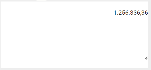
Number Format Usage
The following format options can be used to format the ‘number’ values. However, if groupseperator and radixpoint are set with the use as default option in the settings of the application, these values you set will be invalid.
Drag and Drop Textarea component
Set format prop 'number'
Set formatValues prop with needed format options
Example Setting FormatValues
{'alias'='decimal','groupSeparator'='.','radixPoint'=',','digits'=2,'enforceDigitsOnBlur'=true}
Number Format Options
| Options | Values | Description | Type |
|---|---|---|---|
| alias | numeric, currency, decimal, integer, percentage | The defaults are those defined in the base numeric alias. The currency alias and others are derived from the numeric alias and can have other defaults. | string |
| digits | The value can be a number, *, or a quantifier syntax like 2,4 When the quantifier syntax is used, the digitsOptional option is ignored | number | |
| digitsOptional | true,false | Specify wheter the digits are optional. Default: true | boolean |
| enforceDigitsOnBlur | true,false | Enforces the decimal part when leaving the input field. Default: false | boolean |
| radixPoint | Digit sembols .default: "." | string | |
| groupSeparator | thousand seperator sembols. default: "" | string | |
| allowMinus | true,false | Allow to enter -.Default: true | boolean |
| prefix | Define a prefix.Default: "" | string | |
| suffix | Define a suffix.Default: "" | string | |
| min | Minimum value.Default: undefined | number | |
| max | Maximum value.Default: undefined | number | |
| shortcuts | Define shortcuts. This will allow typing 1k => 1000, 2m => 2000000. To disable just pass null Default: {k: "000", m: "000000"} | {k: number, m: number } | |
| rightAlign | default: true | Align the input to the right | boolean |
Quick Number Format Options
| Options | Values | Description | Type |
|---|---|---|---|
| quick | true,false | To use the quickInputFormat library, which was developed due to formatting and performance problems in the inputmask library. | boolean |
| alias | numeric, currency, decimal, integer, percentage | The defaults are those defined in the base numeric alias. The currency alias and others are derived from the numeric alias and can have other defaults. | string |
| digits | The value can be a number, *, or a quantifier syntax like 2,4 When the quantifier syntax is used, the digitsOptional option is ignored | number | |
| digitsOptional | true,false | Specify wheter the digits are optional. Default: true | boolean |
| enforceDigitsOnBlur | true,false | Enforces the decimal part when leaving the input field. Default: false | boolean |
| radixPoint | Digit sembols .default: "." | string | |
| groupSeparator | thousand seperator sembols. default: "" | string | |
| allowMinus | true,false | Allow to enter -.Default: true | boolean |
| min | Minimum value.Default: undefined | number | |
| max | Maximum value.Default: undefined | number | |
| rightAlign | default: true | Align the input to the right | boolean |
BigDecimal Format Usage
The following format options can be used to format the ‘bigdecimal’ values. However, if groupseperator and radixpoint are set with the use as default option in the settings of the application, these values you set will be invalid.
BigDecimal Format Options
| Options | Values | Description | Type |
|---|---|---|---|
| digits | fractional digits count | number | |
| radixPoint | Digit sembols .default: "." | string | |
| groupSeparator | thousand seperator sembols. default: "" | string | |
| integerDigits | integer digits count | number |
BigDecimal Format Usage
Drag and Drop TextField component
Set format prop 'bigdecimal'
Set formatValues prop with needed format options
Example Setting FormatValues
{'groupSeparator'='.','radixPoint'=',','digits'=2,'integerDigits'=16}
Regex Format Usage
- Drag and Drop Textarea component.
- Set format prop 'regex'.
- Set formatValues prop with regex value.
Alert: "\" character must be used before "{". Ex: [0-9]{2}[A-Z]{24} must be [0-9]\{2}[A-Z]\{24}
Example Setting FortmatValues
{'regex' = '[0-9]\{2}[A-Z]\{24}'}
{regex = '[0-9]\{1,15}(,[0-9]\{1,15})*'}
Formatted Component Value
To get input value from the component, use the getUnmaskedValue method
let compValue = components.{{compQID}}.getUnmaskedValue()