Data Table
You can use the datatable component for displaying tabular data. Features include sorting, searching, pagination, inline-editing, and row selection.
Props
| Name | Description | Type | Default |
|---|---|---|---|
| calculateWidths | Enables to calculate of column widths. widths property will be available in select scoped slots. | boolean | false |
| caption | Sets the caption. | string | undefined |
| class | Prop that determines the class to add to the Datatable. | string | undefined |
| customFilter | Function to filter items. | function | defaultFilter |
| customSort | Function used to sort items. | function | defaultFilter |
| customGroup | Function used to group items. | function | sortItems |
| CompareDataField | QLegend is used for comparison values. You can look at the QLegend document. | string | undefined |
| compareValue | QLegend is used for comparison values. You can look at the QLegend document. | string | undefined |
| dark | Applies the dark theme variant to the component. You can find more information on the Material Design documentation for dark themes. | boolean | false |
| disableFiltering | Disables filtering completely. | boolean | false |
| disablePagination | Disables pagination completely. | boolean | false |
| disableSort | Disables sorting completely. | boolean | false |
| expandIcon | Icon used for expanding the toggle button. | string | '$expand' |
| expanded | Array of expanded items. Can be used with .sync modifier. | array | [] |
| fixedHeader | Fixed header to top of table. NOTE: Does not work in IE11 | boolean | false |
| footerProps | See the data-footer API for more information. | object | undefined |
| groupBy | Changes which item property should be used for grouping items. Currently only supports a single grouping in the format: group or ['group']. When using an array, only the first element is considered. Can be used with .sync modifier. | string - array | [] |
| groupDesc | Changes which item property should be used for grouping items. Currently only supports a single grouping in the format: group or ['group']. | boolean - array | [] . |
| headerProps | Pass props to the default header. See data-table-header API for more information. | object | undefined |
| headers | Array of objects that each describe a header column. See the example below for a definition of all properties. | DataTableHeader[] | [] |
| headersLength | Can be used in combination with hide-default-header to specify the number of columns in the table to allow expansion rows and loading bar to function properly. | number | undefined |
| height | Sets an explicit height of table. | number - string | undefined |
| hideDefaultFooter | Hides default footer. | boolean | false |
| itemClass | Property on supplied items that contains item’s row class or function that takes an item as an argument and returns the class of corresponding row. | string - function | |
| itemKey | The property on each item that is used as a unique key. | string | 'id' |
| items | Array of items to display. | array | [] |
| itemsPerPage | Changes how many items per page should be visible. Can be used with .sync modifier. Setting this prop to -1 will display all items on the page. | number | 10 |
| loaderHeight | Specifies the height of the loader. | number - string | 4 |
| loading | If true and no items are provided, then a loading text will be shown. | boolean - string | false |
| loadingText | Text shown when loading is true and no items are provided. | ||
| locale | Sets the locale used for sorting. This is passed into Intl.Collator() in the default customSort function. | string | '$vuetify.dataIterator.loadingText' |
| mobileBreakpoint | Used to set when to toggle between regular table and mobile view. | number - string | 600 |
| multiSort | If true then one can sort on multiple properties | multi-sort. | false |
| mustSort | If true, one can not disable sorting, it will always switch between ascending and descending. | boolean | false |
| noDataText | Text shown when no items are provided to the component. | string | '$vuetify.noDataText' |
| noResultsText | Text shown when search prop is used and there are no results. | string | '$vuetify.dataIterator.noResultsText' |
| options | DataOptions. | {} | - |
| page | The current displayed page number (1-indexed). | number | 1 |
| search | Text input used to filter items. | string | undefined |
| selectableKey | The property on each item that is used to determine if it is selectable or not. | string | string |
| serverItemsLength | Used only when data is provided by a server. Should be set to the total amount of items available on server so that pagination works correctly. | number | -1 |
| showExpand | Shows the expand toggle in default rows. | boolean | false |
| showGroupBy | Shows the group by toggle in the header and enables grouped rows. | boolean | false |
| showSelect | Shows the selected checkboxes in both the header and rows (if using default rows). | boolean | false |
| singleExpand | Changes expansion mode to single expand. | boolean | false |
| singleSelect | Changes selection mode to single select. | boolean | false |
| sortBy | Changes which item property (or properties) should be used for sort order. Can be used with .sync modifier. | string - array | undefined |
| sortDesc | Changes which direction sorting is done. Can be used with .sync modifier. | string - boolean | undefined |
| uniqueSlots | Makes the ID of the component used in a cell unique. The ID of the new component is: "compID" + "q" + "itemKey". | boolean | false |
| tabindex | It determines the order of switching from one component to another with the tab key. | string | undefined |
| value | Used for controlling selected rows. | array | [] |
| visible | Visibility of Datatable component. | boolean | true |
Events
| Name | Description | Params |
|---|---|---|
| click:row | Emits when a table row is clicked. | index:any, row:IVDataTableClickRow |
| dblclick:row | Emits when a table row is double clicked. | mouseEvent:MouseEvent, row:IVDataTableClickRow |
| item-selected | Event emitted when an item is selected or deselected | rowObj:IVDataTableItemSelect |
| update:items-per-page | Emits when the items-per-page property of the options prop is updated | number:Number |
| update:options | Emits when one of the options properties is updated | updateOptions:IVDataTableUpdateOptions |
| page-count | Emits when the pageCount property of the pagination prop is updated | number:Number |
| item-expanded | Event emitted when an item is expanded or closed | rowObj:IVDataTableItemSelect |
| update:expanded | The .sync event for expanded prop | value:any[] |
| pagination | Emits when something changed to the pagination which can be provided via the pagination prop | value:IVDataTablePagination |
| toggle-select-all | Emits when the select-all checkbox in table header is clicked. This checkbox is enabled by the show-select prop | value:IVDataTableSelectAll |
The usage of some props in the feature table above is as follows:
Custom Filter Prop Syntax
(value: any, search: string | null, item: any) => boolean
Custom-Group Prop Syntax
(items: any[], groupBy: string[], groupDesc: boolean[]) => Record<string, any[]>
Custom-Sort Prop Syntax
(items: any[], sortBy: string[], sortDesc: boolean[], locale: string, customSorters?: Record<string, compareFn>) => any[]
Headers Prop Syntax
    {
      text: string,
      value: string,
      align?: 'start' | 'center' | 'end',
      sortable?: boolean,
      filterable?: boolean,
      groupable?: boolean,
      divider?: boolean,
      class?: string | string[],
      cellClass?: string | string[],
      width?: string | number,
      filter?: (value: any, search: string, item: any) => boolean,
      sort?: (a: any, b: any) => number
    }
Options Prop Syntax
    {
      page: number,
      itemsPerPage: number,
      sortBy: string[],
      sortDesc: boolean[],
      groupBy: string[],
      groupDesc: boolean[],
      multiSort: boolean,
      mustSort: boolean
    }
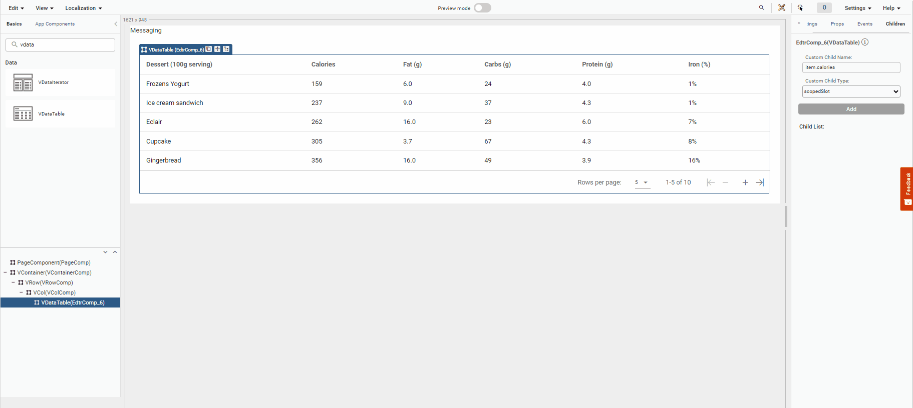
How to Add a Datatable Component Child?
- In order to create a child element in the Datatable component, you need to open the children tab in the right menu of the UI Editor.
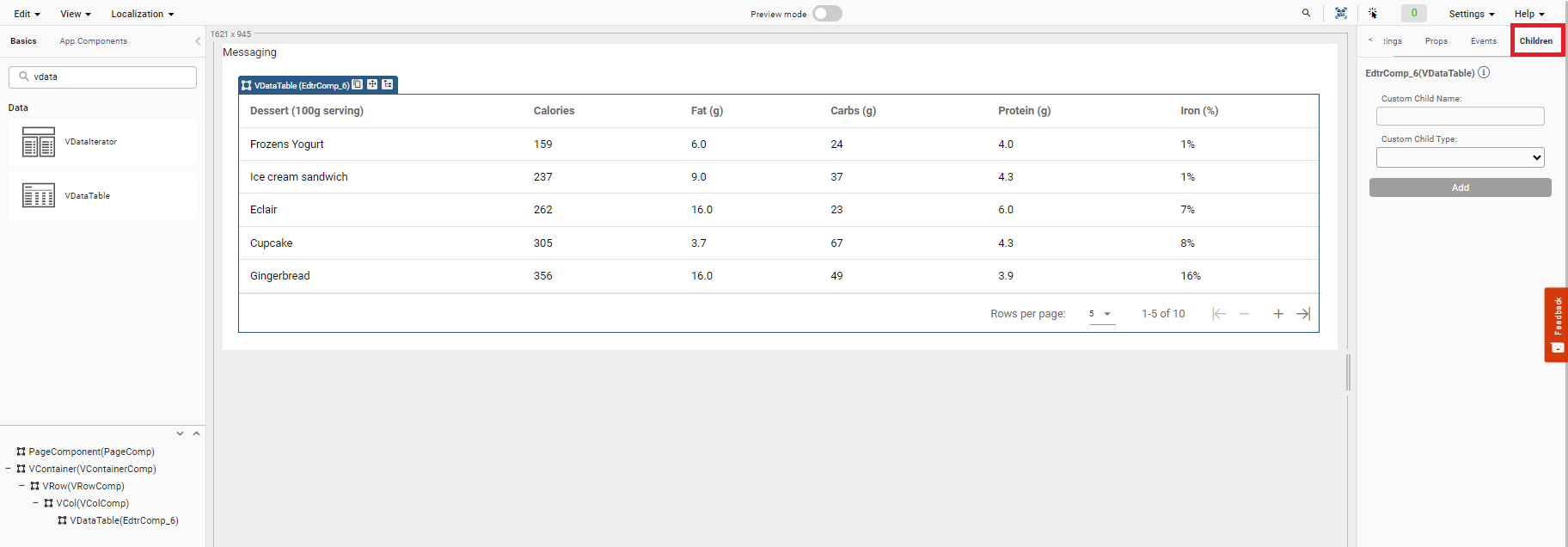
- In the Custom Child Name field, you can enter the slot names located at the Datatable Slots.
- You can select the Custom Child Type field child, slot or scopedSlot in the dropdown according to your needs.
Example:
Custom Child Name
item.caloriesCustom Child Type
scopedSlot
- You can drag a component that you want to the ghost that occurs in the datatable component.
Component Samples
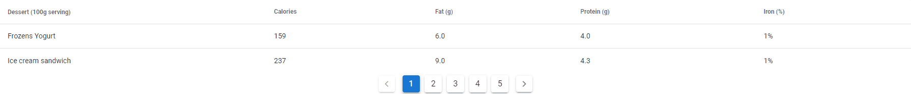
Custom Search Filter
When filtering the search in a datatable, you need to use a special search filter to filter without Decoupling the TR and the EN characters. For this, you can review the headers prop at the Vuetify — A Material Design Framework for Vue.js.
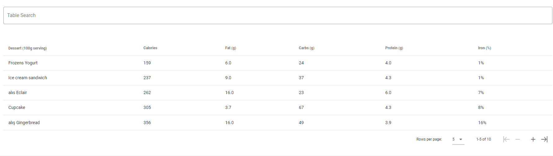
To create the example found in the gif above:
- For the fields that are requested to be filtered in the prop header, 'filterable= true', is done.
Datatable Headers Prop
[{ text = 'Dessert (100g serving)', align= 'start', sortable= false, value= 'name', filterable= true},
{ text = 'Calories', value= 'calories', sortable = true, filterable= false },
{ text = 'Fat (g)', value= 'fat' , filterable= false},
{ text = 'Carbs (g)', value= 'carbs' , filterable= false},
{ text = 'Protein (g)', value= 'protein', filterable= false },
{ text = 'Iron (%)', value= 'iron', filterable= false }]
- In the PageComponent's postRender event on the page, a custom function for filtering is defined for each of the DataTable's headers.
Page Component PostRender Event
(<any[]>components.myDataTable.headers).forEach(item => {
    item.filter = function (value, search, item) {
        let result = turkishCharacterToEnglish(value).indexOf(turkishCharacterToEnglish(search)) > -1;
        return result;

    }
});


function turkishCharacterToEnglish(text: string) {
    let turkishChars = ['ı', 'ğ', 'İ', 'Ğ', 'ç', 'Ç', 'ş', 'Ş', 'ö', 'Ö', 'ü', 'Ü'];
    let englishChars = ['i', 'g', 'I', 'G', 'c', 'C', 's', 'S', 'o', 'O', 'u', 'U'];

    // Match chars
    for (let i = 0; i < turkishChars.length; i++)
        text = text.replace(turkishChars[i], englishChars[i]);

    return text;
}
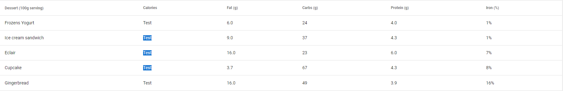
Custom Sort
When sorting in a datatable, customSort method that lets you override the default sorting logic. By default, Vuetify sorts strings alphabetically and numbers numerically, but sometimes you need more control (e.g., sorting dates, localized strings, or custom objects).
To create the example found in the gif above:
- For the fields that are requested to be sorted in the prop header, 'sortable= true', is done.
Datatable Headers Prop
[{ text = 'Dessert (100g serving)', align= 'start', sortable= false, value= 'name'},
{ text = 'Calories', value= 'calories', sortable = true },
{ text = 'Fat (g)', value= 'fat' },
{ text = 'Carbs (g)', value= 'carbs' },
{ text = 'Protein (g)', value= 'protein' },
{ text = 'Iron (%)', value= 'iron' }]
- In the PageComponent's postRender event on the page, a custom function for sorting is defined for each of the DataTable's headers.
Page Component PostRender Event
components.myDataTable.items =
    [{ name: 'Frozens Yogurt', calories: "26/01/2024", fat: '6.0', carbs: 24, protein: '4.0', iron: '1%' },
    { name: 'Ice cream sandwich', calories: "08/01/2024", fat: '9.0', carbs: 37, protein: '4.3', iron: '1%' },
    { name: 'Eclair', calories: "01/01/2023", fat: '16.0', carbs: 23, protein: '6.0', iron: '7%' },
    { name: 'Cupcake', calories: "05/01/2023", fat: '3.7', carbs: 67, protein: '4.3', iron: '8%' },
    { name: 'Gingerbread', calories: "01/09/2023", fat: '16.0', carbs: 49, protein: '3.9', iron: '16%' },
    { name: 'Jelly bean', calories: "01/08/2023", fat: '0.0', carbs: 94, protein: '0.0', iron: '0%' },
    { name: 'Lollipop', calories: "01/07/2023", fat: '0.2', carbs: 98, protein: '0.0', iron: '2 %' },
    { name: 'Honeycomb', calories: "01/03/2023", fat: '3.2', carbs: 87, protein: '6.5', iron: '45%' },
    { name: 'Donut', calories: "01/02/2023", fat: '25.0', carbs: 51, protein: '4.9', iron: '22%' },
    { name: 'KitKat', calories: "01/09/2023", fat: '26.0', carbs: 65, protein: '7', iron: '6 %' }];


(<any>components.myDataTable).customSort = customSort;


function customSort(items, index, isDesc) {

    let dateFormat = "dd/MM/YYYY";
    items.sort((a, b) => {
        if (index[0] == 'calories') {
            if (!isDesc[0]) {
                return <any>quick.Quick.toDate(a[index], dateFormat) - <any>quick.Quick.toDate(b[index], dateFormat)
            } else {
                return <any>quick.Quick.toDate(b[index], dateFormat) - <any>quick.Quick.toDate(a[index], dateFormat);
            }
        }
        else if (index[0] == "carbs") {
            if (!isDesc[0]) {
                return parseInt(b[index]) - parseInt(a[index]);
            } else {
                return parseInt(a[index]) - parseInt(b[index]);
            }
        }
        else {
            if (typeof a[index] !== 'undefined') {
                if (!isDesc[0]) {
                    return a[index].toLocaleLowerCase('tr').localeCompare(b[index].toLocaleLowerCase('tr'));
                }
                else {
                    return b[index].toLocaleLowerCase('tr').localeCompare(a[index].toLocaleLowerCase('tr'));
                }
            }
        }
    });
    return items;
}
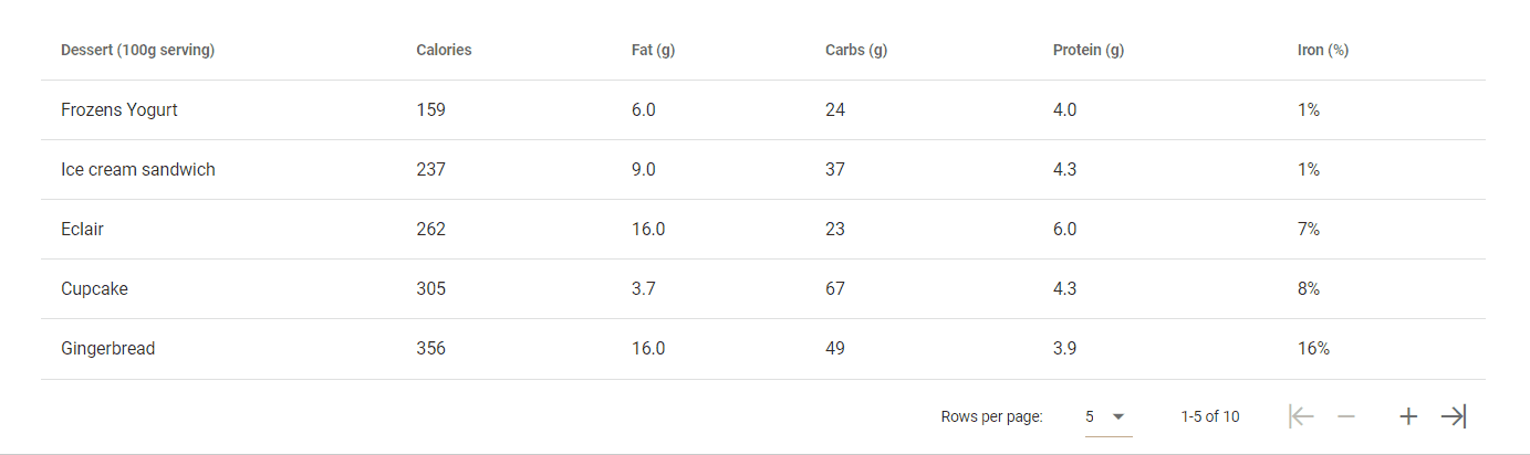
DataTable Search in Rows
- Add a DataTable and a vTextField component to your page to be able to search in a table.
- Give the name ('QID') of the DataTable components
Example: datatable = 'Mydatatable'
- Set the headers and items props to fill the table

Headers prop
[{ text = 'Dessert (100g serving)', align= 'start', sortable= false, value= 'name'},
{ text = 'Calories', value= 'calories', sortable = true },
{ text = 'Fat (g)', value= 'fat' },
{ text = 'Carbs (g)', value= 'carbs' },
{ text = 'Protein (g)', value= 'protein' },
{ text = 'Iron (%)', value= 'iron' }]
Items prop
[{name = 'Frozen Yogurt', calories = 159, fat = '6.0', carbs = 24, protein = '4.0', iron = '1%'},
{name = 'Ice cream sandwich', calories = 237, fat = '9.0', carbs = 37, protein = '4.3', iron = '1%'},
{name = 'Eclair', calories = 262, fat = '16.0', carbs = 23, protein = '6.0', iron = '7%'}]
- To search for items in the created table, in the Input event of the vTextField component; set each character entered into the textfield to the Datatable's search prop.
VtextField Input Event
components.MyDatatable.search=value
For more detailed information, you can review the Table_Search example.
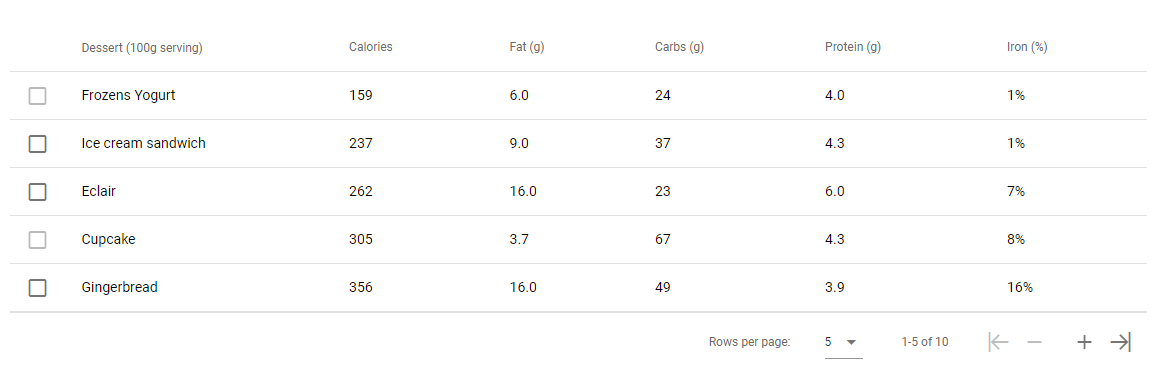
DataTable Select Items
To create the example below:
- Create a datatable and give it a name (QID) myTable
- The showSelect prop is set to true to show the selected checkboxes in both the header and the rows.
- Selected item(rowObj) event is triggered when you select or deselect an item. You can print it to the console in the event to try it out.

quick.EM.trace(rowObj.item)
- You can keep the selected datatable items in the form of objects or arrays.
//Selected Objects

    quick.EM.trace((<any>components.myTable).selection)

//Selected object array

    let selectedItems = []
    Object.keys((<any>components.myTable).selection).forEach(item =>{
    selectedItems.push((<any>components.myTable).selection[item])
    });
    quick.EM.trace(selectedItems);
DataTable Set Item Select
In the Datatable component:
- you need to set the showSelect prop true to use the select check boxes in both the header and rows.
- you need to set the itemkey prop to used as a unique key.
Set item select
let setItems =
    [{ name: 'Frozens Yogurt', calories: 159, fat: '6.0', carbs: 24, protein: '4.0', iron: '1%' },
    { name: 'Ice cream sandwich', calories: 237, fat: '9.0', carbs: 37, protein: '4.3', iron: '1%' },
    { name: 'Eclair', calories: 262, fat: '16.0', carbs: 23, protein: '6.0', iron: '7%' },
    { name: 'Cupcake', calories: 305, fat: '3.7', carbs: 67, protein: '4.3', iron: '8%' }];

setItems.forEach(item => {

    (<any>components.myTable).select(item);

});
Get selection items
let selectionList =(<any>components.myTable).selection;
DataTable_SetItemSelect_GetSelection
DataTable Select & Unselect Item
When the Datatable select feature is available through existing props, but no prop is available for unselect, to provide the unselect feature, assign a class to each row's selections when the conditions for unselecting are met. This class distinguishes the unselected selection from others and can be styled with CSS to disable it.
To use the Datatable unselect feature, the following steps should be taken:
- In the props of the Datatable:
- Set the showSelect prop to true.
- Set the SingleSelect prop to true.
- Set the itemKey prop to enable the select feature.
With the props set up to this point, you can use the Datatable select feature.
- In the PostRender event of the PageComponent, set the class for the situations where the unselect feature is desired.
components.myDatatable.itemClass = (item) => {
    const unselectedItems = ["Frozens Yogurt", "Cupcake"];
    if (unselectedItems.indexOf(item.name) !== -1) {
         return "unSelected";
        } return ""; // If you want to return a different class, you can adjust this accordingly.
}
- CSS is applied to the unselect class added to disable the checkboxes.
.unSelected .v-data-table__checkbox {
    pointer-events: none;
    opacity: 0.5;
}
DataTable Add & Delete Item
To add a row to the Datatable, use the following code block wherever or under whatever condition you want to add it:
let index = quick.store.get('tableIndex') ?? -1;
index++;
quick.store.set('tableIndex', index);
let newItem = {addNumber:'', deleteIcon:index};
let copy = quick.Quick.copy(components.datatable.items);
copy.push(newItem);
components.datatable.items = copy;
- To delete a row in the Datatable:
- Set the uniqueSlot prop to true.
- Set the itemKey prop.
- Add a delete button as a slot.
- In the click event of the delete button, use the following code to delete the row:
If you are not familiar with the use of Unique Slot and slot, you can find information under the headings How to Add a Datatable Component Child and DataTable Slot Instances on the current page.
declare let item;
let newItems =components.datatable.items.filter(tableItem =>{ return tableItem.deleteIcon != item.deleteIcon} );
components.datatable.items= newItems;
quick.Quick.updateComponent(components.datatable);
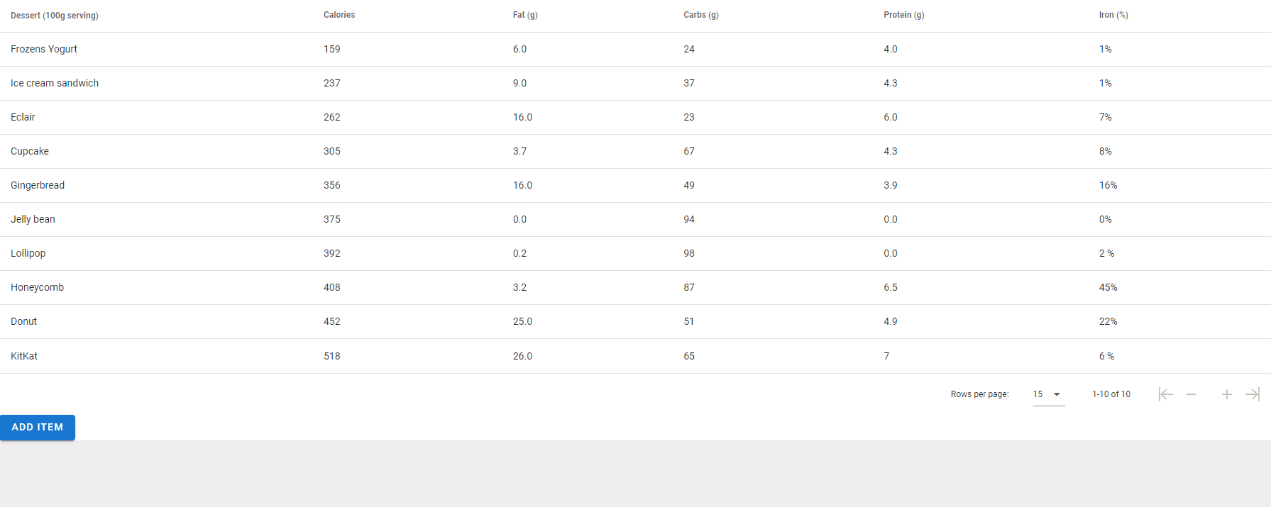
DataTable Server Side Pagination
You can use Server-side pagination in the Datatable Component. Serverside pagination is a method used to process large data sets more effectively. Data is retrieved in pages and only the data that the user needs is presented. This improves performance and prevents unnecessary data transfer.
- If you want to use serverside pagination in the datatable component, you need to add the Vpagination component to the page. You can see this event in the input event of the Vpagination component.
How to Create an Example for Serverside Pagination?
- Define an array name. This array can include the name of the dishes, their calories, fat content, amount of carbohydrates, protein and iron content.
- Using the page number (for example, number) received from the user, it is calculated which data items to retrieve. Since indexing starts from 1, index = number - 1.
- Then, arrayIndex is calculated. This determines the starting index of the corresponding page in the data array.
Example: For page 2, arrayIndex = 2 * 2 = 4.
- A new array named b is created and data items from the relevant page are added to this array. The first data item is taken as a[arrayIndex] and the second data item as a[arrayIndex + 1].
components.EdtrComp_1.qValue=number
components.EdtrComp_2.page=number

//This array can be taken from a service
let a=[{name : 'Frozens Yogurt', calories : 159, fat : '6.0', carbs : 24, protein : '4.0', iron : '1%'},
{name : 'Ice cream sandwich', calories : 237, fat : '9.0', carbs : 37, protein : '4.3', iron : '1%'},
{name : 'Eclair', calories : 262, fat : '16.0', carbs : 23, protein : '6.0', iron : '7%'},
{name : 'Cupcake', calories : 305, fat : '3.7', carbs : 67, protein : '4.3', iron : '8%'},
{name : 'Gingerbread',calories : 356, fat : '16.0', carbs : 49, protein : '3.9', iron : '16%'},
{name : 'Jelly bean', calories : 375,  fat : '0.0', carbs : 94, protein : '0.0', iron : '0%'},
{name : 'Lollipop', calories : 392, fat : '0.2', carbs : 98, protein : '0.0', iron : '2 %'},
{name : 'Honeycomb', calories : 408, fat : '3.2', carbs : 87, protein : '6.5', iron : '45%'},
{name : 'Donut', calories : 452, fat : '25.0', carbs : 51, protein : '4.9', iron : '22%'},
{name : 'KitKat', calories : 518, fat : '26.0', carbs : 65, protein : '7', iron:  '6 %'}]

let index = number - 1
let arrayIndex = index * 2

let b=[]

b.push(a[arrayIndex])
b.push(a[arrayIndex + 1])
components.EdtrComp_2.items=b
DataTable Row Expand Opens New VTable
You can use TableCell to show a new DataTable for each expanded row in a DataTable.
For more detailed information, you can take a look at the TableCell Document.

DataTable Row Expand with Treeview Structure
You can use TableCell to show a new DataTable for each expanded row in a DataTable.
For more detailed information, you can take a look at our TableCell Document.

DataTable Cell Template
You can use different components by adding child elements to the rows in the Datatable component.
- After dragging the Datatable component to the screen, you need to create a child on the children tab in the menu on the right.
Datatable Children Tab
Custom Child Name
item.caloriesCustom Child Type
scopedSlot
- In the class prop of the Text component, you can write conditions to the component.
Example:
- If the protein item from the datatable's items is larger than 4.2, write a code that adds the primary class to the label in the Text component's class prop.
    if(Number.parse(item.protein) > Number.parse('4.2'))
    {
    'primary'
    }
- This is the code,'item.protein it compares the value of a variable called protein with the number 4.2. If 'item.if the value of the 'protein' variable is greater than 4.2, it gives the 'primary' class to the label as a result.
DataTable Cell Component Access
You can access the selected item and its properties from the item-selected event of the DataTable.
- In the Datatable component, you need to set the showSelect prop true to use the select check boxes in both the header and rows.
- In order to access the items in the selected check boxes, you can use the item-selected event
Datatable item-selected(rowObj) Event
    quick.EM.trace(rowObj)
    //We can print the item on the row containing the check box that we    clicked with the rowObj object to the console or perform different operations according to the scenario.
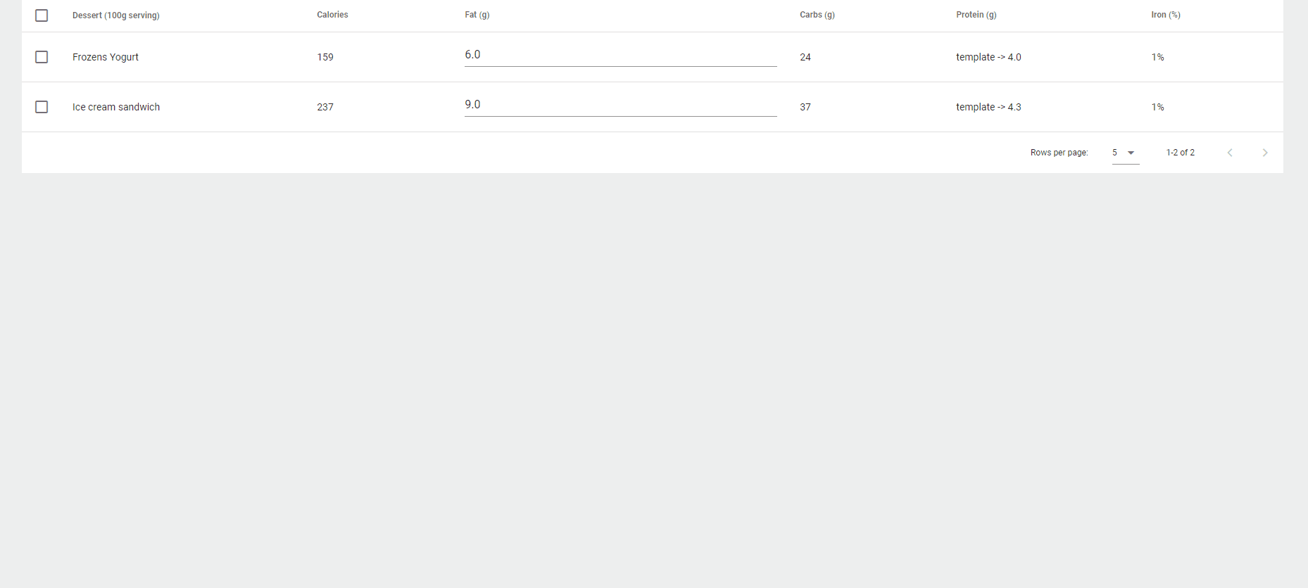
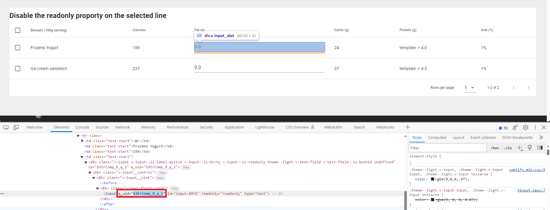
Disable the Readonly Proporty on the Selected Line
When you select check boxes in the DataTable component, the component added to the table as child can be accessed and its properties can be changed.
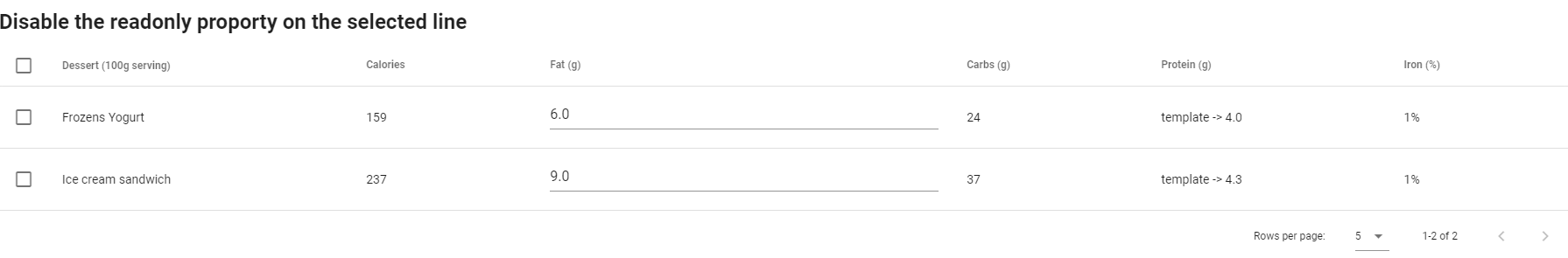
- The datatable component is created, and add the textfield component as child to this component.
- After adding child to the datatable component, in the component's items prop, uniqueID (This value gives an id to each textfield added as child) to access the Textfield components on the lines where the check boxes are located. You need to define the value. Then, you need to set this uniqueID value as a string in the itemkey prop.
Datatable items Prop
    [{name = 'Frozens Yogurt', calories = 159, fat = '6.0', carbs = 24, protein = '4.0', iron = '1%', uniqId = '1'},
    {name = 'Ice cream sandwich', calories = 237, fat = '9.0', carbs = 37, protein = '4.3', iron = '1%', uniqId = '2'}]
To use the uniqueID property, set the uniqueSlot value to true from the prop tab of the Datatable component.
When click to check one of the check boxes in Datatable, rowObj.item.selected value will return true, in order to disable the readonly property of the Textfield component, the readonly prop must return false. In the readonly prop of the Textfield component, you can provide it by writing !item.selected.
VTextField Readony prop
!item.selected
- When the check box on the line is checked or unchecked, you can use the following codes to change the read-only property of the text field.
- Assigns rowObj.value to the rowObj.item.selected property. (The rowObj.value value returns true when the checkbox is selected and false when the checkbox is unchecked.)
- A variable named tableItems is assigned the value components.EdtrComp_3.items.length. Then, the for loop returns the number in the tableItems variable (the number of data in the table).
- In each loop, if the rowObj.item.selected property is set to true and the rowObj.item.name property is set to 'Frozens Yogurt' or 'Ice cream sandwich', the components["EdtrComp8_q"+i].selected property is set to true and the loop is terminated.
Datatable item-selected Event
rowObj.item.selected = rowObj.value
quick.EM.trace(rowObj.item.selected)
let tableItems = components.EdtrComp_3.items.length
for (let i =0; i<tableItems; i++){
if (rowObj.item.selected == true && rowObj.item.name == 'Frozens Yogurt') {
    components["EdtrComp_8_q_"+i].selected=components["EdtrComp_8_q_"+i].selected

    break;
}
else if (rowObj.item.selected == true && rowObj.item.name == 'Ice cream sandwich') {
    components["EdtrComp_8_q_"+i].selected=components["EdtrComp_8_q_"+i].selected
    break;
}
}
DataTable With Combobox
You can add a combobox or another component as an item to the data table.
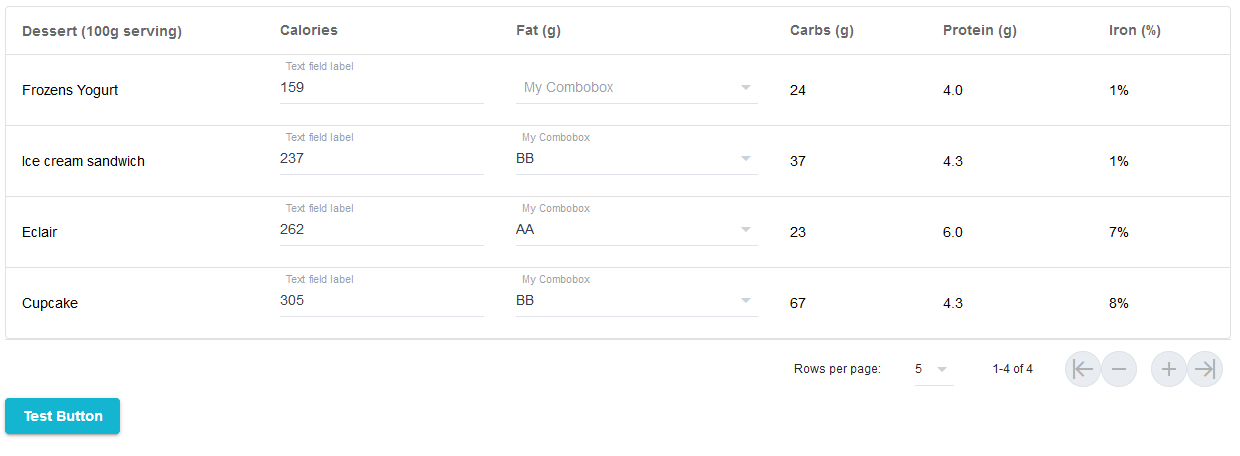
To add items to the data table, follow these steps:
- In the children tab of the datatable component, create a child with Custom Child Name: 'item.HeadersValue' and Custom Child Type: 'scopedSlot'.
Datatable Headers prop
[{ text = 'Fat (g)', value= 'fat' }]
Datatable Children Tab
Custom Child Name
item.fatCustom Child Type
scopedSlot
- You should drag the Combobox component to the ghost, which occurs under Datatable on the Treeview tab.
- To add the items of the Combobox to the Datatable items, you need to set the child to the header value that you created in the Datatable items prop.
Datatable Items prop
[{name = 'Frozens Yogurt', calories = 159, fat = [{text = 'nilay', value = 1},{ text = 'gökçe', value = 2}], carbs = 24, protein = '4.0', iron = '1%'}]
- Setting the combobox items that you have defined in Datatable in the items prop of the Combobox component. So, you will be able to see it on the dropdown of the Combobox.
Combobox Items Prop
item.fat
- Every time a selection is made in Combobox's dropdown, you can see the selection you made by printing it to the console in Combobox's change event.
quick.EM.trace(value)
DataTable with Popover Menu

Adding a child to the iron element in the table:
Datatable Headers prop
[{ text = 'Iron (%)', value= 'iron' }]
Datatable Children Tab
Custom Child Name
item.ironCustom Child Type
scopedSlot
- To add a drop-down menu as child under the header, drag the ToggleMenu component to the ghost that occurs after adding the child.
You can find more information about how to use Toggle Menu in ToggleMenu Document.
ToggleMenu_PopoverInTableDataTable with Tooltip
Adding a child to the iron element in the table:
Datatable Headers prop
[{ text = 'Iron (%)', value= 'iron' }]
Datatable Children Tab
Custom Child Name
item.ironCustom Child Type
scopedSlot
- To add a tooltip as child under the header, drag the Tooltip component to the ghost that occurs after adding child.
- In the Tooltip component added as a child element, set this value in the toolTipContent prop in order to display the value given in the Datatable's items prop.
Datatable Items prop
[{name = 'Frozens Yogurt', calories = 159, fat = '6.0', carbs = 24, protein = '4.0', iron = '1%'}]
Tooltip toolTipContent Prop
item.iron
- If you take the line of code at the top, the value given in the Datatable's items prop is %1. the %1 value is displayed in the Tooltip component.
You can find more information about how to use Tooltip in Tooltip Document.
DataTableWithTooltipDataTable Header Bold
To make Datatable headers bold, you need to define them as a class in the headers prop.

Datatable Headers prop
[{ text = 'Fat (g)', value= 'fat', class='black--text' }]
DataTable Vertical Border
To add a vertical border to the Datatable, set the Divider property true in the Datatable's headers prop.

Datatable Headers prop
[{ text = 'Calories', value= 'calories', sortable = true ,divider= true }]
DataTable Edit Row
In the datatable component, you can access the item in the row and change the values of this item.
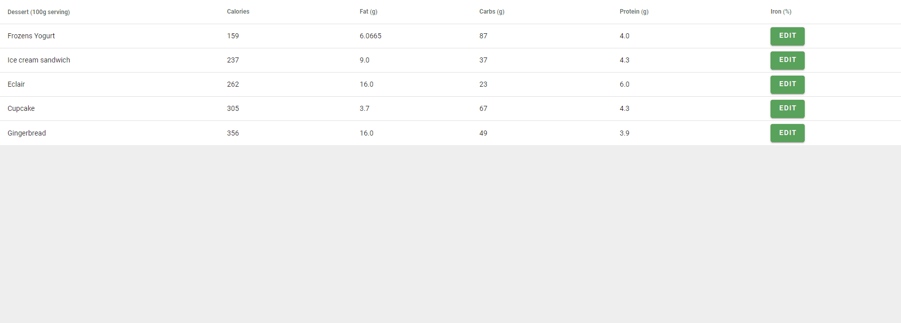
Create the example found in the gif above:
- Add Datatable and VDialog components to the screen
- Add a button as child to the Datatable component
- When the buttons in the row are clicked, to transfer the values in the row it is located in to the fields located in the dialog;
- Open the dialog box should
- Define the item object located on the Datatable in the event and create a for loop and add the item in each loop. If the uniqId value is equal to i, synchronize the Datatable component items to the fields in the dialog.
Child VBtn Click Event in Datatable
    components.EdtrComp_6.qValue=!components.EdtrComp_6.qValue
declare var item;
 for (let i =0; i<=10; i++)
 {
      if(item.uniqId ==i )
      {
           components.EdtrComp_17.qValue=components.EdtrComp_1.items[i].name
     components.EdtrComp_18.qValue=components.EdtrComp_1.items[i].calories
     components.EdtrComp_25.qValue=components.EdtrComp_1.items[i].fat
     components.EdtrComp_26.qValue=components.EdtrComp_1.items[i].carbs
     components.EdtrComp_27.qValue=components.EdtrComp_1.items[i].protein

     components.EdtrComp_17.disabled=components.EdtrComp_1.items[i].nameDisable
     components.EdtrComp_18.disabled=components.EdtrComp_1.items[i].caloriesDisable
     components.EdtrComp_25.disabled=components.EdtrComp_1.items[i].fatDisable
     components.EdtrComp_26.disabled=components.EdtrComp_1.items[i].carbsDisable
     components.EdtrComp_27.disabled=components.EdtrComp_1.items[i].proteinDisable
      }
 };
- To edit the lines in the Datatable component in the dialog, the save button located in the dialog is located behind;
- Datatable elements are passed to the MyItem variable.
- A loop is created with datatable elements, the index of the element is transferred to variable b in each loop. If the EdtrComp_17 value in the dialog box is equal to the value in the b directory of the Datatable element, the values of the fields in the dialog box are passed to the Datatable element and the dialog is closed.
VBtn Click Event in Datatable
    let myItem = components.EdtrComp_1.items
    myItem.forEach(item => {

   let b = components.EdtrComp_1.items.indexOf(item)
   if (components.EdtrComp_17.qValue==components.EdtrComp_1.items[b].name)    {
   components.EdtrComp_1.items[b].name = components.EdtrComp_17.qValue
   components.EdtrComp_1.items[b].calories = components.EdtrComp_18.qValue
   components.EdtrComp_1.items[b].fat = components.EdtrComp_25.qValue
   components.EdtrComp_1.items[b].carbs = components.EdtrComp_26.qValue
   components.EdtrComp_1.items[b].protein = components.EdtrComp_27.qValue
   }
    });

    components.EdtrComp_6.qValue = false
DataTable Format Column
You can format the added Text component as a child element in the Datatable component.

Date formatting in Text component Text Prop
Quick.toShortDate(item.date, 'DD/MM/YYYY')
Date(UI) formatting in Text component Text Prop
   dateObj = Quick.toDate(item.date) // Gets format type from ui settings.yaml (settings-proxy.js for editor) "serviceDateFormat" field
   Quick.toShortDate(dateObj) // Gets format type from ui settings.yaml (settings-proxy.js for editor) "shortDateFormat" field
Time formatting in Text component Text Prop
Quick.toShortTime(item.shortTime)Quick.toMoney(item.money)
Money formatting in Text component Text Prop
Quick.toMoney(item.money)
DataTable Add Item
To add a new item to the Datatable component:
- After adding the datatable component to the page, create a button and add a new element to the Datatable component in the click event of this button by using the codes below.
VBtn Click Event
    let newItem = {name : 'KitKat21', calories : 518, fat : '26.0', carbs : 65, protein : '7', iron:  '6 %'}
    let copy = quick.Quick.copy(components.Datatable.items)
    copy.push(newItem)
    components.Datatable.items = copy
Let's explain the code that should be written in the click event of the button;
The first line defines an object called newItem, which has properties such as name, calories, fat, carbohydrates, protein, and iron.
In the second line, quick.Quick.copy(components.Datatable.items) creates a copy of the Components.Datatable.items array.
In the third line, a new element is added to this duplicate array.
In the last line, the components.Datatable.items property is updated with the new array.
DataTable Right Fixed Actions Column
If you want to add a fixed actions column to the right in the datatable component, in the Headers prop, set the align and class properties.

Datatable Headers Prop
[{ text = 'Carbs (g)', value= 'carbs' },
{ text = 'Protein (g)', value= 'protein' },
{ text = 'Actions', value= 'action', align='center fixed', class='fixed', width= '150px'}]
DataTable Left Fixed Actions Column
If you want to add a fixed actions column to the left in the datatable component, in the Headers prop, set the align and class properties.
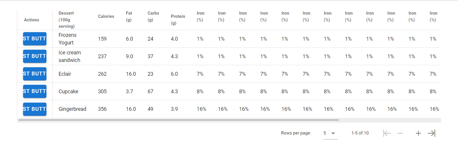
Datatable Headers Prop
[{ text = 'Actions', value= 'action', align='center fixed',class='fixed'},
{ text = 'Dessert (100g serving)', align= 'start', sortable= false, value= 'name'},
{ text = 'Calories', value= 'calories', sortable = true }]
Highlight Selected Row
- To highlight the selected row in the datatable component, it is necessary to set the singleSelect prop to true.
- To select table rows, the following code is run in datatable's click:row event.
Datatable Click:row Event
row.select(true)
DataTable Change Footer PageText

- A child with the following properties is added in the children tab of the Datatable.
Datatable Children Tab
Custom Child Name
footer.page.textCustom Child Type
scopedSlot
- After adding the child, the Text component is dragged to the ghost created.
- The desired expression is written to the text prop of the Text component.
pageStart + '-' + pageStop + '/' + itemsLength
DataTable Change Column Color
- A child with the following properties is added in the children tab of the datatable.
Datatable Children Tab
Custom Child Name
item.ironCustom Child Type
scopedSlot
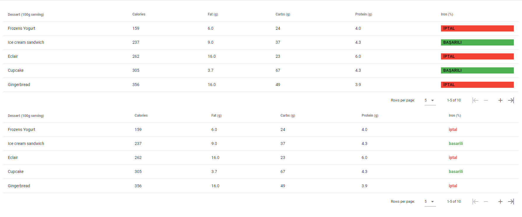
After this step, find how to create 2 different examples for coloring according to data in Datatable below:
How to Change the Color of the Cell according to the Data?
After adding a child to the Datatable, drag the VSheet component to the ghost created. Then, add the Text component to the ghost inside the VSheet component.
To color the VSheet component, you can write a condition in its class prop.
if(item.iron == 'BAŞARILI'){
'green'
}else {
'red'
}
Set the item that you'd like to see into text property of the Text Component.
item.iron
How to Change the Color of the Text component According to the Data?
After adding a child to the datatable, the Text component needs to be dragged to the created ghost.
Set the item that you'd like to see into text property of the Text Component.
item.ironTo give color to the Text component, you can write a condition in the class prop.
   if(item.iron == 'iptal') {
   'red--text'
   }else {
   'green--text'
   }
DataTable Slot Instances
To use slot component instances in the DataTable:
- Set uniqueSlots prop to true and set the itemKey prop with row objects unique fields.
- New component ids will be created as templateCompId + "q" + rowObject[itemKey] and can be accessed by new id under components field.

DataTable_uniqueSlot_itemKey_Object
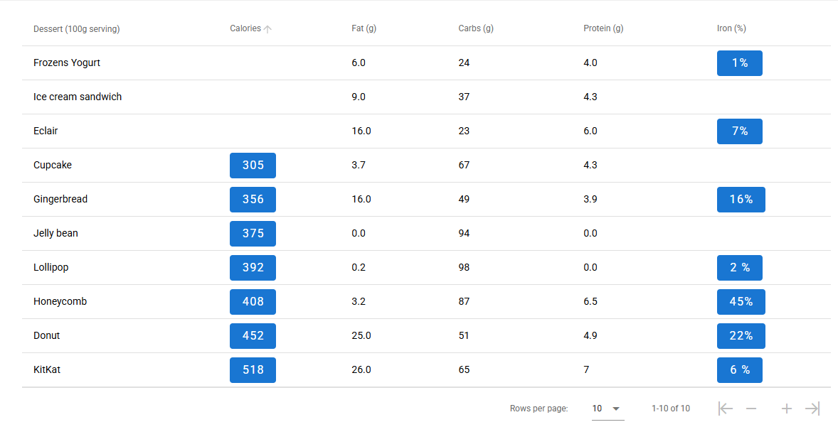
DataTable Item Aggregation (Total)
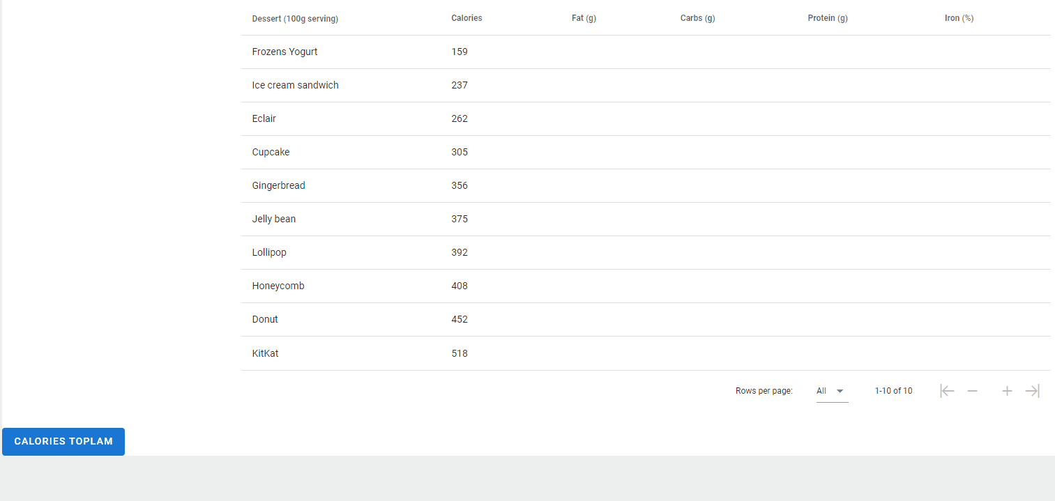
After the service call is made in Messaging, call the service event in the onLoad of a block component we created.
If it returns true, collect the items with a for loop in onServiceSuccess and complete the process by clicking the total item into the DataTable with a button you will create.
Tooltip Display of Selected Data in DataTable
- A child with the following properties is added in the children tab of the datatable.
Datatable Children Tab
Custom Child Name
item.caloriesCustom Child Type
scopedSlot
After adding a child to the Datatable, drag the ToolTip component to the ghost created. Then, add the Text component to the ghost inside the ToolTip component.
Set the item that you'd like to see into text property of the Text Component.
Custom Child Name
item.calories
- You can write a function inside click:row in the VDataTable to display the sum of the data in the ToolTip component.
Set Child Button Visible in DataTable
- A child with the following properties is added in the children tab of the datatable.
Datatable Children Tab
Custom Child Name
item.caloriesCustom Child Type
scopedSlot
Custom Child Name
item.ironCustom Child Type
scopedSlot
After adding a child to the DataTable, drag the Button component to the ghost created.
Set the item that you'd like to see into text property of the Text Component inside Button.
item.calories
item.iron
Write condition in Render prop of calories child Button
if(item.calories < 300){
false
}
else{
true
}
Write condition in Render prop of iron child Button
item.visibleIron
DataTable Range Selection with Ctrl, Single Selection, Toggle, and Sum Calculation
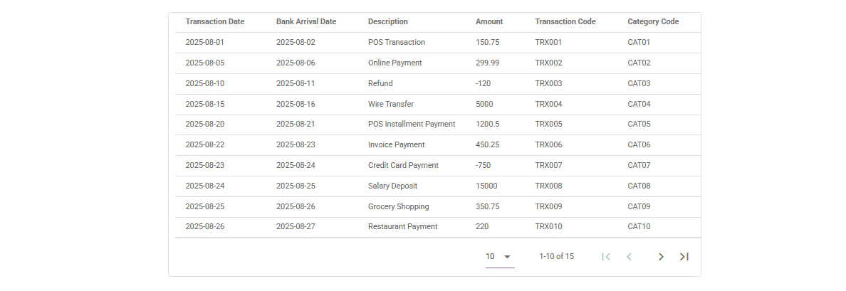
You can use the steps below to implement single-row selection, multi-row range selection with Ctrl, deselecting rows, and real-time summation of selected values in a DataTable.
- Single Click: Selects or deselects individual rows and updates the total.
- Ctrl + Click:
- If only one row is clicked: toggles selection.
- If multiple rows are selected: selects a full range from the last selected row.
- Clicking the same row again: deselects it and removes its value from the total.
- Click Outside: Clears all selections and resets the total.
Single Row Click When a user clicks a row:
- The code checks whether the row is already selected
(selectedRowIds.includes(clickedId)).
- If the row is already selected:
- The row’s ID and value are removed from selectedRowIds, selectedValues, and currentAmount.
- The row is visually deselected:
components.ledgerTable.select(row.item, false); - If this was the last selected row (lastSelectedId), it's updated to the previous one or cleared.
- If the row is not selected yet:
- The column value (amount) is parsed to a number and added to the total.
- The row’s ID and value are added to selectedRowIds and selectedValues.
- The row is visually selected:
components.ledgerTable.select(row.item, true); - The clicked row becomes the new lastSelectedId
if (isAlreadySelected) {
    // Remove from selection
    const index = selectedRowIds.indexOf(clickedId);
    selectedRowIds.splice(index, 1);
    selectedValues.splice(index, 1);
    const amountIndex = currentAmount.indexOf(amountToRemove);
    if (amountIndex !== -1) currentAmount.splice(amountIndex, 1);

    components.ledgerTable.select(row.item, false);
} else {
    // Add to selection
    const clickedAmount = parseAmount(row.item[targetColumn]);
    currentAmount.push(clickedAmount);
    selectedRowIds.push(clickedId);
    selectedValues.push(clickedAmount);
    components.ledgerTable.select(row.item, true);
    lastSelectedId = clickedId;
}
Ctrl + Click When the user Ctrl+Clicks a row:
- If there was no valid previous selection (lastSelectedId === null), it falls back to single selection.
- If lastSelectedId was deselected, the system tries to recover the most recent selection from selectedRowIds.
- Using items.findIndex(), the code locates the indices of the last selected row and the currently clicked row.
- A range between these two indices is created (start → end).
- For each item in that range:
- If the item is not already selected, it is added to:
- selectedRowIds (for ID tracking)
- selectedValues (for summation)
- currentAmount (for total)
- Visually selects the row via:
components.ledgerTable.select(item, true)
- If the item is not already selected, it is added to:
- Finally, the clicked row becomes the new lastSelectedId
if (!selectedRowIds.includes(lastSelectedId)) {
    lastSelectedId = selectedRowIds.length > 0
        ? selectedRowIds[selectedRowIds.length - 1]
        : null;
}

if (lastSelectedId !== null && clickedId !== lastSelectedId) {
    const startIndex = items.findIndex(item => item.id === lastSelectedId);
    const endIndex = items.findIndex(item => item.id === clickedId);
    const start = Math.min(startIndex, endIndex);
    const end = Math.max(startIndex, endIndex);

    for (let i = start; i <= end; i++) {
        const item = items[i];
        if (!selectedRowIds.includes(item.id)) {
            const val = parseAmount(item[targetColumn]);
            currentAmount.push(val);
            selectedRowIds.push(item.id);
            selectedValues.push(val);
            components.ledgerTable.select(item, true);
        }
    }

    lastSelectedId = clickedId;
}
Click Outside When the user clicks outside the DataTable:
- All related values are cleared from store: &tooltipStatement, &amountStatement, &lastSelectedId, etc.
- The current selection state is retrieved:
components.ledgerTable.selection;
- This object is converted into an array of selected items.
- Each selected row is deselected visually using:
components.ledgerTable.select(item, false);
- Finally, the component is updated to reflect the cleared state.
quick.store.delete('&tooltipStatement');
quick.store.delete('&amountStatement');
quick.store.delete('&lastSelectedId');
quick.store.delete('&selectedValues');
quick.store.delete('&selectedRowIds');

const selection = components.ledgerTable.selection;
const selectedItems: any[] = Object.values(selection);

for (const item of selectedItems) {
    components.ledgerTable.select(item, false);
}

quick.Quick.updateComponent(components.ledgerTable);
Recalculation and Store Update After any selection or deselection:
- The total is recalculated by summing up the currentAmount array:
- The following store keys are updated:
- &amountStatement: All selected values (raw data, not sum)
- &tooltipStatement: Computed total sum
- &selectedRowIds: List of currently selected row IDs
- &selectedValues: Column values of selected rows
- &lastSelectedId: ID of the most recently selected row
- The UI components are refreshed via:
- components.EdtrComp_65 → Shows the sum
- components.ledgerTable → Visually shows selected rows
const totalSum = currentAmount.reduce((acc, val) => acc + val, 0);

quick.store.set('&amountStatement', currentAmount);
quick.store.set('&tooltipStatement', totalSum);
quick.store.set('&selectedRowIds', selectedRowIds);
quick.store.set('&selectedValues', selectedValues);
quick.store.set('&lastSelectedId', lastSelectedId);

quick.Quick.updateComponent(components.EdtrComp_65);
quick.Quick.updateComponent(components.ledgerTable);
Samples Qjson
DataTableIconExampleDataTableSearch
DataTableAddRemoveItem
DataTableIndexExample