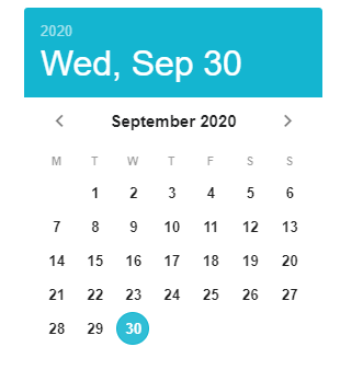
Date Picker
The DatePicker component is a fully featured date selection component that lets you select a date, or range of dates.
info
For more details about Vuetify’s usage of DatePicker component, click DatePicker page.
For more prop explanations, click Vuetify DatePicker API page.
Props
| Name | Description | Type | Default |
|---|---|---|---|
| dark | Applies the dark theme variant to the component. You can find more information on the Material Design documentation for dark themes. | boolean | false. |
| dayFormat | Allows you to customize the format of the day string that appears in the date table. Called with date (ISO 8601 date string) arguments. | function | null |
| disabled | Disables interaction with the picker. | boolean | false |
| eventColor | Sets the color for event dot. It can be string (all events will have the same color) or object where attribute is the event date and value is boolean/color/array of colors for specified date or function taking date as a parameter and returning boolean/color/array of colors for that date. | array - function - object - string | warning |
| events | Array of dates or object defining events or colors or function returning boolean/color/array of colors. | array - function- object | null |
| firstDayOfWeek | Sets the first day of the week, starting with 0 for Sunday. | string- number | 0 |
| headerDateFormat | Allows you to customize the format of the month string that appears in the header of the calendar. Called with date (ISO 8601 date string) arguments. | function | null |
| landscape | Orients picker horizontal. | boolean | false |
| locale | Sets the locale. Accepts a string with a BCP 47 language tag. | string | undefined |
| localeFirstDayOfYear | Sets the day that determines the first week of the year, starting with 0 for Sunday. For ISO 8601 this should be 4. | string - number | 0 |
| max | Maximum allowed date/month (ISO 8601 format). | string | undefined |
| min | Minimum allowed date/month (ISO 8601 format). | string | undefined |
| monthFormat | Formatting function used for displaying months in the months table. Called with date (ISO 8601 date string) arguments. | function | null |
| multiple | Allow the selection of multiple dates. | boolean | false |
| nextIcon | Sets the icon for next month/year button. | string | '$next' |
| noTitle | Hide the picker title. | boolean | false |
| pickerDate | Displayed year/month. | string | undefined |
| prevIcon | Sets the icon for previous month/year button. | string | '$prev' |
| range | Allow the selection of date range. | boolean | false |
| reactive | Updates the picker model when changing months/years automatically. | boolean | false |
| readonly | Makes the picker readonly (doesn’t allow to select new date). | boolean | false |
| scrollable | Allows changing displayed month with mouse scroll. | boolean | false |
| selectedItemsText | Text used for translating the number of selected dates when using multiple prop. Can also be customizing globally in Internationalization. | string | '$vuetify.datePicker.itemsSelected' |
| showCurrent | Toggles visibility of the current date/month outline or shows the provided date/month as a current. | boolean - string | true |
| showWeek | Toggles visibility of the week numbers in the body of the calendar. | boolean | false |
| titleDateFormat | Allows you to customize the format of the date string that appears in the title of the date picker. Called with date (ISO 8601 date string) arguments. | function. | null |
| type | Determines the type of the picker - date for date picker, month for month picker. | string | 'date' |
| weekdayFormat | Allows you to customize the format of the weekday string that appears in the body of the calendar. Called with date (ISO 8601 date string) arguments. | function | null |
| tabindex | It determines the order of switching from one component to another with the tab key. | string | undefined |
| value | Date picker model. | array - string | undefined |
| visible | Visibility of DatePicker component. | boolean | true |
Events
| Name | Description |
|---|---|
| input | The updated bound model |
| change | Reactive date picker emits input even when any part of the date (year/month/day) changes, but change event is emitted only when the day (for date pickers) or month (for month pickers) changes. If range prop is set, date picker emits change when both [from, to] are selected. |
| update:picker-date | The .sync event for picker-date prop |
Mobile Usage
Use VInlineDatePicker on mobile.
Samples Component
How do I change the language of the DatePicker?
DatePickerLocale
How do I use the DatePicker inline?

DatePickerInlineExample
How can I make certain dates selectable in DatePicker?

AllowdDates
How can I show weekends and holidays on DatePicker?

DatePicker_AllowdDates