Inline Date Picker
InlineDatePicker component is part of the date picker components. An inline date picker is a date selection component that is embedded directly in the page rather than being displayed in a dialog or a separate page.
For more details about Vuetify’s usage of InlineDatePicker component, click InlineDatePicker page.
For more prop explanations, click Vuetify InlineDatePicker API page.
Props
| Attribute | Description | Type | Default |
|---|---|---|---|
| clearable | Add input clear functionality, default icon is Material Design Icons mdi-clear. | boolean | true |
| compareValue | QLegend is used for comparison values. You can look at the QLegend document. | string | undefined |
| compareText | QLegend is used for comparison values. You can look at the QLegend document . | string | undefined |
| compareTableValue | QLegend is used for comparison values. You can look at the QLegend document. | string | undefined |
| dateNow | Makes today the starting date. | boolean | false |
| displayFormat | Displays date format given by the user. | string | - |
| discardSettings | Overrides the displayDateFormat value defined in the Settings File. | boolean | false |
| headerColor | Defines the header color. | string | - |
| hideDetails | Hides hint and validation errors. When set to auto messages will be rendered only if there’s a message (hint, error message, counter value etc) to display. | boolean | string | undefined |
| hint | Hint text. | string | undefined |
| hideMenu | Controls the drop-down menu. | boolean | false |
| firstDayOfWeek | Sets the first day of the week, starting with 0 for Sunday. | string-Number | 'Pick a date' |
| multiple | Allows the selection of multiple dates. | boolean | false |
| range | Allows the selection of date range. | boolean | false |
| disabled | Disables interaction with the picker. | boolean | false |
| label | Datepicker text-field label value. | string | 'Pick a date' |
| locale | Sets the locale. Accepts a string with a BCP 47 language tag. | string | 'tr' |
| min | Maximum allowed date/month (format that defined at settings file). | string | - |
| max | Maximum allowed date/month (format that defined at settings file). | string | - |
| label | Datepicker text-field label value. | string | 'Pick a date' |
| solo | Changes the style of the input. | boolean | false |
| soloInverted | Reduces element opacity until focused. | boolean | false |
| prependInnerIcon | Prepends an icon inside the component's input, uses the same syntax as Icon | string | 'mdi-calendar'. |
| noTitle | Hides the picker title. | boolean | true |
| tabindex | It determines the order of switching from one component to another with the tab key. | string | undefined |
| titleDateFormat | Allows you to customize the format of the date string that appears in the title of the date picker. | function | - |
| type | Determines the type of the picker - date for date picker, month for month picker. | string | undefined |
| noTitle | Hide the picker title. | boolean | false |
| persistentHint | Forces hint to always be visible. | boolean | false |
| placeholder | Sets the input’s placeholder text. | string | undefined |
| prependInnerIcon | Prepends an icon inside the component’s input, uses the same syntax as icon. | string | 'mdi-calendar' |
| readonlyDatepicker | Prevents selection from the menu. | boolean | false |
| readonlyTextField | Prevents changing of input field. | boolean | false |
| rules | You can find more detailed information here. | array | [] |
| solo | Changes the style of the input. | boolean | false |
| separateChar | Shows the character between two dates when displayed. | string | undefined |
| soloInverted | Reduces element opacity until focused. | boolean | false |
| openOnlyIconClick | It opens only when you click on the icon. | boolean | false |
| value | Date picker model (ISO 8601 format, YYYY-mm-dd or YYYY-mm). | array | string |
| visible | Visibility of InlineDatePicker component | boolean | true |
| willAttach | Allows the drowdown menu to open in a fixed manner, independent of the scroll. | boolean | true |
Events
| Attribute | Description |
|---|---|
| onClear | Runs when the entered value is cleared |
| blur | Event fires when an element has lost focus |
| focus | The focus event fires when an element has received focus |
Component Samples
Multiple

Range

Disabled

Min & Max

Label

Allowed Dates

Weekend and Holidays

DisplayFormat and DiscardSettings
DiscardSettings property is set to true to override the displayDateFormat value defined in the Settings File. When DiscardSettings property is set to true, DD/MM/YYYY format is used if the displayFormat value is not provided, otherwise the provided value is used.
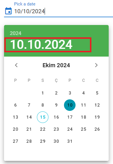
TitleDateFormat
You need to define the titleDateFormat function of the InlineDatePicker component in the Page Component's PostRender event.
TitleDateFormat
How to Format InlineDatepicker Component?
We have 2 parameters for formatting: serviceDateFormat and the displayDateFormat.
ServiceDateFormat
The service format specifies in which format the date value from the service should be set.
DisplayDateFormat
The display format indicates in which format the selected date should be displayed.
We manage these formats with settings-proxy.js and/or settings.yaml files. You can customize them as desired, based on your needs. The date formats are the same as the rally formats:
displayDateFormat: 'dd/MM/yyyy' serviceDateFormat: 'YYYYMMDD'

Samples Qjson
VınlineDatepickerDeleteValueAllowdDates_DoubleDaysOfTheMonth
AllowdDates_WorkingDaysOfTheMonth
InlineDatepickerMaxMin
InlineDatepickerReset
DatepickerDatenow
DatePickerExampleApp