Dialog
The Dialog component is used to inform users about a specific task and may contain critical information, require decisions, or involve multiple tasks. You can use dialogs sparingly as they are interruptive in nature. For more detailed information, you can refer to the Dialog component page.
info
Props
| Name | Description | Type | Default |
|---|---|---|---|
| attach | Specifies which DOM element that this component should detach to. String can be any valid querySelector and Object can be any valid Node. This will attach to the root app component by default. | any | false |
| class | Prop that determines the class to add to the Dialog. | string | ‘undefined’ |
| contentClass | Applies a custom class to the detached element. This is useful because the content is moved to the beginning of the app component (unless the attach prop is provided) and is not targetable by classes passed directly on the component. | string | undefined |
| dark | Applies the dark theme variant to the component. This will default the components color to white unless you’ve configured your application theme to dark or if you are using the color prop on the component. You can find more information on the Material Design documentation for dark themes. | boolean | false |
| eager | Will force the components content to render on mounted. This is useful if you have content that will not be rendered in the DOM that you want crawled for SEO. | boolean | false |
| Fullscreen | Changes layout for fullscreen display. | boolean | false |
| hideOverlay | Hides the display of the overlay. | boolean | false |
| internalActivator | Detaches the menu content inside of the component as opposed to the document. | boolean | false |
| noClickAnimation | Disables the bounce effect when clicking outside of a Dialog's content when using the persistent prop. | boolean | false |
| openOnHover | Designates whether component should activate when its activator is hovered. | boolean | false |
| Origin | Sets the transition origin on the element. You can find more information on the MDN documentation for transition origin. | string | 'center center' |
| persistent | Clicking outside of the element or pressing esc key will not deactivate it. | boolean | false |
| retainFocus | Tab focus will return to the first child of the dialog by default. Disable this when using external tools that require focus such as TinyMCE or vue-clipboard. | boolean | true |
| scrollable | When set to true, expects a Card and a card-text component with a designated height. For more information, check out the scrollable example. | boolean | false |
| transition | Sets the component transition. Can be one of the built in transitions or one your own. | string|boolean | dialog-transition |
| width | Sets the width for the component. | string|number | undefined |
| value | Controls whether the component is visible or hidden. | any | undefined |
| visible | Visibility of Dialog component. | boolean | true |
Events
| Name | Description | |
|---|---|---|
| click:outside | Event that fires when clicking outside an active dialog. MouseEvent | |
| keydown | Event that fires when key is pressed. If dialog is active and not using the persistent prop, the esc key will deactivate it. KeyboardEvent |
Mobile Usage
- Add items to be displayed by adding a VContainer inside.
- If the Label won't fit on one line, place it inside a VRow-VCol and do not center center the VCol containing the Label.
- If necessary, place the VRow-VCol containing the Label inside another VRow-VCol and set the align-items and justify-content properties of the VCol to center.
- For Labels that don't fit on one line, define a class with css and set the min-height property.
- The Dialog component should not be placed inside another component; it should be at the top level of the component tree.
Usage Scenarios
Default

Fullscreen
Due to limited space, full-screen dialogs may be more appropriate for mobile devices than dialogs used on devices with larger screens.

Persistent
Similar to a Simple Dialog, except that it’s not dismissed when touching outside or pressing esc key.
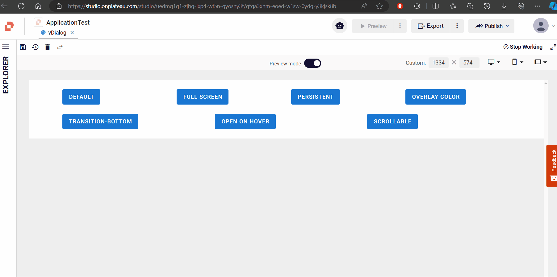
Overlay Color

Open On Hover

Scrollable
When you want to display the component as scrollable, set the scrollable prop of the component to true. Additionally, add other components inside the VCard-VContainer structure within the component.

Samples Qjson
DialogExampleWithıconDialogWithEagerProp
DialogExample
Dialog