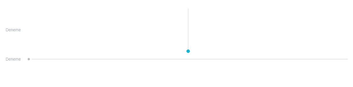
Slider
The Slider component is a better visualization of the number input. It is used for gathering numerical user data.
info
Props
| Attribute | Description | Type | Default |
|---|---|---|---|
| appendIcon | Appends an icon to the component, uses the same syntax as Icon. | string | undefined |
| dark | Applies the dark theme variant to the component. | boolean | false |
| disabled | Disable the input. | boolean | false |
| error | Puts the input in a manual error state. | boolean | false |
| errorCount | The total number of errors that should display at once. | number | string | 1 |
| errorMessages | Puts the input in an error state and passes through custom error messages. Will be combined with any validations that occur from the rules prop. This field will not trigger validation. | string | array | [] |
| hint | Hint text. | string | undefined |
| label | Applies the light theme variant to the component. | string | undefined |
| loading | Displays linear progress bar. Can either be a String which specifies which color is applied to the progress bar (any material color or theme color - primary, secondary, success, info, warning, error) or a Boolean which uses the component color (set by color prop - if it’s supported by the component) or the primary color. | boolean | string | false |
| max | Sets the maximum allowed value. | number | string | 100 |
| min | Sets the minimum allowed value. | number | string | 0 |
| prepenInnerIcon | Prepends an icon to the component, uses the same syntax as Icon. | string | undefined |
| readonly | Puts input in readonly state. | boolean | false |
| succes | Puts the input in a manual success state. | boolean | false |
| succesMessages | Puts the input in a success state and passes through custom success messages | string | array | [] |
| step | If greater than 0, sets step interval for ticks. | number | string | 1 |
| validateOnBlur | Delays validation until blur event. | boolean | false |
| thumbSize | Controls the size of the thumb label. | number | string | 32 |
| tickLabels | When provided with Array, will attempt to map the labels to each step in index order. | array | [] |
| ticks | Show track ticks. If true it shows ticks when using slider. If set to 'always' it always shows ticks. | boolean | string | false |
| vertical | Changes slider direction to vertical. | boolean | false |
| tabindex | It determines the order of switching from one component to another with the tab key. | String | |
| value | The input’s value. | any | undefined |
| visible | Visibility of Slider component. | boolean | true |
Events
| Attribute | Description |
|---|---|
| change(value: number) | Emitted when the input is changed by user interaction |
| input(value: number) | The updated bound model |
Samples Component