Radio
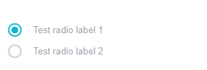
The Radio component serves as a basic radio button, enabling users to select a single option from a set of predefined choices.
When used in conjunction with the RadioGroup component, it allows for groupable functionality, presenting a cohesive set of radio buttons that facilitate user selection from multiple options.
info
Props
| Attribute | Description | Type | Default |
|---|---|---|---|
| activeClass | Changes active radio's class. | string | undefined |
| class | Configure the active CSS class applied when the qValue is true. | string | undefined |
| dark | Applies the dark theme. | boolean | false |
| disabled | Removes the ability to click or target the component. | boolean | false |
| error | Puts the input in a manual error state. | boolean | false |
| errorCount | The total number of errors that should display at once. | number | string | 1 |
| errorMessages | Puts the input in an error state and passes through custom error messages. Will be combined with any validations that occur from the rules prop. This field will not trigger validation. | string | Array | [] |
| label | Sets input label. | string | Test radio label |
| offIcon | The icon used when inactive. | string | undefined |
| onIcon | The icon used when active. | string | undefined |
| ripple | Applies the ripple directive. | boolean-string | true |
| success | Puts the input in a manual success state. | boolean | false |
| successMessages | Puts the input in a success state and passes through custom success messages. | string | array | [] |
| tabIndex | Allows component to give and receive focus. | number | undefined |
| visible | Visibility of Radio component. | boolean | true |
| value | The value used when the component is selected in a group. If not provided, the index will be used. | any | undefined |
Events
| Attribute | Description |
|---|---|
| change | Emitted when the input is changed by user interaction |
RadioGroup
The RadioGroup component organizes multiple Radio buttons into a single, manageable group, ensuring that only one selection can be made at a time from the provided options.
It should not be used independently; it should be within a RadioGroup.
Props
| Attribute | Description | Type | Default |
|---|---|---|---|
| appendIcon | Appends an icon to the component, uses the same syntax as Icon | String | undifined |
| column | Displays radio buttons in column | boolean | true |
| dark | Applies the dark theme variant to the component. This will default the components color to white unless you’ve configured your application theme to dark or if you are using the color prop on the component. | boolean | false |
| disabled | Disable the input | boolean | false |
| error | Puts the input in a manual error state | boolean | false |
| errorCount | The total number of errors that should display at once | number | String | 1 |
| errorMessages | Puts the input in an error state and passes through custom error messages. Will be combined with any validations that occur from the rules prop. This field will not trigger validation | String | array | [] |
| hideDetails | Hides hint and validation errors. When set to auto messages will be rendered only if there’s a message (hint, error message, counter value etc) to display. | boolean-string | undefined |
| hint | Hint text | String | undefined |
| label | Sets input label | String | undefined |
| mandatory | Forces a value to always be selected (if available). | boolean | false |
| max | Sets a maximum number of selections that can be made. | number | String | undefined |
| multiple | Allow multiple selections. The value prop must be an array. | boolean | false |
| persistentHint | Forces hint to always be visible | boolean | false |
| prependInnerIcon | Prepends an icon to the component, uses the same syntax as Icon | String | undefined |
| row | Displays radio buttons in row | boolean | false |
| readonly | Puts input in readonly state | boolean | false |
| success | Puts the input in a manual success state | boolean | false |
| successMessages | Puts the input in a success state and passes through custom success messages. | String | array | [] |
| validateOnBlur | Delays validation until blur event | boolean | false |
| valueComparator | Apply a custom value comparator function | function | null |
| activeClass | The active-class applied to children when they are activated. | String | 'item--active' |
Samples Component